

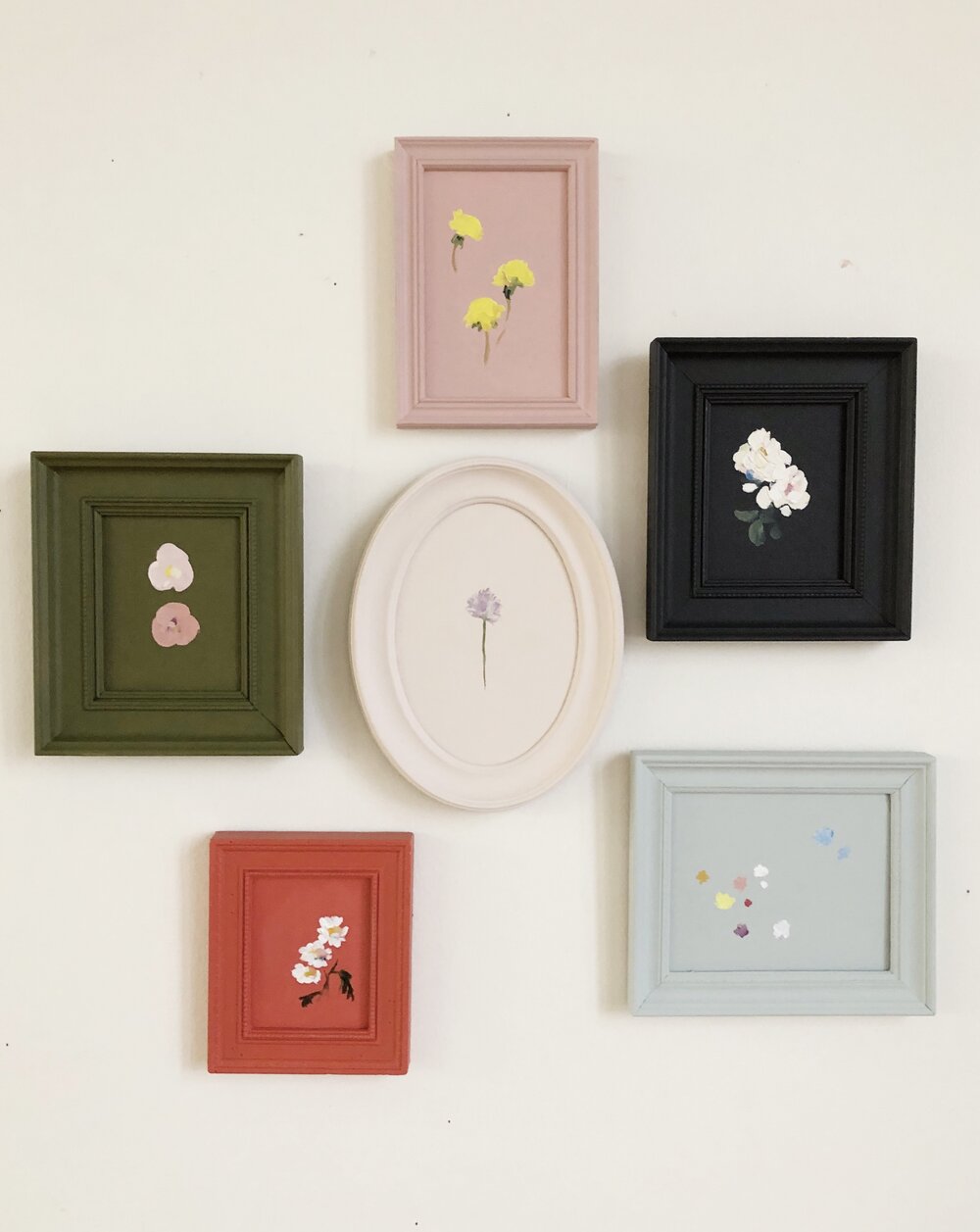
Old picture frames have a sneaky talent: they sit in closets, attics, junk drawers, and “I’ll deal with this later” piles until one day you realize they could be doing something much more glamorous than collecting dust. The good news? You do not need a design degree, a power tool collection, or the emotional stamina of a home-renovation TV host to transform them. A simple monochromatic freshen-up can turn mismatched, dated, thrifted, or slightly tragic frames into a polished gallery-worthy display.
A monochromatic frame makeover means using one color family across several frames, then playing with finish, texture, shape, and layout. Think matte black frames on a white wall, creamy beige frames around botanical prints, deep navy frames in a reading nook, or soft sage frames for a calm bedroom gallery. The magic is that everything looks intentionaleven if half the frames came from a yard sale and one still has a mysterious sticker from 2007.
This DIY project is affordable, beginner-friendly, and surprisingly satisfying. Paint is the tiny cape-wearing hero of home decor: it can rescue old wood, metal, plastic, composite, and ornate frames without requiring a full room makeover. Whether you want modern minimalism, vintage charm, cozy farmhouse style, or a sleek monochrome gallery wall, repainting old frames is one of the easiest ways to refresh your space.
Why a Monochromatic Frame Makeover Works So Well
Monochromatic decorating is powerful because it creates visual unity. Instead of fighting with several wood tones, metallic finishes, and random frame colors, you give everything one shared language. The frames may have different shapes, carvings, widths, or ages, but once they are painted in the same color family, they suddenly look like they belong together. It is basically group therapy for wall decor.
The approach also helps the artwork stand out. A mixed frame collection can sometimes compete with photos, prints, sketches, and keepsakes. When the frames are unified, the eye moves more easily across the gallery. The result feels cleaner, calmer, and more designed.
Monochromatic Does Not Mean Boring
One-color decorating does not mean flat, dull, or “waiting room beige.” A monochromatic palette can include several versions of the same hue: light, medium, dark, warm, cool, matte, satin, glossy, brushed, or distressed. For example, a black frame collection might include charcoal, soft black, and true black. A white collection might use warm ivory, chalk white, and creamy off-white. A green collection might combine sage, olive, and moss. The trick is to stay within a color family while allowing enough variation to keep the display alive.
Best Frames to Use for This DIY Project
You can refresh almost any frame, but some candidates are especially good for this project. Look for frames with sturdy corners, interesting profiles, and surfaces that can be cleaned. Real wood frames are excellent because they accept paint well after light prep. Metal frames can look sleek with the right primer and thin coats of spray paint. Plastic or resin frames can work too, especially if you choose a paint made for slick surfaces.
Thrift stores, flea markets, estate sales, garage sales, discount bins, and forgotten storage boxes are all prime hunting grounds. Do not dismiss ornate frames with questionable gold finishes. Once painted in one quiet color, those curvy details can look elegant instead of “haunted mansion with Wi-Fi.”
Frames Worth Avoiding
Skip frames that are warped, moldy, badly cracked, or too fragile to handle. If a frame is antique and has flaking paint, be cautious. Older painted items may contain lead-based paint, so avoid aggressive sanding unless you know the surface is safe. When in doubt, test first or choose a different frame. DIY should be fun, not a surprise chemistry lesson.
Choosing the Right Monochromatic Color
Your frame color should support the room, the wall color, and the artwork. Before grabbing the loudest spray can in the aisle, think about the mood you want.
Black Frames: Crisp, Modern, and Foolproof
Black is the little black dress of frame colors. It works with photography, line drawings, typography prints, family portraits, abstract art, and nearly every wall color. Matte black feels modern and quiet. Satin black adds a subtle polish. Gloss black can look dramatic, especially in a dining room, hallway, or office.
White and Cream Frames: Soft and Airy
White frames are great for coastal, Scandinavian, cottage, and minimalist interiors. If your walls are also white, choose a slightly different tone so the frames do not disappear completely. Cream, ivory, and warm white can soften bright artwork and make a room feel lighter.
Greige, Taupe, and Beige Frames: Understated and Warm
Neutral monochrome frames are ideal when you want a collected look without high contrast. Taupe and greige work beautifully with vintage landscapes, botanical art, family photos, and natural textures like linen, rattan, oak, and stone.
Navy, Green, or Burgundy Frames: Color With Confidence
Deep colors can make old frames feel custom. Navy pairs well with white walls, brass accents, and coastal or traditional rooms. Sage and olive green feel calm and organic. Burgundy or oxblood can add a library-like richness, especially around black-and-white photos or moody artwork.
Supplies You Will Need
You do not need a professional workshop for this old frame makeover. A kitchen table, a garage, a balcony, or a protected outdoor area can work, as long as you have ventilation and enough room to lay the frames flat.
- Old picture frames
- Painter’s tape
- Drop cloth, cardboard, or kraft paper
- Microfiber cloth or lint-free rag
- Mild soap or degreasing cleaner
- Fine-grit sandpaper or sanding sponge
- Tack cloth or damp cloth
- Primer suitable for wood, metal, plastic, or glossy surfaces
- Spray paint, chalk paint, acrylic paint, or furniture paint
- Small angled brush for detailed frames
- Clear topcoat, wax, or sealer
- Gloves, eye protection, and a respirator or mask appropriate for painting
Step-by-Step: How to Freshen Up Old Frames
Step 1: Remove the Glass, Art, Backing, and Hardware
Start by taking the frame apart. Remove the glass, mat, photo, artwork, cardboard backing, and hanging hardware if possible. This makes painting cleaner and prevents accidental overspray. If the glass cannot be removed, cover it carefully with painter’s tape and paper. Be patient here. A rushed tape job is how paint ends up on glass, and then you become a person muttering at a razor blade at midnight.
Step 2: Clean Every Surface
Paint sticks best to a clean surface. Wipe the frame with mild soap and water or a gentle degreasing cleaner. Pay extra attention to carved grooves and corners, where dust likes to retire permanently. Let the frame dry completely before moving on.
Step 3: Lightly Sand Glossy or Rough Areas
If the frame has a glossy finish, chipped paint, or rough patches, lightly sand it with fine-grit sandpaper. You are not trying to remove every bit of old finish. The goal is to dull the surface enough for primer and paint to grip. After sanding, wipe away all dust with a tack cloth or damp rag.
Step 4: Prime for Better Adhesion
Primer is the difference between “I painted this beautifully” and “Why is my frame peeling like a sunburn?” Use a primer that matches your frame material. Wood, metal, plastic, and laminate-like surfaces often need different formulas. If you are painting a dark frame a light color, primer also helps block the old tone. If you are painting light frames dark, primer helps create even coverage.
Step 5: Apply Thin Coats of Paint
Thin coats are your best friend. Whether brushing or spraying, avoid the temptation to load on paint like frosting. Heavy coats can drip, bubble, pool in details, or stay tacky. Spray paint should be applied in light passes, moving steadily past the frame rather than stopping directly over it. Brush-on paint should be smoothed in the direction of the frame profile, with extra care around corners and carvings.
Let each coat dry according to the product label. Many paints feel dry to the touch before they are ready for another coat or before they are fully cured. Waiting is annoying, yes, but so is leaving fingerprints in your beautiful new finish.
Step 6: Add Dimension With Finish
For a monochromatic look, finish matters as much as color. A matte finish feels soft and modern. Satin offers a gentle sheen that works almost anywhere. Gloss creates drama and reflects light. Chalk paint gives old frames a velvety, vintage feel. For ornate frames, a dry-brush technique in a slightly lighter or darker shade can highlight raised details while keeping the overall palette unified.
Step 7: Seal the Frame
A clear sealer protects your work, especially on frames that will be handled often or placed in busy areas. Choose a topcoat that matches your desired finish. Matte sealer keeps things quiet, satin adds subtle durability, and gloss makes color feel richer. For chalk-painted frames, wax can create a soft protective layer.
Step 8: Reassemble and Style
Once the frames are fully dry and cured, clean the glass, replace the artwork, secure the backing, and reinstall hanging hardware. This is the moment when the project goes from “painted objects on cardboard” to “I may actually have my life together.”
Monochromatic Gallery Wall Ideas
A set of freshly painted frames can do more than hold pictures. It can anchor an entryway, refresh a hallway, upgrade a home office, or make a bedroom feel finished. The monochromatic approach works especially well because it allows you to mix sizes and styles without visual chaos.
The Classic Grid
Use matching frame colors and equal spacing to create a clean grid. This is perfect for family photos, travel photography, botanical prints, or black-and-white artwork. A grid looks best when the frames are the same size or arranged in a disciplined pattern.
The Collected Salon Wall
Mix large, medium, and small frames, but paint them in one color family. This style feels relaxed and personal while still looking curated. It works beautifully above a sofa, staircase, console table, or bed.
The Empty Frame Display
Empty frames can become sculptural wall decor, especially if they have interesting shapes or ornate details. Paint them all the same color and layer them on a wall for a tone-on-tone architectural effect. This idea is excellent for renters because lightweight frames can often be hung with removable strips.
The Shelf Lean
If you do not want to commit to a wall arrangement, lean frames on a picture ledge, mantel, bookcase, or console. Mix painted frames with candles, small plants, books, and ceramics in the same color family for a layered monochrome vignette.
Common Mistakes to Avoid
Skipping the Cleaning Step
Dust, oil, and old polish can interfere with paint adhesion. Even if a frame looks clean, wipe it down. Frames live near hands, walls, candles, kitchens, pets, and airborne mystery particles. Give them a fresh start.
Painting Over Loose or Flaking Finish
If old paint or finish is already peeling, new paint will not magically fix it. Remove loose flakes safely, smooth the surface, and prime before painting. For potentially antique or lead-painted frames, avoid sanding dust and consider professional advice.
Using One Heavy Coat
Heavy coats create drips, clogged details, and uneven drying. Several thin coats produce a smoother, more durable finish. This is especially important for detailed frames with grooves, beading, or carved corners.
Ignoring the Wall Color
A frame color that looks gorgeous on cardboard may behave differently on your wall. Test your chosen color near the actual display area. Light changes everything. A soft beige can look creamy in morning sun and oddly gray under cool bulbs.
Reassembling Too Soon
Paint may feel dry before it is truly cured. If you rush, the backing can stick, the hardware can dent the finish, or your fingers can leave marks. Give the frames more drying time than you think they need.
Budget-Friendly Styling Tips
This project is already inexpensive, but a few smart choices can make it look higher-end. First, use matching mats inside mismatched frames. White, cream, black, or linen-textured mats can make inexpensive art feel polished. Second, repeat one subject matter, such as family photos, vintage landscapes, pressed flowers, abstract shapes, or travel prints. Third, keep spacing consistent. Even thrifted frames look designer-level when they are hung with intention.
You can also paint the frames the same color as the wall for a subtle tone-on-tone look. This works beautifully in small rooms because it adds texture without clutter. A creamy wall with creamy frames feels calm and architectural. A navy wall with navy frames feels bold and dramatic. A sage wall with sage frames says, “I drink herbal tea and remember to water my plants,” even if neither is strictly true.
Specific Examples for Different Rooms
Entryway
Paint a mix of old frames in satin black and fill them with family photos, house sketches, or vintage maps. Add a narrow console table and a bowl for keys. Suddenly, your entryway looks intentional instead of like a shoe migration zone.
Living Room
Use warm white or taupe frames around abstract prints, textile samples, or landscape photography. The neutral palette will blend with sofas, rugs, and wood furniture without stealing attention.
Bedroom
Try soft sage, dusty blue, or creamy beige frames for a soothing mood. Pair them with gentle artwork such as botanical drawings, black-and-white portraits, or minimalist line art.
Home Office
Deep charcoal or navy frames can make a workspace feel focused and polished. Use them for certificates, typography prints, architectural sketches, or personal photos that make Monday feel less rude.
Kids’ Room
Choose one cheerful color, such as sky blue, coral, yellow, or mint, and paint a group of lightweight frames. Fill them with rotating artwork, school projects, or family photos. A monochromatic frame color keeps the display from looking too busy, even when the art is wildly enthusiastic.
Experience Notes: What This Project Teaches You
A monochromatic frame makeover seems simple, but it teaches several surprisingly useful DIY lessons. The first is that preparation is not optional. When you clean, sand lightly, tape carefully, and prime properly, the final result looks smoother and lasts longer. When you skip prep, the project may still look good for one glorious afternoon, but then the paint starts scratching off and your confidence leaves the room wearing a tiny backpack.
The second lesson is that color confidence grows through small projects. Painting a whole room dark green may feel intimidating. Painting six thrifted frames dark green is manageable. You can test a color in your real space without committing to gallons of paint or several weekends of wall repair. Frames are like design appetizers: small, satisfying, and unlikely to ruin your life.
The third lesson is that “matching” and “coordinating” are not the same thing. A monochromatic display does not require every frame to be identical. In fact, the charm often comes from mixing different frame shapes and profiles. A skinny modern frame, a chunky wood frame, and an ornate vintage frame can work together when they share a color. The color creates harmony; the shapes create interest.
The fourth lesson is patience. DIY painting rewards the person who waits between coats, lets the finish cure, and resists poking the paint to “see if it’s dry.” Everyone pokes once. This is how we learn. But after you leave a fingerprint in satin black paint, you become wiser.
The fifth lesson is that small changes can shift the feeling of a room. A hallway with random mismatched frames may feel cluttered. Paint those frames one warm white, and suddenly the hallway feels brighter and calmer. A home office with cheap plastic frames may feel temporary. Paint them matte black or deep navy, and the desk area feels more grown-up. The transformation is not just about the frames; it is about the room finally looking like someone made a decision.
One of the best personal approaches is to start with frames you already own. Pull them from closets, shelves, and storage boxes. Lay them on the floor and sort them by size, material, and style. Then choose the one color that would make the group feel unified. You may discover that the “ugly” frame is only ugly because it is shiny fake cherry wood. In matte taupe, it might become the star. DIY is full of these small redemption arcs.
Another helpful experience is to paint one test frame before tackling the whole group. Try the primer, paint, and sealer on the least precious frame. Check how the paint handles corners, how the color looks in your room, and whether the finish feels too glossy or too flat. This test run can save you from painting twelve frames a color that looked sophisticated online but appears strangely like wet cement in your hallway.
If you are refreshing frames for sentimental photos, take extra care with reassembly. Clean the glass on both sides, use acid-free mats if possible, and make sure the backing is secure. A beautiful frame makeover should protect the memory inside, not just decorate around it.
The most enjoyable part of this project is the reveal. There is something deeply satisfying about seeing old frames lined up in a new color, looking like they came from the same boutique instead of three different decades and one suspicious basement box. It proves that good design is not always about buying more. Sometimes it is about seeing potential in what you already have, giving it a little effort, and letting paint do its tiny miracle.
Conclusion
A monochromatic freshen-up for old frames is one of the easiest DIY home decor projects with one of the biggest visual payoffs. It is affordable, flexible, beginner-friendly, and endlessly customizable. With careful cleaning, light sanding, proper primer, thin coats of paint, and a protective finish, tired frames can become a cohesive gallery wall, a polished shelf display, or a stylish focal point.
The beauty of this project is that it celebrates what you already own. Instead of replacing every mismatched frame, you can unify them with one thoughtful color. Black can feel crisp and modern. White can feel airy and calm. Taupe can feel warm and collected. Green, navy, or burgundy can add personality without chaos. The monochromatic method gives you structure, while the different frame shapes keep the display personal.
So before you donate those old frames or let them continue their glamorous career under the bed, consider giving them a one-color makeover. A little paint, a little patience, and a little imagination can turn forgotten decor into a fresh design moment. Your walls get an upgrade, your budget survives, and your old frames finally get to stop pretending they are “vintage” when they are really just dusty.