

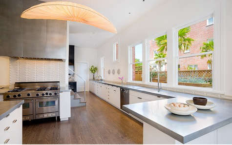
Some kitchens politely ask to be admired. The J. Weiss Kitchen & Bar in San Francisco walks into the room wearing crisp white tailoring, then changes into midnight blue for cocktails.
Designed by architect Jennifer Weiss for the 2009 San Francisco Decorator Showcase, this residential kitchen-and-bar project remains memorable because it is more than a collection of expensive fixtures. It tells a visual story. A bright, efficient kitchen represents daytime, while an adjoining dark blue bar creates a glamorous transition into evening. Zinc surfaces, dimensional ceramic tile, handcrafted metal hardware, and sculptural lighting give both spaces depth without turning them into a design showroom where nobody is allowed to make toast.
The good news is that you do not need the original productsor a showcase-house budgetto capture the effect. The real lesson is how Weiss balanced contrast, texture, craftsmanship, and function. Here is how to steal the J. Weiss kitchen look without stealing anyone’s chandelier.
The Story Behind the J. Weiss Kitchen & Bar
Jennifer Weiss brought substantial architectural experience to the project, including education at the Harvard Graduate School of Design and professional work with Ryan Associates and Skidmore, Owings & Merrill. For the San Francisco Decorator Showcase, she reportedly designed and completed the kitchen and bar in approximately two and a half months.
Project background verified through Remodelista and Jennifer Weiss Architecture.
The original rooms had been cramped, so the redesign focused on opening and streamlining the kitchen while retaining materials with a sense of history. That combination explains why the finished space does not feel like a time capsule from 2009. Its layout is contemporary, but zinc, ceramic tile, bronze, and fireclay introduce the pleasant irregularities associated with older homes.
The “night and day” concept is the project’s cleverest move. The white kitchen is clean, active, and practical. The midnight-blue bar is intimate, reflective, and theatrical. Between them, the change in color and lighting signals a change in activityfrom chopping onions to pouring something that makes the onions seem less important.
Why the Design Still Looks Fresh
Contrast Does the Heavy Lifting
The project does not depend on dozens of colors. Instead, it uses a disciplined contrast between white and deep blue, then adds gray metal, warm bronze, and translucent glass. Because the palette is controlled, every texture becomes more visible.
White cabinetry reflects light and keeps the working kitchen feeling energetic. The dark bar absorbs light, creating a cocoon-like atmosphere. This is an effective strategy for an open or connected floor plan: related rooms can share materials while developing different personalities.
Traditional Materials Meet Modern Lines
Flat, orderly cabinet fronts and streamlined fixtures provide a modern framework. Against that framework, zinc develops character, ceramic tiles show natural variation, and bronze hardware contributes warmth. The result feels polished but not factory-sealed.
This mix is especially appropriate in San Francisco, where many historic homes benefit from contemporary upgrades that still acknowledge craftsmanship. The goal is not to reproduce a period kitchen. It is to create a modern room that does not act embarrassed about living in an older building.
The Decorative Features Are Also Functional
The backsplash protects the wall, but its sculptural surface also acts as artwork. The vent hood handles cooking fumes, but its zinc finish makes it a focal point. The chandelier illuminates the bar, yet it also marks the bar as a destination. Nothing is merely decorative, and nothing functional is treated as an afterthought.
The Essential Ingredients of the Look
1. Sculptural White Tile
One of the kitchen’s most recognizable elements is its Heath Ceramics Oval Dimensional Tile. The tile was installed behind the range and as a decorative band above the countertops. Its curved surface catches light differently throughout the day, giving a mostly white room movement and shadow.
Heath describes its Dimensional collection as a group of sculptural, three-dimensional shapes that function as both architectural material and art. The company also notes that its handmade tile is intentionally variable in glaze, size, and curvature. That variation is important: a textured backsplash should look lively, not as though it was generated by spreadsheet.
Tile details verified through Heath Ceramics and Remodelista.
To recreate the effect, look for oval, pill-shaped, fluted, scalloped, or convex ceramic tile in white, ivory, or pale gray. Use matching grout for subtle texture or a slightly darker grout for stronger definition. In a smaller kitchen, limit the dimensional tile to the range wall or a narrow horizontal band.
2. Zinc Countertops and a Matching Hood
Zinc gives the kitchen its quietly industrial edge. Unlike polished stainless steel, zinc has a soft gray appearance and develops a darker, mottled patina as it ages. Scratches, water marks, and tonal changes are part of the material’s personality.
That personality is not for everyone. Anyone who expects a countertop to remain visually perfect may spend a great deal of time arguing with chemistry. For homeowners who appreciate evolving surfaces, however, zinc becomes more attractive as it records daily use.
A custom zinc range hood creates continuity with the counters and makes the cooking zone feel architectural. A more affordable interpretation could use stainless steel, pewter-toned sheet metal, brushed nickel, or a painted hood in a warm charcoal gray.
Zinc characteristics informed by the original project documentation and Houzz material guides.
3. A White Fireclay Sink
The original product list referenced a Rohl Allia fireclay sink. A glossy white sink creates a clean visual break against zinc or dark metal and reinforces the project’s mix of old and new.
Fireclay sinks are made by firing clay at very high temperatures and covering it with a fused glaze. The result is a hard, luminous surface with strong resistance to stains. Current Allia models continue the tradition of glazed fireclay sinks associated with Limoges, France.
Sink information verified through House of Rohl.
For a similar appearance, choose a white undermount or apron-front sink with gently rounded corners. If the budget is limited, a high-quality enameled cast-iron or composite sink can provide the same bright visual anchor.
4. Professional-Style Faucets
A tall pull-out or semi-professional faucet adds height and reinforces the kitchen’s working character. The J. Weiss product palette included an AXOR Citterio-style pull-out spray faucet. Current versions of the semi-professional design feature a full swivel range, multiple spray modes, and a ceramic cartridge.
Faucet features verified through Hansgrohe USA.
Choose chrome or polished nickel for a bright kitchen and aged bronze or dark brass for the bar. The faucet should feel substantial but not comically oversized. If it resembles equipment for washing a small horse, check the measurements again.
5. Bronze Cabinet Hardware
Rocky Mountain Hardware Catch pulls were associated with the original design. Their solid-bronze construction and artisan finishes add weight and warmth to otherwise restrained cabinetry.
You can recreate the effect with dark bronze, oil-rubbed bronze, antiqued brass, or blackened metal pulls. Simple forms work best. The material and finish should provide character, while the shape remains quiet enough to avoid competing with the backsplash.
Hardware details verified through Rocky Mountain Hardware.
6. A Jewel-Like Chandelier
The dark bar was illuminated by a Bocci 14-series chandelier. Designed by Omer Arbel, the fixture uses cast-glass forms made from two hemispheres joined into textured spheres. The 14.14 configuration contains 14 pendants, creating a cluster of glowing glass points.
Lighting construction verified through Bocci.
The fixture works because it contrasts with the bar’s dark walls. Clear and textured glass catches the light, while the scattered composition feels glamorous without becoming formal. To obtain a similar effect, use a cluster chandelier with clear, seeded, smoked, or handblown glass globes. Hang it low enough to feel intimate but high enough that guests do not leave with a pendant embedded in their hairstyle.
How to Steal the Look Step by Step
Step 1: Build a Day-to-Night Color Palette
Begin with warm white for the main kitchen. Avoid a harsh blue-white, particularly if the room receives limited natural light. Add pale gray, soft metal, and natural wood to prevent the room from feeling clinical.
For the bar, choose navy, ink blue, blue-black, or charcoal. Benjamin Moore Chelsea Gray was included in the original product references and remains a useful bridge between the bright kitchen and darker bar. The manufacturer describes it as a gray with a slight brown undertone and lists a light reflectance value of 23.33, meaning it creates a rich, relatively dark surface.
Paint information verified through Benjamin Moore and Remodelista.
Always test dark paint on multiple walls. Blue can become nearly black at night, while gray can reveal green, violet, or brown undertones depending on daylight and artificial lighting.
Step 2: Keep the Cabinetry Quiet
The more expressive the tile, metal, and lighting become, the simpler the cabinetry should be. Use flat-panel doors, restrained Shaker fronts, or clean inset cabinets. Paint the kitchen cabinets white and the bar cabinetry the same color as the bar walls for a built-in, enveloping effect.
Carry one detail between both roomsperhaps the same countertop edge, pull shape, shelf thickness, or faucet silhouette. Repetition makes the two spaces feel related even when their colors differ dramatically.
Step 3: Treat the Backsplash as Architecture
Do not automatically cover every wall with expensive dimensional tile. Identify the view that deserves emphasis, usually the range, hood, sink, or bar display. Concentrating texture in one location creates a focal point and protects the budget.
Before installation, arrange handmade tiles on the floor and mix pieces from different boxes. Variation should appear distributed rather than clustered. Use skilled installers, because curved surfaces and handmade dimensions are less forgiving than standard subway tile.
Step 4: Design Separate Lighting Scenes
The white kitchen requires strong task lighting for chopping, cooking, and cleaning. The bar needs warmer, lower illumination that flatters glassware and creates atmosphere. Use separate switches and dimmers so one room does not have to perform every job at the same brightness.
Combine recessed or ceiling light with under-cabinet task lighting in the kitchen. In the bar, use a statement pendant, integrated shelf lighting, or a small decorative lamp. Layered lighting allows practical zones to remain safe while social zones feel relaxed.
Layered lighting principles informed by Architectural Digest.
Step 5: Style With Restraint
Display only objects that reinforce the palette: clear glassware, white ceramics, metal cocktail tools, dark bottles, a wooden cutting board, or one small arrangement of greenery. Open shelves should look useful, not as though a home-accessories store suffered a minor explosion.
Three Budget Levels for Recreating the Design
The Investment Version
Commission zinc countertops and a custom hood, specify handmade dimensional tile, install solid-bronze hardware, and use a hand-cast glass chandelier. This approach captures the material richness of the original project and works best when craftsmanship is the central priority.
The Balanced Version
Use dimensional tile only behind the range, select quartz or soapstone-look counters, purchase mid-priced bronze pulls, and invest in one memorable light fixture. Paint and strategic contrast will provide much of the drama, allowing you to spend where touch and visibility matter most.
The Budget-Smart Version
Paint existing cabinets, create the dark bar with a single gallon of saturated paint, and install a small area of textured ceramic tile. Choose brushed-metal laminate or standard stainless steel rather than custom zinc. Finish with clustered glass pendants and simple dark hardware.
The least expensive way to steal this look is to steal its logic: bright work zone, dark social zone, one tactile surface, and one sparkling light source.
Common Mistakes to Avoid
- Making every surface a focal point: Dimensional tile, bold metal, dramatic lighting, dark paint, and ornate hardware cannot all shout at once.
- Using cold lighting: Dark blue and gray rooms can feel unwelcoming under harsh, high-temperature bulbs.
- Expecting zinc to remain unchanged: Patina, scratches, and tonal variation are normal characteristics, not a countertop rebellion.
- Ignoring practical task light: A beautiful chandelier cannot tell whether the chicken is fully cooked.
- Choosing products before planning the composition: Start with the relationship between rooms, then select individual fixtures.
- Copying every historic product literally: Some original items may be discontinued, altered, or priced very differently today. Match the design principle rather than chasing an exact catalog number.
The Experience of Living With the J. Weiss Look
Morning: Bright, Calm, and Ready to Work
A kitchen inspired by the J. Weiss design feels especially successful in the morning. Daylight spreads across white cabinets and reflects from chrome, pale tile, and the glazed sink. Even when the room is compact, the limited palette makes it feel organized before anyone has actually organized anything.
The dimensional backsplash becomes more noticeable as the sun changes position. Curved tiles cast small shadows, so a plain white wall develops rhythm without needing a printed pattern. This is the kind of detail that reveals itself gradually. It does not demand attention during breakfast, but it rewards anyone who pauses long enough to look up from the coffee.
Afternoon: Materials Begin to Show Their Character
During food preparation, the value of the design’s practical choices becomes clear. A large sink handles baking sheets and stockpots. A pull-out faucet reaches awkward corners. Strong task lighting illuminates the counter rather than the top of the cook’s head.
Zinc or another living metal changes the emotional tone of the room. A polished stone counter encourages caution; zinc encourages acceptance. The first scratch may cause a moment of silence. The twentieth becomes part of the surface. Over time, marks merge into a patina that makes the kitchen feel used rather than damaged.
That evolving finish suits a room built for cooking. It also means homeowners should agree on their tolerance for imperfection before installation. One person’s romantic patina is another person’s urgent cleaning project.
Evening: The Bar Becomes a Destination
At night, the relationship between the two rooms becomes theatrical. Bright task lights in the kitchen can be dimmed while the bar chandelier and shelf lighting remain on. The dark walls recede, causing glass, bottles, and metal details to appear more luminous.
This is where the “night and day” concept becomes more than a clever description. Lighting changes how people move through the space. Guests naturally gather near the warmer glow of the bar while the working kitchen settles into the background. The bar does not need to be large. Even a shallow cabinet, a narrow counter, and two shelves can establish a social center when the color and lighting are sufficiently distinct.
Dark paint also improves the appearance of ordinary objects. Clear tumblers look brighter. Brass tools look warmer. A simple bottle collection gains the mysterious confidence of a hotel lounge, even if one of the bottles is mostly used for cooking.
Entertaining: Separation Without Isolation
The design works well for entertaining because it separates activities without building a hard barrier. One person can prepare food in the bright kitchen while another mixes drinks in the darker bar. Guests understand the purpose of each area immediately, reducing the familiar party problem in which six people stand directly in front of the refrigerator.
Repeated materials maintain visual continuity. The same hardware finish, countertop detail, or cabinet proportions can connect both zones. The result feels like a sequence rather than two unrelated rooms.
Long-Term Use: A Kitchen That Can Age Gracefully
The strongest aspect of the J. Weiss approach is that it allows materials to age. Handmade tile contains variation from the beginning. Bronze becomes richer with handling. Zinc develops patina. Fireclay retains its glossy contrast. Dark paint can be touched up without replacing an entire surface.
This is a more forgiving way to design than selecting materials that look perfect only on installation day. A kitchen should survive spilled wine, enthusiastic cooking, hurried mornings, and the occasional pan placed somewhere it absolutely should not have been placed.
Living with this look is therefore less about maintaining a showroom and more about enjoying contrast. The white kitchen supports concentration and activity. The blue bar encourages conversation and slowing down. Together they create a home that changes mood as the day progressesan impressive achievement for rooms whose main responsibilities include dishes and beverages.
Final Thoughts
The J. Weiss Kitchen & Bar remains compelling because its personality comes from composition rather than trend-chasing. Jennifer Weiss paired a luminous white kitchen with a midnight-toned bar, then connected them through craftsmanship, strong architectural lines, and carefully controlled lighting.
To recreate the look, focus first on contrast. Establish a bright working area and a darker entertaining zone. Add one sculptural tile, one evolving metal, simple cabinetry, substantial hardware, and a glass light fixture that glows after sunset. Expensive originals are optional; clear design intent is not.
The finished room should feel efficient in daylight and inviting at night. In other words, it should be able to make pancakes at 8 a.m. and look ready for cocktails at 8 p.m.without requiring a costume change.