Note: In this article, “mistakes” means more than somebody spilling coffee on a drawing board and accidentally inventing a billion-dollar franchise. These are happy accidents, production shortcuts, printing problems, technical limits, and creative misunderstandings that became unforgettable parts of pop culture.
Introduction: When Creative Accidents Become Pop Culture Gold
Some famous characters look like they were designed by a committee of geniuses locked in a room with perfect lighting, expensive coffee, and a wall full of mood boards. The truth is much funnier. Many iconic character designs were born because someone ran out of time, had too few pixels, misunderstood instructions, or simply needed to get through the workday without applying six hours of monster makeup.
That is the weird magic of entertainment design. A small compromise can become a visual signature. A printing problem can turn into a superhero brand. A mask grabbed for a lighting test can become the face of horror. A scarf that was not supposed to be absurdly long can become the most recognizable accessory in science fiction television. In other words, the universe occasionally rewards panic.
These stories also show why great character design is not always about polish. It is about memorability. The best designs communicate instantly. You see green skin and think Hulk. You see a hockey mask and think Jason Voorhees. You see a red cap, mustache, and overalls and think Mario before your brain even finishes chewing its cereal. These accidental character designs worked because they solved a problem and created a strong silhouette, bold color identity, or emotional shortcut.
Below are five iconic designs of famous characters that were mistakesor at least creative accidentsthat became bigger than the original plan.
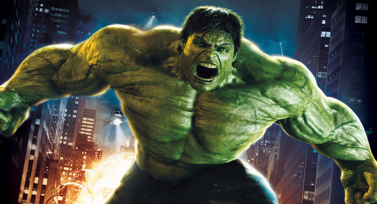
1. The Hulk’s Green Skin: A Printing Problem That Became a Superhero Brand
The original idea
Today, the Hulk is so deeply associated with green that “angry green giant” practically sounds like a job title. But when Stan Lee and Jack Kirby introduced the character in The Incredible Hulk in 1962, the plan was not to make him green. The Hulk was originally gray. Lee wanted a non-human color that felt eerie and monstrous without linking the character to a real-world ethnic group.
That was a reasonable idea on paper. Unfortunately, comic books are not just ideas on paper; they are ideas on paper that must survive printing presses, ink consistency, cheap newsprint, tight deadlines, and the ancient curse known as “production.” The gray tone did not reproduce consistently. Across pages, the Hulk’s skin shifted in a way that looked less like deliberate monster design and more like the printer was having an emotional episode.
The mistake that worked
Marvel solved the problem by changing the Hulk to green in the second issue. That practical fix became one of the most powerful color identities in comics. Green made the Hulk instantly readable on the page. It also gave writers and marketers a built-in vocabulary: the Green Goliath, the Jade Giant, the big guy who looks like spinach got really, really upset.
The lesson is simple: a technical limitation can create a stronger brand than the original concept. Gray Hulk was creepy, but green Hulk was unforgettable. The mistake did not weaken the character; it made him visually explosive. A printer problem accidentally handed Marvel a color code that still works across comics, cartoons, toys, video games, and blockbuster movies.
2. Jason Voorhees’ Hockey Mask: A Lazy Lighting Test That Terrified the World
The original look
Jason Voorhees did not begin life as the hockey-mask icon we know today. In the first Friday the 13th, he was not the main killer. In Friday the 13th Part 2, adult Jason wore a burlap sack with one eye hole, which made him look like a nightmare scarecrow who had lost a custody battle with a potato sack.
By the third film, the crew needed something new. Jason’s face required special makeup, and that process was not exactly a quick powder-and-go situation. During a lighting check, applying the full makeup just to test the shot was too much work. So the crew looked for a fast solution.
The accidental horror icon
Martin Jay Sadoff, the film’s 3D effects supervisor and a hockey fan, had a goalie mask with him. It was placed on actor Richard Brooker for the test, and director Steve Miner liked the look. The mask was then modified for the movie, including the now-famous red markings.
That little shortcut became one of horror’s most recognizable images. The hockey mask worked because it was blank, cold, and strangely ordinary. It did not scream “monster” in the usual gothic sense. It suggested a person who had erased his face and replaced it with a piece of sports equipment. Somehow, that is worse. Dracula has style. Jason has a recreational item and a machete. Very different energy.
The design also gave Jason a clean, marketable silhouette. You can reduce the hockey mask to a simple white shape with red marks and still recognize it. That is the dream of character branding: instant recognition, minimum detail, maximum dread.
3. Mario’s Mustache, Hat, and Overalls: Pixel Limits Dressed as Personality
The tiny canvas problem
Mario’s look feels so natural now that it is easy to forget how strange it is. A red cap, a big mustache, blue overalls, white gloves, and heroic plumber energy? That is not a standard fantasy archetype. Nobody in ancient mythology said, “Only the mustached tradesman can save the princess.”
Mario’s design came from early arcade limitations. Shigeru Miyamoto had to make a small character readable on a tiny pixel grid. There was not enough visual space to draw detailed hair, facial expressions, or subtle body movement. So every element of Mario’s design became a practical solution.
The “mistake” that became a mascot
The mustache reduced the need to draw a clear mouth. The hat avoided the problem of animating hair. The overalls made the movement of Mario’s arms easier to see because his sleeves and body could contrast. The gloves later helped his hands pop during motion. In short, Mario’s famous design was not born from fashion ambition. It was born from the question, “How do we make this tiny man look human without melting the screen?”
That is why Mario is one of the greatest examples of form following function. His design is charming because it is efficient. Every feature is doing a job. The mustache is not just a mustache; it is a face-saving device. The cap is not just a cap; it is an anti-hair-animation shield. The overalls are not just workwear; they are movement indicators.
The funny part is that technology eventually became powerful enough to render Mario with realistic hair, detailed facial expressions, and fancy fabrics. Nintendo wisely kept the old look. Why? Because the workaround had become the character. The limitation became the logo.
4. The Fourth Doctor’s Scarf: A Knitting Misunderstanding That Became Sci-Fi Fashion
The costume plan
Tom Baker’s Fourth Doctor is one of the most recognizable versions of Doctor Who, and his absurdly long, striped scarf is a major reason why. It swings, trails, wraps, dangles, and generally behaves like a colorful supporting actor. It is less an accessory than a wool-based co-star.
The original costume concept drew inspiration from a bohemian, theatrical style. Costume designer James Acheson wanted a distinctive scarf, so he provided yarn to knitter Begonia Pope. The misunderstanding came when Pope used all the wool she had been given. The result was a scarf far longer than expected.
The accident that matched the character
Instead of rejecting it, the production team realized the oversized scarf perfectly fit Baker’s eccentric Doctor. The Fourth Doctor was alien, whimsical, unpredictable, and slightly as if he had wandered out of a library, a magic shop, and a very confusing laundry basket at the same time. A normal scarf would have been fine. The giant scarf was unforgettable.
The design works because it extends the character’s personality into physical space. The scarf creates movement. It makes the Doctor look taller, stranger, warmer, and more approachable all at once. It also gives fans something easy to recognize and recreate. Cosplay loves a signature accessory, even if that accessory appears determined to trip its owner on every staircase.
This is a perfect example of a production accident becoming character language. The scarf says, “This person is brilliant, odd, cozy, chaotic, and probably carrying jelly babies.” That is a lot of storytelling for a knitted rectangle.
5. Lex Luthor’s Bald Head: An Artist Error That Redefined a Villain
The original Luthor
Modern Lex Luthor is almost impossible to imagine without his bald head. It is part of his brand: cold intelligence, enormous ego, expensive suits, and a skull polished by ambition. But early Luthor was not bald. In his first appearances, he had red hair.
The shift is typically traced to an artist error in the early Superman newspaper strips and later comic appearances. Artist Leo Nowak is often credited with accidentally drawing Luthor bald, possibly because of confusion with another bald character. Rather than vanish, the mistake stuck. Later stories even created in-universe explanations for how Lex lost his hair, including a famous Superboy-era lab accident.
Why bald Lex became better Lex
The bald design sharpened Luthor’s visual identity. With Superman, the iconography is all warmth and primary colors: cape, curl, shield, sky. Luthor’s bald head and tailored clothing offer a visual opposite: controlled, sterile, intellectual, human. He does not need horns or claws. His menace comes from the idea that his brain is the weapon.
The change also simplified the silhouette. Great comic book villains often survive because readers can identify them instantly. Luthor’s bald head became as memorable as Superman’s cape. It made him look less like a generic pulp villain and more like a symbol of ruthless intellect. The error did what good redesigns are supposed to do: it clarified the character.
Why These Famous Character Design Mistakes Worked
These five examples reveal a pattern. The accident itself is not enough. Plenty of mistakes remain mistakes. The reason these designs became iconic is that each one solved a real creative problem while adding meaning.
The Hulk’s green skin created stronger color branding. Jason’s mask simplified fear into a clean visual symbol. Mario’s pixel-driven outfit made him readable and charming. The Fourth Doctor’s scarf turned eccentricity into motion. Lex Luthor’s bald head made intelligence look dangerous. In each case, the design became more memorable because it was practical.
There is also an important SEO-friendly truth here for anyone interested in iconic character designs, pop culture history, or entertainment branding: audiences remember clarity. A character does not need to be visually complicated to be powerful. In fact, many of the most famous character designs are easy to describe in one sentence. Green rage monster. Hockey-mask killer. Mustached plumber. Alien traveler with a giant scarf. Bald billionaire genius. Simple beats fancy when the image sticks.
Conclusion: Mistakes Are Sometimes Better Designers Than Designers
The entertainment industry loves to talk about vision, and vision matters. But pop culture history proves that accidents deserve a seat at the creative table. Some of the most iconic designs of famous characters were not planned in perfect detail. They were discovered through pressure, limitation, miscommunication, and improvisation.
That does not mean creators should abandon craft and simply hope the printer breaks in a useful way. It means great creators notice when an accident works. They adapt. They recognize when a practical fix has emotional power. Hulk’s green skin, Jason’s hockey mask, Mario’s mustache, the Fourth Doctor’s scarf, and Lex Luthor’s bald head all survived because someone looked at the unexpected result and said, “Actually, keep that.”
And that may be the real lesson. A mistake becomes iconic only when artists are smart enough to see its potential. Sometimes the best design choice is not the one you planned. Sometimes it is the one that wandered in late, wearing a hockey mask, dragging twenty feet of scarf, and asking where the printer went wrong.
Experience Notes: What Designers, Writers, and Fans Can Learn From These Accidental Icons
Anyone who works with creative projects eventually learns that the final version rarely matches the first idea. A character sketch changes because the page feels crowded. A costume changes because the actor cannot move. A logo changes because it becomes unreadable at small sizes. A game character changes because old hardware refuses to cooperate. At the time, these moments feel annoying. Later, they may become the part everyone remembers.
That is why the stories behind these famous character design mistakes are useful beyond trivia. They remind creators to stay flexible. If a design problem forces a shortcut, the shortcut might reveal the cleanest version of the idea. Mario’s look is a masterclass in this. His design was built from restrictions, yet those restrictions produced a character children can draw from memory. That is not a failure. That is design efficiency wearing a red hat.
Writers can learn from this too. A visual mistake often becomes powerful when it aligns with character psychology. Lex Luthor’s baldness works because it matches his controlled, ego-driven personality. The Fourth Doctor’s scarf works because it fits his warm, oddball unpredictability. Jason’s mask works because it removes expression from a character who is already terrifyingly silent. The audience accepts the accident because it feels emotionally true.
Fans also play a role. A design does not become iconic simply because a studio keeps using it. It becomes iconic because people repeat it, quote it, wear it, draw it, parody it, and recognize it instantly. The moment fans choose a detail as the symbol of a character, that detail gains cultural armor. Try removing Mario’s mustache or Jason’s mask now and watch the internet politely react with the calm restraint of a raccoon in a trash can.
For modern creators, the practical takeaway is clear: test designs in the real world. Shrink them. Animate them. Put them on merchandise. See whether people can describe them after one glance. A brilliant design that only works in a high-resolution concept painting may fail where it matters. A simple design born from a mistake may travel farther because it is easier to remember.
In creative work, mistakes are not automatically magic. Most are just inconvenient little gremlins. But when a mistake improves clarity, strengthens personality, or creates instant recognition, it deserves attention. The smartest creators do not merely avoid errors; they learn to recognize the rare error that arrives carrying a gift basket. Pop culture is full of them. Sometimes history is designed on purpose. Sometimes it is knitted too long, printed the wrong color, or pulled from a hockey bag at exactly the right moment.