In a Victorian home in North London, a new kitchen proves that luxury does not need to announce itself with a brass band. Dark painted cabinetry, Carrara marble, steel-framed doors, a hardworking island, and a walk-in larder create a room that feels refined but entirely livable. It is a master class in balancing historic character with modern family lifeand in making practical decisions look suspiciously elegant.
Quiet Luxury, Before Quiet Luxury Became a Hashtag
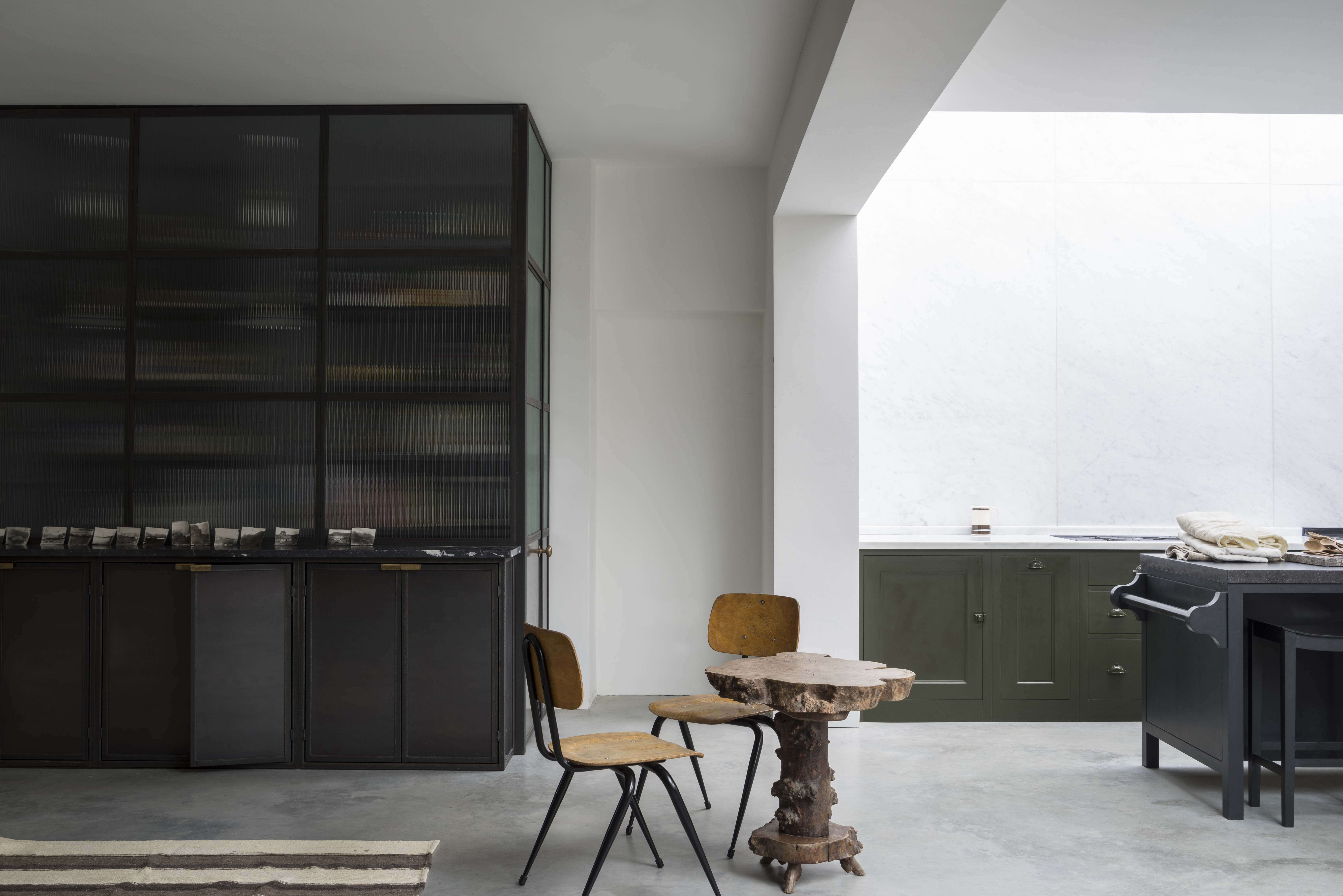
Some kitchens enter a room wearing sequins. This one prefers a beautifully cut wool coat.
Created for a Victorian house in North London, the Mapesbury Estate kitchen by Plain English is subtly splendid because it avoids the usual showroom theatrics. There is no desperate attempt to make every cabinet, faucet, and appliance compete for attention. Instead, the room relies on proportion, natural materials, rich color, disciplined storage, and a few beautifully judged contrasts.
The kitchen occupies a skylit, L-shaped addition at the back of the house. Steel-framed window walls and French doors connect it to the garden on three sides, while the original home lends the project a sense of age and architectural gravity. The result is neither a reproduction Victorian kitchen nor an aggressively contemporary extension. It sits comfortably between eras, which is much harder than simply choosing one and buying the matching knobs.
Plain English, led creatively by cofounder Katie Fontana, is known for cabinetry inspired by traditional English joinery but tailored to modern routines. Here, that approach produces a kitchen that appears to have evolved naturally with the houseeven though its layout, storage, appliances, and lighting were clearly planned with considerable precision.
The Architecture Does the First Half of the Decorating
A Garden-Facing L-Shaped Extension
The most important design feature is not a cabinet color or countertop material. It is the relationship between the kitchen and the garden.
The open kitchen and dining area occupies an L-shaped rear extension connected to a former reception room. Large steel-framed doors and windows bring in daylight, frame greenery, and give the kitchen a visual destination beyond the cabinets. This matters particularly because the cabinetry is painted in a deep, muted shade. Dark kitchens can feel intimate and sophisticated, but without adequate daylight they can also resemble an unusually well-organized cave.
Here, light arrives from the sides and from above. A rooflight runs over the main wall of cabinetry, washing the marble backsplash and work surfaces with daylight. The combination allows the designers to use a moody palette without making the room feel heavy.
Why Steel-Framed Windows Work So Well
The narrow profiles of the steel frames maximize the amount of glass while adding crisp black lines to the room. Those lines provide a modern counterpoint to the traditional paneled cabinets. They also echo the metal screens used in the larder, helping the new architectural elements feel related rather than randomly collected.
For homeowners borrowing this idea, the lesson is not necessarily to order steel doors tomorrow morning. The larger principle is to create contrast between solid cabinetry and visually light openings. Slim-framed windows, glazed doors, open sightlines, or even a carefully positioned interior window can prevent a cabinet-heavy kitchen from feeling boxed in.
A Cabinet Wall With Drama and Discipline
Traditional Cabinetry in an Untraditional Color
The principal cabinets use Plain English’s Spitalfields-style paneling and are painted in Army Camp, a subdued military green-brown. It is the kind of color that changes character throughout the day. In strong light it reads earthy and green; in shadow it becomes deeper, smokier, and almost charcoal.
This is a smart choice for a North London kitchen because the color has historic associations without looking theatrical. It complements brick, garden foliage, brass, stone, and black metal. It also gives the cabinetry enough visual weight to stand up to the broad expanse of marble.
The paint extends across small functional details, including the bin pulls. That consistency keeps the long cabinet run calm. When a kitchen already contains marble veining, brass fixtures, steel frames, multiple appliances, and an Aga flue with a personality of its own, restraint is not boring. Restraint is crowd control.
A Carrara Marble Wall That Reaches the Rooflight
Instead of stopping the backsplash a few inches above the counter, the designers carried Carrara marble from the worktop toward the rooflight. This creates a continuous vertical plane and makes the ceiling feel higher.
The marble also performs several visual jobs at once. Its pale surface reflects daylight into the room, its gray veining relates to the metal and dark paint, and its natural variation introduces movement without requiring a decorative pattern. Against the solid cabinetry, it feels luxurious but not fussy.
Natural marble does demand realistic expectations. Acidic ingredients such as lemon juice and vinegar can etch the surface, and spills should be cleaned promptly with a stone-safe product. For some homeowners, the marks that develop over time become part of the kitchen’s patina. Others may prefer a more stain-resistant stone or engineered surface. The correct choice depends on whether you view a faint ring near the cocktail station as character or a personal betrayal.
The Island: Modern Counterpoint and Family Workhorse
A Cleaner, More Contemporary Shape
The long central island comes from Plain English’s comparatively modern Osea vocabulary. Its simpler geometry prevents the kitchen from becoming overly traditional and establishes a clear axis through the extension.
Rather than matching the Carrara marble used along the cabinet wall, the island is topped with Belgian fossil stone, a type of limestone with subtle natural markings. The change in material gives the island its own identity while keeping the palette cohesive. It is an excellent example of how two stones can coexist without turning the room into a countertop sample showroom.
Washing Up With a Garden View
The island contains a prep sink positioned so the user faces the garden. This small decision transforms an ordinary task into a more pleasant experience. It also keeps the sink user connected to the dining area and the rest of the room rather than facing a wall.
The sink is paired with a traditional bridge-style faucet, reinforcing the dialogue between old and new. Storage cupboards occupy one side of the island, while less photogenic equipmentincluding a backup oven and dishwasheris arranged on the working side. From the main sightlines, the island appears composed and furniture-like. Behind the scenes, it is doing the culinary equivalent of three people carrying clipboards.
Recessed seating at one end allows the island to serve as a breakfast counter, homework station, or place for guests to talk to the cook while contributing absolutely nothing to dinner. A towel rail attached to the end demonstrates the value of planning for the smallest repeated actions. Convenient details often improve a kitchen more than another decorative shelf ever could.
What Makes the Layout Successful
The island works because it supports, rather than interrupts, circulation. The sink, dishwasher, ovens, and primary cabinetry are close enough for efficient movement, yet the island also guides people through the room. Good kitchen planning is less about obeying a perfect work triangle and more about protecting clear routes between preparation, cooking, cleanup, storage, and seating zones.
Anyone planning a similar island should test the design with appliance doors open. A beautiful aisle becomes much less charming when the dishwasher and oven stage a territorial dispute. Adequate landing space beside sinks, refrigerators, and cooking surfaces is equally important.
Old Aga, Modern Appliances, No Identity Crisis
The homeowners wanted to keep their beloved Aga, which becomes one of the room’s most characterful elements. Its distinctive flue rises in front of the marble wall and rooflight rather than being hidden in conventional cabinetry.
A Gaggenau gas cooktop or range sits nearby, while an electric backup oven is integrated into the island. This combination reflects how serious home cooks often operate: one appliance may provide tradition, constant warmth, and emotional attachment, while another offers precise contemporary performance.
The lesson is not that every kitchen needs several ovens. It is that appliances should reflect actual habits. A minimalist bank of integrated equipment may photograph beautifully, but it is not successful if the homeowner constantly wishes for a second oven, warming zone, or better ventilation.
Because combustion cooking and high-heat appliances produce moisture, grease, odors, and airborne particles, effective ventilation is essential. A properly sized range hood that vents outdoors is preferable to a decorative hood that mostly supervises the bacon. It should be used whenever cooking and left running briefly afterward.
The Walk-In Larder Solves an Awkward Architectural Problem
Turning Three Difficult Bays Into Useful Storage
The larder may be the cleverest part of the project. After a fireplace was removed, two brick piers divided the wall into three awkward bays. Instead of attempting to disguise each irregularity with separate cabinets, Fontana enclosed the entire area behind metal screens and obscured glass.
Two bays contain tiered fossil-stone pantry shelves, while the third accommodates the family’s large American-style refrigerator. This strategy converts a visually messy wall into a unified architectural feature. It also moves bulky food storage and refrigeration slightly away from the main cabinet run, allowing the visible kitchen to remain calmer.
Obscured glass is particularly useful. It introduces depth and brightness without requiring every cereal box to stand at attention. The screens also repeat the dark metal of the garden doors, tying the larder to the extension’s architecture.
A Small Bar With Big Social Value
A metal cupboard at the front of the larder is topped with a black-and-white marble shelf and used as a bar or cocktail staging area. Separating drinks from the primary cooking zone allows guests to refill glasses without wandering into the path of someone carrying a hot pan.
This is a practical planning idea for kitchens of many sizes. A beverage station might be a full cabinet, a shallow niche, or simply one end of a counter containing glasses, a coffee maker, and a small refrigerator. Keeping it outside the main prep route reduces traffic and makes entertaining feel less like directing aircraft on a crowded runway.
Lighting That Changes With the Day
Natural light is the star during daylight hours, but a successful kitchen also requires several layers of artificial illumination. General lighting makes the room navigable, task lighting protects fingers during chopping, and accent lighting adds warmth after dinner.
This kitchen’s rooflight and glass walls reduce the need for heavy overhead fixtures during the day. At night, smaller task-oriented lamps and carefully positioned fixtures create a more intimate atmosphere than a ceiling filled with equally bright recessed lights.
The approach is especially effective in an open kitchen and dining room. Bright, even illumination is useful while cooking, but nobody wants dessert under lighting that suggests a minor medical procedure. Dimmers, under-cabinet lighting, and separate switching zones allow the room to shift from workspace to gathering place.
How to Recreate the North London Kitchen Look
A full Victorian extension and custom English cabinetry may not fit every home or budget, but the design principles are highly adaptable.
Start With Architecture and Daily Routines
Plan the location of doors, windows, rooflights, appliances, and circulation routes before selecting finishes. Consider where groceries enter, where coffee is made, where dishes are unloaded, and where guests naturally gather.
Choose One Deep, Complex Cabinet Color
Look beyond basic black or navy. Muddy green, olive-brown, charcoal, and deep gray can feel softer and more historic. Test large samples in morning and evening light because undertones can change dramatically.
Balance Darkness With Reflective Surfaces
Use pale stone, glazed doors, light walls, or a generous backsplash to reflect daylight. Dark cabinetry feels richest when it is balanced, not when every surface joins the same gloomy secret society.
Mix Traditional and Modern Elements
Combine paneled cabinets with a streamlined island, traditional faucets with simple lighting, or vintage furniture with integrated appliances. The tension between periods gives the room personality.
Hide Bulk, Not Character
Large refrigerators, recycling bins, small appliances, and surplus pantry goods benefit from discreet storage. Useful objects with visual charmcopper pans, botanical prints, cutting boards, pottery, and a beloved old rangecan remain visible.
Design the Island From the Inside Out
Decide which activities the island must support before choosing its shape. Plan plumbing, power, seating, dish storage, towel placement, and appliance clearance early. A kitchen island should earn its square footage every day.
Why the Design Still Feels Timeless
The North London kitchen remains compelling because its strongest decisions are not based on fleeting trends. Natural stone, painted wood, brass, steel, glass, and thoughtful joinery have all aged well in homes for generations.
More importantly, the design responds to the building and the family. The Aga was preserved because it mattered to the owners. The sink faces the garden because that improves a daily task. The larder exists because an awkward wall needed a practical solution. The island combines food preparation, cleanup, storage, and seating because the household cooks and gathers there.
This is the real definition of understated luxury: not expensive materials scattered for applause, but a room in which architecture, craft, and routine support one another. Nothing appears desperate to be admired. Naturally, that makes the entire kitchen extremely admirable.
Experience Notes: What a Subtly Splendid Kitchen Feels Like to Use
Living with a kitchen inspired by this North London project would reveal qualities that photographs cannot fully capture. The first is how quickly natural light becomes part of the daily routine. Morning sun across pale stone makes the room feel awake before the coffee has completed its assigned duties. On gray afternoons, the rooflight still supplies softer overhead illumination, preventing deep cabinet colors from flattening into darkness.
A long island changes family behavior as well. People naturally gather around it, even when a perfectly respectable dining table is only a few steps away. One person prepares vegetables at the sink, another answers email at the recessed seat, and a child conducts an urgent investigation into whether cookies count as lunch. Because the island offers storage, seating, and cleanup functions, it becomes less a piece of cabinetry than the household’s operations desk.
The garden-facing sink is another decision whose value grows over time. Washing produce or rinsing dishes is more pleasant when the view includes greenery and changing weather. It also allows the person working at the sink to remain visually connected to anyone outdoors. That may sound minor during planning, but kitchens are experienced through thousands of repeated five-minute tasks. Improving one of those tasks can matter more than choosing an impressive decorative feature.
A walk-in larder also changes how the visible kitchen is maintained. Bulk food, large appliances, recycling supplies, serving pieces, and refrigerator clutter can be stored behind a single set of doors. The main room stays calmer without demanding monastic discipline from the household. Obscured glass offers a useful compromise: the larder feels connected and luminous, but nobody can judge the emergency stack of crackers from across the room.
Natural stone introduces a different kind of experience. It is cool to the touch, visually varied, and capable of developing marks as the kitchen is used. Homeowners who choose marble or limestone should decide in advance whether they can accept patina. A surface that must remain flawless can create low-level anxiety every time someone approaches with a lemon. A surface allowed to age becomes a record of meals, gatherings, and occasional cocktail enthusiasm.
Dark painted cabinets are similarly forgiving in some ways and demanding in others. They conceal certain stains better than white cabinetry but may reveal dust, fingerprints, or chips along frequently handled edges. A durable hand-painted finish can be touched up, and small signs of wear often enhance the furniture-like character. Regular cleaning with gentle products is more useful than treating the room like a museum exhibit.
Finally, the mixture of old and new keeps the space emotionally comfortable. The Aga provides history and familiarity; modern appliances provide control and convenience. Traditional cabinet doors offer warmth; steel glazing gives the extension clarity. The kitchen does not force the owners to choose between nostalgia and efficiency. It allows both to share the room, provided they do not argue over who left the oven on.
The broader experience is one of ease. Storage appears where it is needed, the garden is always present, social activity is separated from dangerous traffic, and the visual palette remains calm even when dinner preparation is not. That is why this North London kitchen feels splendid without showing off: its beauty is repeatedly confirmed by the way it works.