Some decorators whisper. Dorothy Draper entered the room with a marching band, a glossy black door, a cabbage-rose chintz sofa, and a ceiling that absolutely refused to be ignored. Long before “maximalist home decor” became a Pinterest rabbit hole and “dopamine decorating” became a social media phrase, Draper was already proving that colorful home decor could be elegant, energizing, and deeply personal.
Born in 1889, Dorothy Draper became one of America’s most influential interior decorators and helped turn decorating into a respected professional field. Her style was not shy. It was bold, theatrical, polished, and wonderfully confident. She used dramatic color schemes, oversized patterns, black-and-white contrast, glossy finishes, grand plasterwork, and floral prints that looked as if they had taken a vitamin and joined show business.
Her best-known projects, including The Greenbrier in West Virginia, the Hampshire House in New York, and hotel and restaurant interiors across the country, showed a simple but powerful belief: rooms should lift the spirit. Draper did not decorate as if a home were a museum where everyone must tiptoe. She decorated as if life were happening theredinner parties, muddy shoes, gossip, coffee, flowers, laughter, and the occasional lampshade that knows it is fabulous.
If your home has been living in a beige witness protection program, these Dorothy Draper-inspired colorful home decor tips may be exactly the invitation it needs.
Who Was Dorothy Draper, and Why Does Her Style Still Matter?
Dorothy Draper was a pioneer of American interior design, often associated with a style called Modern Baroque. That phrase sounds fancy, but the idea is surprisingly practical: take classical shapes, architectural details, and traditional decorating rules, then make them feel fresh with fearless color, scale, pattern, and personality.
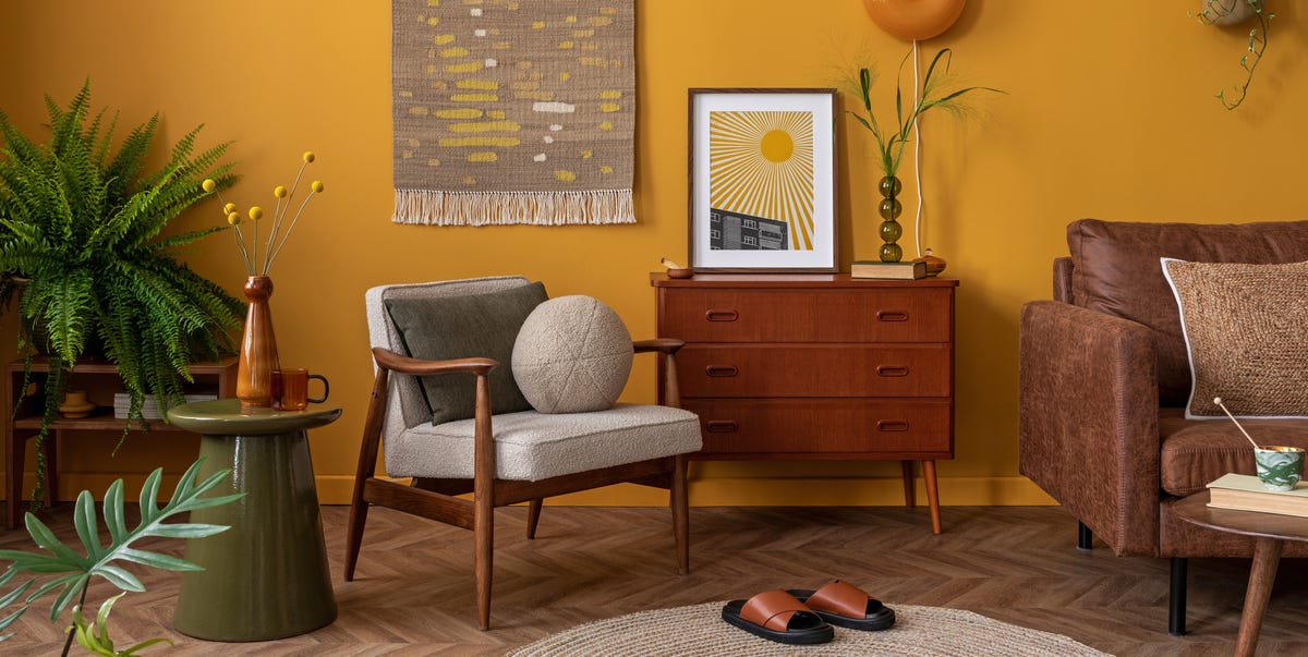
Instead of timid rooms filled with polite neutrals, Draper favored strong combinations: black and white with bright accents, red with green, coral with blue, shiny surfaces against soft textiles, and bold floral chintz beside crisp stripes. Her interiors were carefully balanced, but they were never dull. She believed color affected mood, and she treated decorating as something joyful rather than intimidating.
That is why her influence still feels current. Today’s homeowners want rooms that feel individual, expressive, and emotionally alive. Draper’s work gives us permission to stop asking, “Is this too much?” and start asking, “Does this make the room sing?”
1. Start with Courage Before You Start with Color
The first Dorothy Draper decorating lesson is not about paint, wallpaper, or fabric. It is about courage. Draper believed a successful room required confidence. Not reckless chaos, not a sofa shaped like a shrimp unless you truly mean it, but the nerve to choose what you love and let the room have a point of view.
Many people decorate cautiously because they are afraid of making a mistake. So they buy a gray sofa, beige rug, white curtains, and a coffee table that looks like it came with a rental agreement. Nothing is technically wrong, but nothing feels memorable either.
To decorate in a Dorothy Draper spirit, begin with one brave decision. Paint the powder room emerald green. Choose a coral lamp. Add a black-and-white checkerboard entry rug. Hang a floral wallpaper in the hallway. Use one bold move as the spark, then build the room around it.
Try This Draper-Inspired Move
Pick one “hero” element for each room. It could be a patterned chair, a lacquered console, a dramatic ceiling color, or a bright area rug. Let that element set the mood, then choose supporting colors and textures that make it look intentional.
2. Use Black and White as Your Decorating Seat Belt
One reason Draper’s colorful interiors worked so well is that she often anchored them with black and white. This combination creates structure. It gives the eye a place to rest, even when the room is full of flowers, stripes, shine, and high drama.
Black-and-white floors, striped walls, painted trim, lampshades, pillows, and framed art can all act as graphic punctuation. Think of black and white as the crisp tuxedo jacket that lets the colorful accessories party responsibly.
If you love bright color but fear your room will look messy, use black and white to sharpen the design. A black side table can make a pink sofa feel sophisticated. White walls with black trim can make green curtains look crisp. A checkerboard floor can make even the smallest entry feel glamorous.
Easy Ways to Add Black-and-White Contrast
- Use a black-and-white striped pillow with a floral sofa.
- Add black picture frames to colorful walls.
- Choose a checkerboard rug for an entry, kitchen, or bath.
- Paint interior doors glossy black for instant polish.
- Pair white lampshades with dark bases for clean contrast.
3. Mix Patterns Like They Were Invited to the Same Dinner Party
Dorothy Draper was famous for mixing patterns, especially florals and stripes. Today, that combination still feels fresh because it balances softness with order. Florals bring romance and movement. Stripes bring discipline and rhythm. Together, they are like the friend who tells great stories and the friend who remembers where the car is parked.
The key is scale. If one pattern is large and dramatic, let the other be smaller or more structured. A big cabbage-rose chintz chair can sit beautifully beside a narrow striped curtain. A botanical wallpaper can work with a geometric rug if the colors are connected.
Do not try to match everything perfectly. Draper’s style was coordinated, not cloned. A room becomes more interesting when patterns share a color family but do not look as if they came shrink-wrapped in the same showroom bundle.
A Simple Pattern-Mixing Formula
Use one large-scale pattern, one medium pattern, and one small pattern. For example: large floral wallpaper, medium striped curtains, and small dotted pillows. Repeat at least one color across all three to make the mix feel planned.
4. Treat the Ceiling as the Fifth Wall
One of the most useful colorful home decor tips inspired by Draper is to stop ignoring the ceiling. Many rooms have four decorated walls and one blank white rectangle overhead, silently wondering why it was not invited.
Draper understood that ceilings could add glamour, depth, and surprise. A ceiling does not always need to be loud, but it should be considered. In a dining room, a glossy ceiling can reflect candlelight. In a bedroom, a soft blue or pale pink ceiling can feel dreamy. In a powder room, wallpaper on the ceiling can make a small space feel jewel-box special.
If a bold ceiling feels scary, start with a gentle tint instead of stark white. Try pale aqua, blush, butter yellow, or a very soft green. The result can make the room feel finished without shouting from above like a theatrical aunt.
5. Let Nature Bring the Color Palette
Draper often drew from nature, especially flowers, leaves, gardens, and tropical motifs. Her famous use of bold florals and leafy patterns showed that nature is not always neutral and quiet. Nature can be hot pink, palm green, coral, sky blue, cherry red, and sunny yellowbasically a paint deck with better lighting.
For a modern home, this means you can build a color palette from something organic. Look at a bouquet, a landscape, a favorite houseplant, or even a bowl of citrus. A room inspired by hydrangeas might combine blue, lavender, green, and white. A room inspired by a peony could use blush, raspberry, cream, and deep leaf green.
Botanical prints, floral upholstery, leafy wallpaper, and fresh flowers are all natural allies of the Dorothy Draper look. The trick is to keep the scale confident. Tiny scattered flowers can feel timid, while a larger floral print can look intentional and chic.
6. Use Color to Create Mood, Not Just Decoration
Color is not only visual. It changes how a room feels. Draper understood this deeply. A red dining room can feel lively and social. A green entry can feel fresh and welcoming. A yellow breakfast nook can make mornings seem slightly less rude. A glossy black ceiling can make a bar or library feel dramatic and intimate.
Before choosing a color, ask what you want the room to do emotionally. Should it energize, soothe, impress, comfort, or entertain? A family room may need warm, friendly colors. A home office may need crisp contrast and a color that keeps you awake without making you feel like you are trapped inside a highlighter.
Once you know the mood, the palette becomes easier. Draper’s rooms were bold, but they were not random. Each color had a job.
7. Add One Conversation Piece
A Draper-inspired room should have at least one item that makes guests pause and say, “Wait, tell me about that.” It could be a sculptural lamp, a vintage mirror, a giant floral chair, a painted screen, an unexpected wall color, or a leopard-print stool minding its own glamorous business.
This does not mean filling the house with novelty objects. A conversation piece works best when the rest of the room supports it. Think of it as the lead singer, not the entire band. One bold item can give the space charm and confidence.
Modern colorful interior design often becomes more memorable when it includes a little wit. Draper’s work had elegance, but it also had humor and theatrical timing. A room should not feel as if it was assembled by a committee that banned fun in 1978.
8. Make Accessories Smart, Not Scattered
Draper believed accessories mattered. Lamps, mirrors, flowers, trays, books, and art are not afterthoughts; they are the jewelry of a room. But jewelry works best when you do not wear every necklace you own to buy lettuce.
Choose accessories that reinforce the room’s color story. If your palette is green, coral, black, and white, repeat those tones in small places: a vase, a pillow edge, a painting, a lampshade trim. Repetition makes bold color feel intentional.
Scale also matters. Draper was not afraid of oversized details, and modern rooms can benefit from that lesson. A large mirror often looks better than three tiny ones. A pair of tall lamps can bring balance to a console. A generous floral arrangement can make a dining table feel alive.
9. Refresh Old Furniture Instead of Replacing Everything
One of Draper’s most practical lessons is that decorating does not require throwing away everything you own. She encouraged fresh thinking, which can include repainting, slipcovering, reupholstering, and rearranging.
An old chair can become the star of a room with bold floral fabric. A tired wood dresser can look sharp in glossy black, lacquer red, or deep green. A plain lampshade can become custom with trim. A basic sofa can get a new personality with bright pillows and a patterned throw.
This approach is especially useful for homeowners who want colorful decor on a budget. Start with what you have. Draper’s glamour was dramatic, but many of her ideas translate beautifully into affordable updates.
10. Balance Drama with Comfort
Dorothy Draper loved drama, but she did not believe rooms should be uncomfortable. A colorful home still needs good seating, proper lighting, practical surfaces, and a layout that works. A room can be glamorous and still allow someone to sit down without performing advanced gymnastics.
Comfort is what keeps bold design from feeling like a stage set. Use soft upholstery, layered lighting, cozy rugs, and tables within reach. If you use a daring wallpaper, balance it with chairs people actually want to sit in. If the palette is energetic, include textures that feel warm and welcoming.
The best Draper-inspired interiors are not merely “look at me” rooms. They are “come in, sit down, have a drink, and please admire the wallpaper” rooms.
11. Bring Dorothy Draper Style into Different Rooms
Living Room
Try a bold floral chair, striped pillows, a glossy black coffee table, and a strong accent wall. Keep the sofa comfortable and use black-and-white details to organize the color.
Dining Room
Paint the walls a rich color such as emerald, coral, navy, or lacquer red. Add a large mirror, dramatic chandelier, patterned curtains, and crisp white tableware. Dining rooms can handle more drama because they are meant for gathering.
Bedroom
Use color more softly but still confidently. A blue ceiling, floral headboard, painted bedside tables, and patterned lampshades can create a room that feels personal without becoming visually noisy.
Powder Room
This is the perfect place to be bold. Try tropical wallpaper, a bright vanity, a black mirror, or a ceiling color. Small rooms often become more exciting when you stop trying to make them disappear.
Entryway
An entry sets the tone for the whole home. A checkerboard floor, bright door, patterned runner, or oversized mirror can create instant Draper-style welcome.
12. Avoid the Most Common Colorful Decor Mistakes
Colorful decorating works best when it has rhythm. The biggest mistake is using many unrelated colors with no repetition. A red pillow, purple rug, orange chair, blue wall, and green lamp can work only if there is a larger plan. Otherwise, the room may feel like a crayon box had a stressful afternoon.
Another mistake is choosing patterns that are all the same size. When every print competes equally, the eye gets tired. Mix large, medium, and small designs. Give one pattern the starring role.
Finally, do not forget lighting. Bold colors change dramatically depending on the light. Test paint samples in morning, afternoon, and evening before committing. Draper loved drama, but even drama deserves good bulbs.
Experience Notes: Living with Dorothy Draper-Inspired Color
In real homes, the Dorothy Draper approach works best when it begins with curiosity rather than perfection. The first experience many people have with bold decorating is fear. A paint chip looks charming in the store, but on the wall it suddenly seems to have joined a parade. That is normal. Color feels louder before the room is complete. Once curtains, art, lamps, rugs, and furniture arrive, the color usually settles into the story.
A helpful experience is to start with a smaller space. A powder room, hallway, laundry room, or reading corner can become a testing ground for colorful interior design. These spaces do not require a huge investment, and they give you a daily burst of personality. A green powder room with a brass mirror and botanical wallpaper can make even handwashing feel like a boutique hotel moment. A striped hallway runner can turn a plain passage into a cheerful transition.
Another lesson from living with Draper-inspired decor is that color becomes easier when you repeat it. A coral pillow may look random by itself. Add coral in a piece of art, a lampshade trim, and a small vase, and suddenly it looks smart. Repetition is the quiet magic behind bold rooms. It tells the eye, “Relax, this was on purpose.”
Pattern mixing also feels less intimidating in practice when you keep one color consistent. A floral curtain, striped chair, and geometric pillow can live together happily if they share green, blue, or pink. The patterns do not need to match. They need to speak the same language. Think of them as guests at dinner: different personalities, one shared table.
Furniture makeovers are another satisfying way to experiment. Painting a tired side table glossy black can make it look expensive. Reupholstering a chair in a cheerful floral can rescue it from retirement. Adding trim to curtains or lampshades gives a custom feel without redesigning the whole room. These changes create the Draper effect without requiring a Greenbrier-sized budget, which is good news for anyone whose wallet prefers a quieter lifestyle.
The most surprising experience is emotional. A colorful room can change how you use your home. A bright breakfast nook may encourage slower mornings. A dramatic dining room may make weeknight pasta feel like an occasion. A lively entryway can make coming home feel more joyful. Draper’s legacy is not just about decoration; it is about atmosphere. Her rooms remind us that home does not have to be timid to be tasteful.
The best advice is to edit after you experiment, not before. Try the bold pillow. Paint the ceiling. Bring home the floral fabric. Then step back and adjust. Maybe one color needs repeating. Maybe one accessory needs to leave the party early. Decorating is a conversation between the room and the person living in it. Dorothy Draper’s greatest tip may be this: trust your eye, keep your sense of humor, and never let beige make all the decisions.
Conclusion
Dorothy Draper’s colorful home decor tips remain powerful because they are not only about making rooms look beautiful. They are about making rooms feel alive. Her fearless use of color, pattern mixing, black-and-white contrast, botanical motifs, statement ceilings, and smart accessories created interiors that were glamorous without being lifeless.
To bring her spirit into your own home, start with courage. Choose one bold idea, repeat colors thoughtfully, balance drama with comfort, and let your rooms show personality. You do not need a hotel lobby, a grand staircase, or a decorator’s budget. You need a little nerve, a good lamp, and perhaps one floral print that refuses to apologize.
Note: This article is based on real Dorothy Draper design history, including her known use of Modern Baroque style, bold color schemes, cabbage-rose chintz, black-and-white contrast, dramatic hotel interiors, and her lasting influence on American decorating.