If you have ever looked at a multiplication chart and thought, “This would be a lot more exciting if it lived inside a spreadsheet,” congratulations: you are exactly the kind of person Excel was born to impress. The good news is that creating a times table in Excel is not complicated, and once you build it, you can turn it into a colorful, reusable memorization tool that feels much smarter than a plain worksheet.
Whether you are a parent helping a child study, a teacher building a quick classroom resource, or a student trying to make multiplication facts stick without staring at a paper chart until your soul leaves your body, Excel can help. It lets you generate the full table with one formula, copy it in seconds, format it clearly, and even turn it into a practice sheet.
In this guide, you will learn how to create a times table to memorize in Excel in 6 simple steps. Along the way, you will also pick up a few tricks to make the chart easier to read, easier to practice with, and much more useful than a static block of numbers.
Why Excel Is Surprisingly Good for Learning Times Tables
A multiplication chart is visual by nature. You can see rows, columns, repeated patterns, and square numbers all in one place. That matters because memorizing times tables is not just about drilling facts until your brain waves a tiny white flag. Strong multiplication fluency usually improves when learners can connect facts to patterns, repeated practice, and meaningful structure.
Excel is perfect for that. It can automatically generate number sequences, repeat formulas accurately, and apply formatting that helps key number families stand out. In plain English, Excel does the boring setup so the learner can focus on the useful part: noticing patterns and remembering them.
And yes, it also gives you the deeply satisfying feeling of watching a whole table fill itself in like magic. Spreadsheet magic is still magic.
What You Need Before You Start
You only need a basic version of Microsoft Excel to build a classic multiplication chart. Excel 2016 and later work well for the standard method. If you have Microsoft 365 or Excel 2024, you can also use newer functions like SEQUENCE or MAKEARRAY for a faster bonus version, but that is optional.
For the main tutorial below, all you need is a blank worksheet and about five minutes of focus.
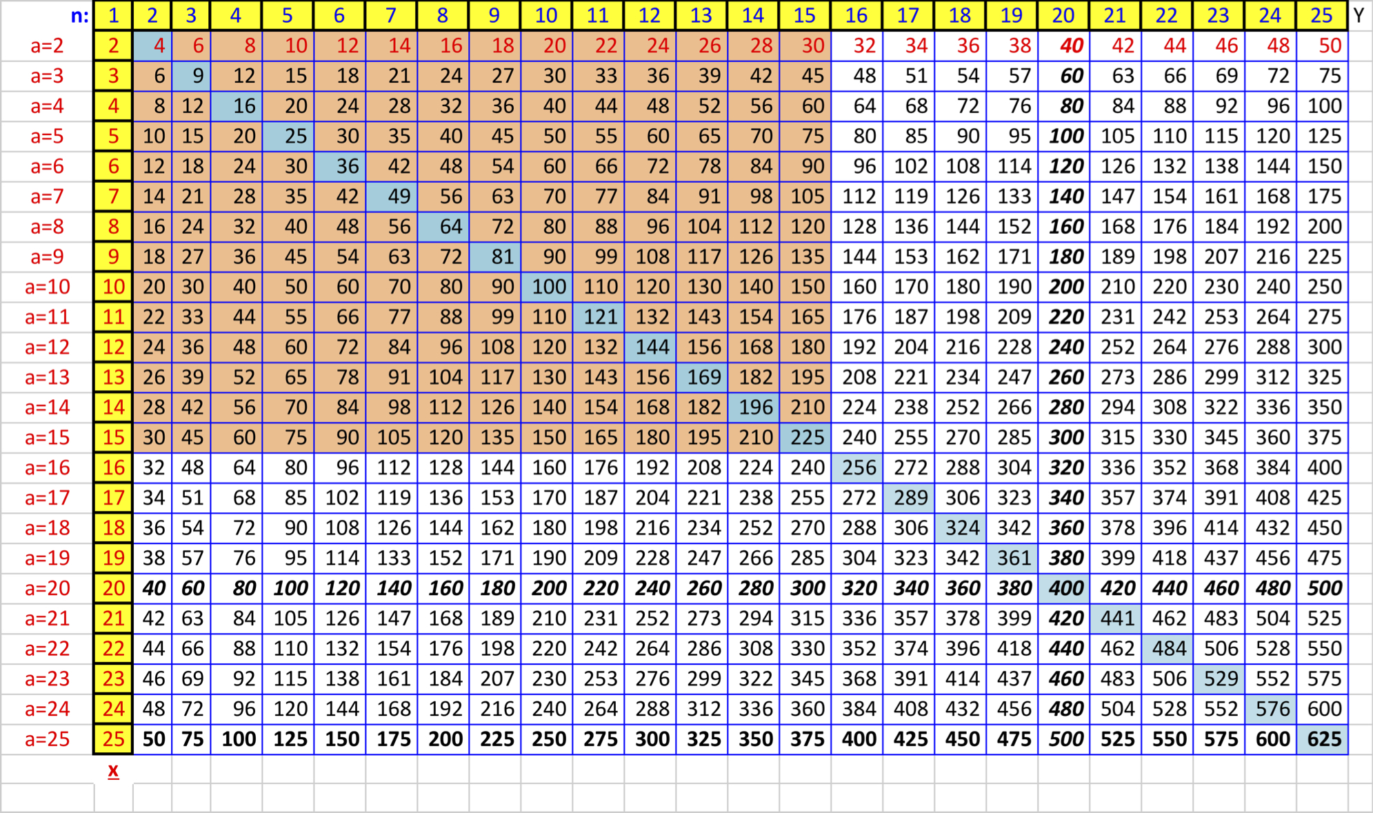
Step 1: Enter the Numbers for Your Header Row and First Column
Open a blank worksheet in Excel. Leave cell A1 empty. This blank corner cell acts like the tiny neutral zone between your top row and left column.
Now type the numbers you want to multiply.
- In cells
A2throughA13, enter the numbers 1 through 12. - In cells
B1throughM1, enter the numbers 1 through 12 again.
This setup creates the framework for a standard 12-by-12 times table. If you only want a 10-by-10 chart, stop at 10. If you want to go full overachiever and build up to 15 or 20, Excel will not complain.
A quick tip: you do not have to type every number one by one if you do not want to. Type 1 and 2 in the first two cells of a row or column, select both, and drag the fill handle to continue the series. Excel recognizes the pattern and fills in the rest. It is like having a very obedient assistant who only speaks in numbers.
Step 2: Type the Formula That Builds the Table
Click cell B2. This is where the first multiplication answer will go.
Type this formula:
=$A2*B$1
Press Enter.
If everything is set up correctly, cell B2 should show 1, because it multiplies the value in A2 by the value in B1.
Now, let’s decode the formula so it does not look like Excel sneezed punctuation all over your worksheet:
$A2locks column A, so when the formula moves across, it always looks back to the row header on the left.B$1locks row 1, so when the formula moves down, it always looks up to the column header at the top.- The asterisk
*is Excel’s multiplication symbol.
Those dollar signs are the secret sauce. Without them, the references shift in the wrong way, and your multiplication chart turns into a math-themed mystery novel.
Step 3: Fill the Entire Grid
Once cell B2 contains the formula, you do not need to type it again and again like a spreadsheet monk copying sacred text.
Select cell B2. Move your cursor to the small square in the bottom-right corner of the cell. That square is called the fill handle. Drag it across to M2, then drag the filled row down to M13.
Just like that, Excel calculates the full times table.
You now have a complete multiplication chart built from one formula. Every cell in the grid automatically matches the header row and header column values.
This is one of the best parts of using Excel for memorization practice: accuracy. Once the formula is correct, the rest of the chart is generated consistently, which means fewer human errors and fewer “why does 7 times 8 suddenly equal 65?” moments.
Step 4: Format the Table So It Is Easy to Read and Memorize
A times table should be visually clean. If the grid looks messy, the learner spends mental energy decoding the sheet instead of noticing multiplication patterns.
Here are a few easy formatting improvements:
Center Everything
Select the table and center the text horizontally and vertically. This makes the chart feel balanced and easier to scan.
Bold the Headers
Make the top row and left column bold. Those numbers are your factors, so they should stand out from the answers.
Add Borders
Apply all borders to the grid. A clear border around each cell makes the table easier for kids and visual learners to follow.
Increase Cell Size
Wider columns and taller rows make the chart feel less cramped. Think “friendly math poster,” not “tiny accounting emergency.”
Use a Larger Font
If the chart is meant for memorization, readability matters more than fitting it into the smallest possible corner of the worksheet.
At this point, your Excel times table already works. But if you want to turn it into a real memorization tool instead of just a pretty grid, keep going.
Step 5: Use Color and Conditional Formatting to Reveal Patterns
Multiplication becomes easier to remember when learners see patterns instead of random answers. Excel’s formatting tools help make those patterns visible.
You can manually color certain rows and columns, or use conditional formatting for a more polished effect.
Highlight Easy Families First
Start with multiplication facts that are usually easier to learn:
- 2s for doubles
- 5s for skip-counting
- 10s for place-value patterns
- 11s for repeated digits in early facts
Color-coding these families helps learners build confidence before tackling the trickier facts like 6s, 7s, and 8s.
Mark the Diagonal
The diagonal from 1×1 to 12×12 shows square numbers. Highlighting that diagonal helps learners notice that 3×3, 4×4, and 5×5 belong to a recognizable pattern.
Spot Mirror Facts
Because multiplication is commutative, 3×4 and 4×3 have the same answer. That means the table mirrors itself across the diagonal. Once learners see that, they realize they do not need to memorize every fact as if it lives on a separate planet.
In real-life studying, this matters a lot. If a child already knows 4×6, they also know 6×4. That is two facts for the mental price of one.
Step 6: Turn the Chart Into a Practice Sheet for Memorization
Looking at a times table is helpful. Using it actively is better.
Once your chart is built, create a second version for practice. Here are a few easy ways to do that:
Method 1: Hide Some Answers
Copy the table to another sheet and delete selected answers. Leave the headers in place so the learner can fill in the missing products.
Method 2: Practice by Number Family
Focus on one row or one column at a time. For example, practice all the 6 facts across one session, then move to 7s the next day.
Method 3: Use Color as a Self-Check
Let the learner type answers into blank cells and compare them with the master chart. Correct answers can be highlighted in green manually or with simple formulas if you want to get fancy.
Method 4: Print the Sheet
Yes, Excel can still leave the screen. Print the formatted chart and use it for quick daily review. This works especially well if the same layout is used over and over, because familiarity helps memorization.
The goal is not just to create a chart but to create a routine. A good times table in Excel becomes more powerful when it is used in short, repeated sessions rather than one heroic cram session fueled by frustration and crackers.
Common Mistakes to Avoid
Even a simple Excel times table can go sideways if one small detail is off. Here are the most common issues:
Using the Wrong Formula
If you type =A2*B1 without dollar signs, Excel will shift both references as you copy the formula. The result is a chart full of incorrect products.
Typing Headers as Text by Accident
If Excel treats your row or column numbers as text instead of numeric values, formulas may not behave as expected. Re-enter the values as plain numbers.
Dragging the Fill Handle Incorrectly
Be sure you fill across and down from the formula cell. One missed column can make it look like Excel has declared independence from mathematics.
Overdesigning the Sheet
Too many colors, fonts, and effects can make the chart harder to use. Keep the design clean and focused on readability.
A Faster Bonus Method for Newer Versions of Excel
If you use Microsoft 365 or a newer version of Excel that supports dynamic arrays, you can generate number sequences faster and experiment with advanced formulas.
For example, SEQUENCE can create your row and column headers automatically. And if your Excel version supports MAKEARRAY, you can generate an entire multiplication grid with a single formula.
That said, the classic method using headers plus =$A2*B$1 is still the best option for most learners, because it makes the structure of multiplication visible. In other words, it teaches the “why,” not just the finished grid.
Why This Method Helps With Memorization
A good multiplication chart does more than display answers. It helps learners notice relationships.
They can see skip-counting patterns in the 2s, 5s, and 10s. They can see square numbers along the diagonal. They can see that facts repeat in mirrored positions. They can also study one number family at a time without losing the bigger picture.
That combination of structure and repetition is exactly why this works so well in Excel. The spreadsheet acts like a clear, customizable practice board. It is part reference sheet, part quiz generator, and part silent math coach that never gets tired.
And unlike a store-bought worksheet, you can adapt it whenever you need. Make it larger. Make it smaller. Hide answers. Highlight problem facts. Add a reward tracker. Add a “facts I nailed today” section. Excel is flexible enough to grow with the learner.
Conclusion
Creating a times table to memorize in Excel is one of those rare tasks that is both easy and genuinely useful. With a simple setup, one smart formula, and a bit of formatting, you can build a multiplication chart that is accurate, attractive, and ready for repeated practice.
The six-step process is simple: enter your headers, add the formula, fill the grid, format it clearly, highlight patterns, and turn the finished table into a practice tool. That is it. No expensive software, no complicated setup, and no reason to hand-draw a multiplication chart like it is 1897.
If the goal is memorization, the real magic is not the spreadsheet itself. It is what the spreadsheet makes possible: short study sessions, visual pattern recognition, confidence-building review, and a cleaner path toward multiplication fluency.
So go ahead and build the chart. Excel is ready. The fill handle is ready. Your times tables are about to become much less intimidating.
Experience-Based Tips: What It Is Actually Like to Use an Excel Times Table for Memorization
Here is something people do not always expect: building the chart is the easy part, but using it regularly is where the real payoff happens. In practice, an Excel times table works best when it becomes part of a simple routine rather than a one-time project. Many learners do well with five to ten minutes a day, especially when the same chart is used consistently. That familiarity matters. Once the layout stops feeling new, the brain can focus on the multiplication facts instead of the worksheet itself.
One common experience is that learners feel less overwhelmed when the full chart is visible. A page of isolated multiplication problems can feel like a trap. A chart feels different. It shows that the facts belong to a system. Students can trace across rows, down columns, and notice that certain answers repeat. Suddenly multiplication looks less like random trivia and more like a pattern they can understand.
Another real benefit is confidence. When students work with a color-coded chart, they often start with the easy wins: 2s, 5s, and 10s. That quick success builds momentum. Then they move into 3s, 4s, and 6s. By the time they reach the tougher 7s, 8s, and 12s, they already trust the process. That emotional piece matters more than many adults realize. Memorization goes better when the learner does not feel doomed from the start.
Parents and teachers also tend to appreciate how flexible Excel is. If a child struggles with one number family, it is easy to create a custom practice sheet focused only on that row or column. If the learner gets distracted by too much information, a second sheet with partial blanks can narrow the task. If a student enjoys checking their own work, the master chart can stay on one tab while the quiz version sits on another. It feels organized, and organization lowers friction.
There is also a practical advantage that shows up over time: accuracy. Handmade multiplication charts are charming, but one copied number in the wrong place can create confusion fast. Excel removes that problem once the base formula is correct. That means adults can spend less time double-checking products and more time actually helping the learner practice. This is especially useful in busy homes and classrooms where nobody wants to reinvent the chart every week.
Perhaps the most interesting experience is how often learners begin noticing patterns on their own. They spot that rows mirror columns. They realize the 9s have recognizable digit patterns. They see that square numbers line up neatly. Those moments are valuable because memorization sticks better when it is connected to understanding. Instead of forcing every fact into memory by brute repetition, the learner starts building shortcuts and reasoning strategies.
So yes, an Excel times table is a spreadsheet. But in real use, it often becomes something bigger: a calm visual guide, a repeatable practice system, and a surprisingly effective confidence booster. Not bad for a tool most people associate with budgets, business reports, and the occasional existential crisis over formulas.