Justifying text in Photoshop sounds like one of those tiny design tasks that should take three seconds. Then Photoshop politely says, “Absolutely not,” and grays out the button like a bouncer outside an exclusive typography club. The good news? The fix is usually simple: Photoshop can justify paragraph text, not regular point text. Once you understand that difference, the whole process becomes much less mysterious.
This guide walks you through how to justify text in Photoshop in 15 clear steps, including how to create a text box, use the Paragraph panel, choose the right justification style, fix weird spacing, and make your type look clean instead of stretched like warm mozzarella. Whether you are designing a poster, flyer, social media graphic, website mockup, product label, or a quote image for your coffee-fueled brand account, justified text can help create a neat, professional text block when used correctly.
What Does “Justify Text” Mean in Photoshop?
Justified text is text that aligns evenly along both the left and right edges of a paragraph box. Instead of having a ragged right edge like normal left-aligned text, Photoshop adjusts spacing between words, letters, and glyphs so each line fills the width of the text box.
In Photoshop, this is controlled through the Paragraph panel. You can choose options such as Justify Last Left, Justify Last Centered, Justify Last Right, or Justify All. The difference mostly comes down to what Photoshop does with the last line of the paragraph.
For most designs, Justify Last Left is the safest and most natural-looking option. Justify All forces even the final line to stretch across the box, which can look dramatic, editorial, orif the last line has only two wordslike your text got scared and ran to opposite sides of the room.
Before You Start: Point Text vs. Paragraph Text
The most important thing to know is this: justification only works properly with paragraph text. If you click once with the Type Tool and start typing, you create point text. Point text is great for short headlines, labels, logos, and single lines. But it does not behave like a paragraph box.
To justify text, you need paragraph text. Paragraph text is created when you click and drag with the Type Tool to draw a text box. The words then flow inside that box, giving Photoshop actual left and right boundaries to align against.
How to Justify Text in Photoshop: 15 Steps
Step 1: Open Your Photoshop Document
Start by opening the Photoshop file where you want to add or edit text. You can work on a blank canvas, a poster design, a social media template, a flyer, a photo, or any document that needs a clean block of text. If you are practicing, create a new document with a simple white background so you can focus on the typography.
Step 2: Select the Type Tool
Choose the Horizontal Type Tool from the toolbar. You can also press T on your keyboard. If you need vertical text, you can use the Vertical Type Tool, but most justified text layouts use horizontal type.
Step 3: Create a Paragraph Text Box
Instead of clicking once, click and drag on the canvas to create a rectangular text box. This is the magic move. The box gives Photoshop a defined width, which allows the program to distribute the text evenly from edge to edge.
Think of the text box like a parking lot. Without painted lines, words park wherever they want. With a box, Photoshop knows where each line should begin and end.
Step 4: Type or Paste Your Text
Enter your paragraph text inside the box. You can type directly or paste text from another source. If you are pasting from a word processor, check for extra spaces, strange line breaks, or formatting that may have tagged along like an uninvited guest at a design meeting.
Step 5: Select the Text Layer
Go to the Layers panel and click the text layer you want to justify. If you want the justification to affect the entire text layer, selecting the layer is enough. If you only want to justify certain paragraphs, highlight only those paragraphs with the Type Tool.
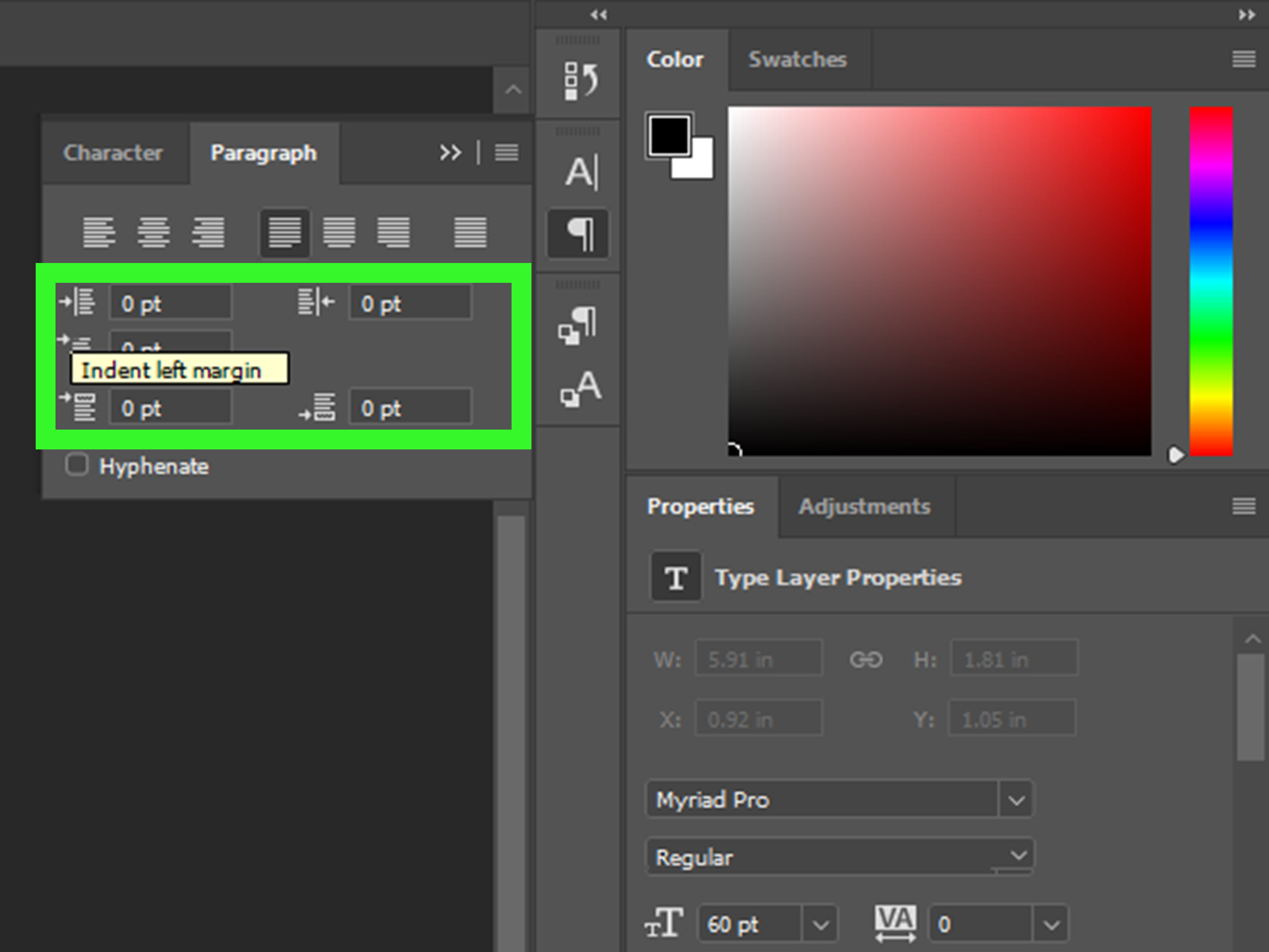
Step 6: Open the Paragraph Panel
Go to Window > Paragraph. This opens the Paragraph panel, where Photoshop keeps its alignment and justification controls. If you only see the Character panel, look for the Paragraph tab in the same panel group.
Step 7: Find the Justification Icons
At the top of the Paragraph panel, you will see alignment icons and justification icons. The regular alignment choices are left, center, and right. The justification choices usually appear as four icons: Justify Last Left, Justify Last Centered, Justify Last Right, and Justify All.
Step 8: Choose “Justify Last Left” for Natural Results
Click Justify Last Left if you want the paragraph to align evenly on both sides while keeping the final line left-aligned. This is commonly the best choice for readable body text because it prevents the last line from stretching awkwardly.
Step 9: Use “Justify All” Only When It Fits the Design
Choose Justify All if you want every line, including the last line, to fill the entire width of the text box. This can work for bold editorial layouts, modern posters, and experimental designs. However, use it carefully. A short last line may create huge spaces between words, and suddenly your elegant layout looks like it is practicing social distancing.
Step 10: Resize the Text Box if the Spacing Looks Strange
If your justified text has large gaps, do not panic. The text box may simply be too narrow or the font size may be too large. Use the bounding box handles to make the paragraph box wider, or reduce the font size slightly. Small changes can make a big difference.
Step 11: Adjust Font Size, Leading, and Tracking
Open the Character panel by going to Window > Character. Here you can adjust font size, leading, tracking, and other character settings. Leading controls the space between lines, while tracking controls the overall spacing between letters. For justified text, avoid extreme tracking unless you are creating a stylized graphic.
Step 12: Turn Hyphenation On or Off
In the Paragraph panel, you may see a Hyphenate option. Hyphenation allows Photoshop to split longer words at the end of lines, which can reduce ugly gaps in justified text. For narrow columns, hyphenation can help. For polished marketing graphics or short copy, you may prefer to turn it off and manually adjust the text.
Step 13: Edit the Copy for Better Line Breaks
Sometimes the cleanest fix is not hidden in a menu. It is in the writing. If one line looks awkward, revise the sentence, remove a filler word, or add a shorter synonym. Designers do this all the time. Typography is not just softwareit is also word choreography.
Step 14: Check the Text at Actual Size
Zoom out and view the design at the size your audience will see it. A paragraph that looks strange at 300% zoom may look fine on a phone screen. On the other hand, spacing that looks “kind of okay” while zoomed out may reveal giant white rivers when printed. Check both close-up and actual-size views.
Step 15: Commit the Text and Save Your File
When you are satisfied, click the checkmark in the options bar or press Ctrl + Enter on Windows or Command + Return on Mac to commit the text. Save your editable Photoshop file as a PSD, and export a copy in the format you need, such as JPG, PNG, PDF, or WebP.
Why Is the Justify Option Grayed Out in Photoshop?
If the justify buttons are unavailable, the most common reason is that your text is point text instead of paragraph text. To fix it, select the text layer, then go to Type > Convert to Paragraph Text. After conversion, open the Paragraph panel again and check the justification options.
Another reason may be that you have not selected the correct text layer. Make sure the text layer is active in the Layers panel. If you are editing only part of the text, highlight the paragraph you want to affect.
Best Practices for Justified Text in Photoshop
Use Justification for Short Blocks, Not Novels
Photoshop is excellent for image-based design, but it is not a full page-layout program. For long documents, magazines, books, or multi-page brochures, Adobe InDesign is usually a better choice. Photoshop is best for shorter text blocks, posters, banners, web graphics, and image-heavy layouts.
Avoid Narrow Text Boxes
Narrow columns make justified text harder to control because Photoshop has fewer words per line to distribute spacing. If the box is too narrow, the program may create obvious gaps. A wider text box gives the paragraph more room to breathe.
Choose Readable Fonts
Justified text works best with fonts that have clear letterforms and balanced spacing. Serif fonts can look elegant in editorial layouts, while clean sans-serif fonts often work well for digital graphics. Avoid overly decorative fonts for long justified paragraphs unless your goal is to make readers squint dramatically.
Watch for Rivers
“Rivers” are vertical streams of white space that appear when gaps between words line up across multiple lines. They can distract the eye and reduce readability. If you notice rivers, try adjusting the text box width, font size, hyphenation, or wording.
Do Not Overuse Justify All
Justify All can be visually powerful, but it is rarely ideal for normal paragraphs. It often stretches the final line too much. Use it when you intentionally want a strong rectangular text shape, not just because it looks tidy at first glance.
Specific Example: Justifying Text for a Poster
Imagine you are creating a coffee shop poster with the headline “Fresh Beans, Better Mornings” and a short paragraph below it. The headline can remain point text because it is only one line. The paragraph, however, should be paragraph text.
You would drag a text box under the headline, paste the description, open the Paragraph panel, and choose Justify Last Left. If the spacing looks too wide, you could slightly widen the box or reduce the font size from 18 px to 16 px. If one long word causes a gap, you might rewrite the sentence. The final result feels structured, calm, and professionallike the design had its coffee before the client meeting.
Specific Example: Justifying Text for a Website Mockup
For a website mockup, justified text can create a clean block in a hero section or feature card. However, because digital screens vary in size, left-aligned text is often easier to read. If you use justified text in a Photoshop web design mockup, test how it looks at different widths. A paragraph that looks perfect on a desktop layout may look cramped on a mobile version.
Common Mistakes When Justifying Text in Photoshop
Mistake 1: Clicking Instead of Dragging
Clicking once creates point text. Dragging creates paragraph text. If you remember only one thing from this guide, make it this: drag the text box first.
Mistake 2: Using Too Few Words
Justification needs enough words to distribute spacing naturally. If your paragraph has only one short line, there is not much to justify. Use alignment instead.
Mistake 3: Ignoring the Last Line
The last line determines whether your paragraph looks polished or odd. If the last line is short, use Justify Last Left rather than Justify All.
Mistake 4: Forgetting to Proofread
Designers sometimes focus so much on spacing that they miss typos. Always proofread after formatting. Beautifully justified misspellings are still misspellings, just wearing nicer shoes.
Advanced Tips for Cleaner Justified Text
Once you know the basic steps, you can improve your justified text with a few advanced adjustments. First, experiment with the width of the text box before changing the font. The shape of the box often matters more than people expect. Second, try modest leading adjustments to keep the paragraph readable. Third, use manual line breaks sparingly. Too many forced line breaks can make text harder to edit later.
You can also use paragraph spacing to separate blocks of text instead of pressing Enter multiple times. Clean paragraph spacing keeps your layout easier to manage and gives your design a more professional rhythm.
When Should You Justify Text in Photoshop?
Justified text is useful when you want a formal, editorial, or structured appearance. It works well in posters, invitations, product cards, quote graphics, magazine-style layouts, menus, brochures, and premium brand visuals. It can make a design feel more organized and balanced.
However, it is not always the best choice. For long reading experiences, left-aligned text often feels more natural. For mobile graphics, short captions, and casual social posts, left alignment may be cleaner and easier to scan. Good typography is not about using the fanciest option; it is about choosing the option that serves the reader.
Experience-Based Notes: What Actually Works in Real Photoshop Projects
In real design work, justifying text in Photoshop is less about clicking one button and more about making small, smart adjustments until the paragraph feels balanced. The first lesson is that the text box matters more than beginners expect. If the paragraph looks awkward, many people immediately change the font, tracking, or alignment. But often, the fastest fix is simply making the text box a little wider or narrower. A few pixels can completely change where words break and how evenly Photoshop distributes space.
Another practical lesson is to avoid treating justified text like a universal upgrade. It can look beautiful in the right context, especially on posters, editorial graphics, and luxury-style layouts. But when it is forced into a narrow box or paired with short sentences, it may create distracting gaps. The design may look “technically aligned” but visually uncomfortable. That is the sneaky thing about typography: the software can be correct while the design still feels wrong.
When working with client graphics, I usually test three versions: left-aligned, justified last left, and fully justified. Seeing the options side by side makes the decision much easier. Left-aligned text often wins for friendly, modern, or casual designs. Justified last left often wins for structured layouts, premium flyers, and formal announcements. Fully justified text only wins when the final line has enough words to avoid awkward stretching or when the stretched look is part of the visual style.
Hyphenation is another setting that deserves a real-world test instead of a fixed rule. In a narrow column, hyphenation may make the paragraph smoother by preventing huge spaces. In a short promotional graphic, it may look messy or overly bookish. If a word breaks in a way that looks ugly, rewrite the sentence or turn hyphenation off. No one gives bonus points for letting Photoshop hyphenate a word in the weirdest possible place.
One of the best habits is to read the text out loud after formatting. This sounds unrelated to justification, but it helps catch awkward line breaks and copy that feels too long. If a sentence is clunky, Photoshop has to work harder to make it fit. Cleaner writing usually produces cleaner typography. Shorter phrases, balanced sentence lengths, and natural punctuation give the Paragraph panel better material to work with.
Finally, always check the design at its final output size. A paragraph meant for Instagram should be tested at phone-screen size. A poster should be viewed from a distance. A website mockup should be checked at desktop and mobile widths. Justified text can look perfect while zoomed in and cramped when exported. The final audience does not see your Photoshop workspace; they see the finished image. Design for that moment, not for the zoom level that made you feel powerful.
Conclusion
Learning how to justify text in Photoshop is simple once you understand the key rule: use paragraph text, not point text. Create a text box, open the Paragraph panel, choose the right justification option, and refine the result with sensible spacing, hyphenation, and text box adjustments.
For most projects, Justify Last Left gives the cleanest balance between structure and readability. Justify All can be useful for bold visual effects, but it should be handled carefully. The best justified text does not scream, “Look, I found the button!” It quietly supports the design, guides the reader, and makes your layout feel intentional.
Note: This article is written for current Photoshop workflows and practical design use. Menu names and panel locations may vary slightly depending on your Photoshop version, workspace layout, and operating system.