Choosing paint colors sounds easy until you are standing in front of 700 tiny swatches with names like “Morning Whisper,” “Agreeable Fog,” and “Beige That Might Be Green If You Squint.” Suddenly, painting a wall feels less like home improvement and more like taking a final exam in emotional decision-making.
The good news: picking the right paint colors is not magic. It is a mix of lighting, undertones, room function, existing furniture, finish, and a little patience. The bad news: yes, that gray you loved online can turn lavender on your wall. Paint has a flair for drama.
This guide breaks down how to choose interior paint colors with confidence, using practical design principles followed by major paint brands, home improvement experts, and interior designers. Whether you are refreshing a bedroom, updating a kitchen, or trying to make a small hallway look less like a shoebox with doors, these steps will help you land on colors that feel intentional, beautiful, and livable.
Why Paint Color Matters More Than Most People Think
Paint is one of the fastest ways to change the mood of a home. A soft warm white can make a living room feel calm and welcoming. A deep navy can make a dining room feel polished and dramatic. A bright yellow bathroom can make every morning feel like being hugged by a lemon. That may or may not be your dream.
The right paint color supports the room’s purpose. Bedrooms usually benefit from soothing shades. Kitchens often handle fresher, cleaner colors well. Living rooms need flexibility because they are part lounge, part snack station, part family headquarters. Entryways and powder rooms can tolerate bolder choices because you do not spend eight straight hours staring at the walls.
Color also affects how large, cozy, formal, playful, or bright a space feels. Light colors tend to open up smaller rooms, while darker colors can make large spaces feel more intimate. But the old rule that small rooms must always be white is not law. A deep green or charcoal can make a tiny powder room feel stylish instead of timid.
Start With the Room’s Purpose
Before choosing a paint color, ask one simple question: what should this room feel like?
If you want a bedroom that feels restful, lean toward soft neutrals, muted blues, gentle greens, warm grays, or creamy whites. If you want a home office that feels focused, consider balanced colors such as sage, slate blue, taupe, or warm off-white. If you want a dining room that feels elegant, deeper tones like forest green, navy, wine, espresso, or charcoal can create instant atmosphere.
Color Mood Examples
Soft blue: calm, airy, relaxed, ideal for bedrooms and bathrooms.
Warm white: clean but cozy, great for living rooms, kitchens, and open spaces.
Sage green: natural, peaceful, flexible, excellent for bedrooms, offices, and kitchens.
Greige: balanced, neutral, easy to decorate around, useful for whole-home color schemes.
Charcoal: bold, modern, dramatic, best for accent walls, offices, dining rooms, and powder rooms.
The goal is not to chase a trend. The goal is to choose a wall color that supports how you actually live. A neon orange meditation room, for example, might be spiritually confusing.
Look at What You Already Own
One of the smartest ways to pick the right paint colors is to start with your existing furniture, flooring, rugs, cabinets, countertops, art, and fabrics. Paint should join the party, not show up wearing a costume from a different movie.
Choose one fixed element as your anchor. This might be a sofa, area rug, stone fireplace, wood floor, tile backsplash, or favorite artwork. Then pull paint inspiration from the colors already present. If your rug has warm tan, cream, and muted blue, those colors can guide your wall palette. If your kitchen counters have gray veining, you may want a paint color with a compatible cool or neutral undertone.
Pay special attention to fixed finishes that are expensive or annoying to replace. Flooring, cabinets, tile, brick, and countertops usually matter more than throw pillows. Pillows are flexible. Countertops are less emotionally cooperative.
Understand Undertones Before They Betray You
Undertones are the hidden colors inside a paint shade. They are why one white looks creamy, another looks icy, and another looks suspiciously pink once it touches your wall. Common undertones include yellow, red, pink, green, blue, violet, beige, and gray.
Two paints can look almost identical on a swatch but completely different in a room. A gray with blue undertones may feel crisp and cool. A gray with green undertones may feel softer and more organic. A beige with pink undertones can clash with yellow-toned wood. A white with too much blue can feel cold in a north-facing room.
How to Spot Undertones
Compare your paint sample against a true white sheet of paper. The undertone usually becomes easier to see. Place the sample next to flooring, cabinets, trim, and fabrics. If something suddenly looks “off,” the undertones may be arguing. And when undertones argue, nobody wins except the paint store selling your second gallon.
Warm undertones usually include yellow, red, peach, or beige. Cool undertones usually include blue, green, violet, or gray. Neutral undertones sit somewhere in the middle and are often easier to pair with mixed materials.
Study the Light in Your Room
Lighting is the boss of paint color. You may choose the shade, pay for the shade, and lovingly roll it onto the wall, but lighting gets the final vote.
Natural daylight usually shows the truest version of a color. Warm artificial bulbs can bring out yellow, cream, and peach tones. Cooler daylight bulbs can emphasize blue, gray, and sharper white tones. This is why a color can look perfect at noon and then turn into a moody stranger by dinner.
Room Direction Matters
North-facing rooms often receive cooler, softer light. Warm whites, creamy neutrals, greige, warm beige, or muted warm colors can help balance the chill.
South-facing rooms usually receive abundant warm light. They can handle cooler whites, blues, greens, grays, and deeper shades without feeling gloomy.
East-facing rooms get bright morning light and cooler afternoon light. Soft balanced colors often work best because the room changes personality during the day.
West-facing rooms may feel muted in the morning and golden later in the day. Warm colors can become warmer in late sunlight, so test carefully before committing.
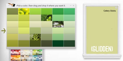
Test Paint Samples the Right Way
Never choose a paint color from a tiny chip alone. That chip has never met your sofa, your lamps, your afternoon shadows, or your slightly dramatic kitchen backsplash.
Buy sample pots or peel-and-stick paint samples. Test at least two coats because paint color deepens and settles after proper coverage. Place samples on different walls in the same room, especially walls that receive different amounts of light. Check them in the morning, afternoon, evening, and under your normal lamps.
For the cleanest comparison, paint samples on white poster board and move them around the room. This prevents your current wall color from influencing the new color. Label each sample so you do not end up saying, “I love this one,” while pointing at a mysterious beige rectangle with no name. That is how paint chaos begins.
Choose a Whole-Home Color Flow
If you are painting several rooms, think about how colors connect from one space to another. Your home does not need to be one color throughout, but it should feel like the rooms are speaking the same language.
A simple whole-home paint palette might include one main neutral, one or two supporting colors, a trim color, and a few accent colors. For example, you could use warm white in open areas, soft sage in the bedroom, muted blue-gray in the office, and charcoal in the powder room. The colors are different, but they share a calm, natural feeling.
The easiest way to create flow is to repeat undertones. If your main neutral is warm, choose other warm or balanced colors. If your home has cool stone, black accents, and crisp white trim, cooler shades may fit better.
Use the 60-30-10 Rule
The 60-30-10 rule is a classic design guideline for building a balanced color scheme. Use one dominant color for about 60 percent of the room, a secondary color for about 30 percent, and an accent color for about 10 percent.
In a living room, the wall color might be the 60 percent, upholstery and rugs might be the 30 percent, and pillows, art, or decor might be the 10 percent. This keeps the room from looking either too flat or too chaotic. Without balance, a room can start to look like every color brought a plus-one.
Do Not Forget Trim, Ceiling, and Sheen
Paint color is not only about walls. Trim, ceilings, doors, cabinets, and finish can completely change the final result.
Trim Color
White trim is popular because it creates clean contrast, but not all whites match every wall color. A cool white trim can make a warm wall color look muddy. A creamy trim can make a cool gray wall look icy. When possible, test wall and trim colors together.
Ceiling Color
Ceilings do not always have to be plain white. Painting the ceiling a lighter version of the wall color can soften a room. Painting walls, trim, and ceiling the same color can create a cozy, high-design effect, especially in small rooms or spaces with awkward angles.
Paint Sheen
Sheen affects how color appears. Matte and flat finishes hide imperfections but are less washable. Eggshell and satin finishes are popular for living areas because they balance softness and durability. Semi-gloss is common for trim and doors because it is easier to clean and adds subtle shine.
Higher sheen reflects more light, which can make colors look brighter or more intense. A dark color in semi-gloss will feel more dramatic than the same color in matte. Translation: sheen has opinions.
Popular Paint Color Families and Where They Work Best
Warm Whites and Creams
Warm whites are friendly, flexible, and easy to live with. They work well in living rooms, kitchens, bedrooms, and hallways. Choose them when you want brightness without a cold, sterile feeling.
Greige and Taupe
Greige combines gray and beige, making it one of the most useful neutral paint colors. Taupe can feel slightly richer and more sophisticated. Both work beautifully with wood tones, black accents, linen fabrics, and natural textures.
Soft Greens
Sage, olive, eucalyptus, and muted forest greens remain popular because they feel connected to nature. These colors are especially effective in bedrooms, kitchens, offices, bathrooms, and exterior accents.
Muted Blues
Blue can feel peaceful, classic, or coastal depending on the shade. Soft blue-gray works well in bedrooms and bathrooms. Navy can add depth to dining rooms, cabinets, offices, or accent walls.
Dark Dramatic Colors
Charcoal, black, deep green, espresso, and inky blue can make a room feel expensive when used thoughtfully. They are excellent for powder rooms, libraries, dining rooms, built-ins, and front doors. The trick is to support dark walls with good lighting, contrast, and texture.
Common Paint Color Mistakes to Avoid
Choosing Paint First
Paint comes in thousands of colors. Your rug, sofa, counters, and tile do not. Choose paint after you understand the fixed elements in the room.
Ignoring Undertones
A “simple white” may have yellow, blue, pink, gray, or green undertones. Always compare samples before buying gallons.
Testing Too Small
A tiny swatch cannot show how a color behaves on a full wall. Use large samples and view them in real lighting.
Following Trends Blindly
Trends can inspire you, but they should not boss you around. If everyone online loves muddy mushroom beige but your house looks better in crisp blue-white, trust the house.
Forgetting the Finish
The same color can look different in matte, eggshell, satin, and semi-gloss. Always consider sheen before making the final choice.
Step-by-Step Guide: How To Pick The Right Paint Colors
Step 1: Define the Mood
Decide whether the room should feel calm, cheerful, cozy, dramatic, bright, formal, or creative.
Step 2: Study Existing Elements
Look at floors, furniture, rugs, cabinets, countertops, trim, and natural materials. These pieces should guide your palette.
Step 3: Identify Undertones
Compare colors against white paper and nearby finishes. Avoid mixing undertones that clash.
Step 4: Consider Natural and Artificial Light
Notice how the room looks throughout the day and under lamps at night. Light can completely change a color.
Step 5: Sample Before Buying
Test large samples on several walls or movable boards. Check them for at least a full day, preferably longer.
Step 6: Coordinate Trim and Ceiling
Make sure wall color, trim color, ceiling color, and sheen work together.
Step 7: Commit With Confidence
Once a color works with your room, your lighting, and your furniture, stop overthinking. At some point, the wall must be painted, and the swatches must be released back into the wild.
Real-Life Examples of Smart Paint Color Choices
Example 1: A small north-facing bedroom. A cool gray may look dull and chilly here. A warm greige, soft cream, or muted beige can make the room feel more comfortable and restful.
Example 2: A sunny south-facing kitchen. This space can handle crisp white, soft green, pale blue, or even a deeper cabinet color because the natural light keeps the room lively.
Example 3: A long hallway. A light neutral with warm undertones can keep the space open. Painting doors or trim a slightly deeper shade can add interest without making the hallway feel narrow.
Example 4: A powder room. This is a perfect place to try bold color. Deep green, navy, plum, charcoal, or terracotta can make a small bathroom feel intentional and stylish.
Extra Experience: What I’ve Learned About Picking Paint Colors in Real Homes
After seeing how paint behaves in different rooms, one lesson becomes obvious: the “perfect color” does not exist in a vacuum. It exists only in your room, with your light, your furniture, your flooring, your trim, and your personal tolerance for surprise. A color that looks stunning in a magazine can fall flat in a real house because the room has different windows, different bulbs, different wood tones, and probably a laundry basket lurking somewhere nearby.
One practical experience is that homeowners often choose colors that are too strong because the swatch looks harmless. A tiny square of deep teal or rich terracotta feels exciting in the store. On four walls, it may suddenly feel like the room is wearing a velvet cape. That is not always bad, but it should be intentional. If you love a bold color, try it first on an accent wall, built-in shelves, a vanity, interior doors, or a powder room. You still get personality without making the main living area feel overwhelming.
Another lesson: neutrals are not automatically safe. In fact, neutrals can be trickier than bold colors because their undertones are subtle. Beige can turn pink. Gray can turn blue. White can turn yellow. Greige can look perfect in the living room and oddly muddy in the hallway. This is why sampling matters so much. Never assume a neutral will behave just because it has a quiet name. Some of the sneakiest colors whisper in the paint store and shout on the wall.
I have also learned that people should choose colors based on the time they use the room most. If you mainly relax in your living room at night, test paint colors under evening lamps. If you work in a home office during the day, judge the color in natural daylight. If you only use the dining room for dinner, do not choose the paint based only on how it looks at 10 a.m. Paint should perform during real life, not just during an inspection tour with coffee in hand.
One helpful trick is to narrow the choice to three colors, not twelve. Too many samples create visual noise. Pick one safe option, one slightly richer option, and one wild card. Live with them for a few days. The right choice usually becomes obvious when you stop staring and start noticing. You may walk by and think, “That one feels good.” That quiet reaction is worth more than an hour of panic-scrolling paint reviews.
Finally, do not underestimate emotional comfort. Some people love crisp, modern whites. Others feel happier surrounded by warm creams, earthy greens, or moody blues. A home should not look like a showroom if you do not live like a showroom person. Most of us have mail piles, charging cables, dog toys, snack crumbs, and one chair that mysteriously collects clothing. Choose paint colors that make your real life feel better, not colors that only impress imaginary guests with perfect posture.
Conclusion
Learning how to pick the right paint colors is really about learning how to read a room. Start with mood, study your existing finishes, understand undertones, respect lighting, test large samples, and think about how each space connects to the rest of your home. Trends can be helpful, but your own room gives the most important clues.
The best paint color is not always the most popular shade or the one with the fanciest name. It is the one that looks good in your light, works with your furniture, supports your lifestyle, and makes you smile when you walk in. And if the first choice is not perfect? Relax. It is paint, not a tattoo. You can always repaint.
Note: This article synthesizes practical guidance commonly recommended by leading U.S. paint brands, home improvement retailers, and interior design resources, including advice on lighting, undertones, sampling, room function, sheen, and whole-home color coordination.