

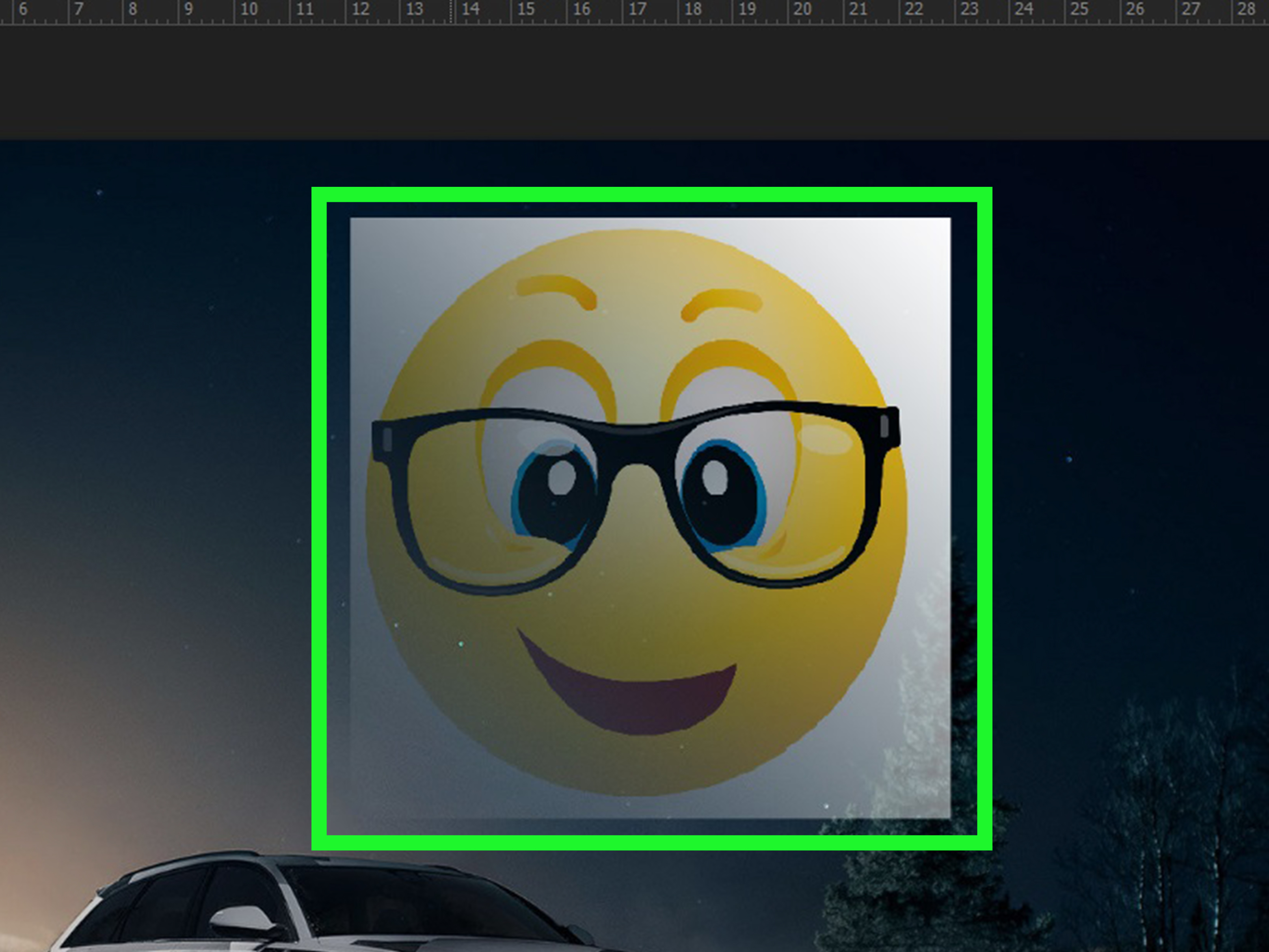
Learning how to fade one image onto another in Photoshop is one of those skills that feels like a secret door. Once you know it, suddenly every design idea looks more possible: dreamy double exposures, smooth photo collages, dramatic YouTube thumbnails, professional banners, wedding edits, travel composites, product promos, and that one “I definitely meant to do this artistically” photo rescue.
The good news? You do not need to be a Photoshop wizard living inside a dark studio with twelve monitors and a suspicious amount of coffee. The most reliable way to fade two images together is simple: place both images on separate layers, add a layer mask to the top image, and use the Gradient Tool to create a smooth transition. Photoshop handles the fancy math. You just drag a line and pretend it was difficult.
In this full guide, you will learn how to fade one image into another in Photoshop using layer masks, gradients, opacity, blending modes, and brush refinements. We will also cover common mistakes, creative examples, export tips, and real-world editing experience so your final image looks intentionalnot like two photos got into a small traffic accident.
What Does It Mean to Fade One Image Onto Another?
To fade one image onto another means to gradually blend part of one photo into another photo. Instead of a hard cut between two images, you create a smooth transition where one image becomes more transparent and the other image becomes more visible.
In Photoshop, this is usually done with a layer mask. A layer mask controls which parts of a layer are visible without permanently deleting pixels. White areas on the mask reveal the layer, black areas hide the layer, and gray areas partially reveal it. That simple black-white-gray system is the heart of most professional Photoshop blending.
Best Method: Fade Images Together With a Layer Mask and Gradient
The cleanest, most flexible, and most professional method is the Gradient Tool plus a layer mask. This method is non-destructive, which means you can edit the fade later without ruining the original images. Designers love non-destructive editing because mistakes happen, clients change their minds, and sometimes your first idea looks like a haunted postcard.
Step 1: Open Both Images in Photoshop
Start by opening Photoshop and bringing in the two images you want to blend. You can do this in several ways:
- Open one image, then drag the second image into the same document.
- Use File > Place Embedded to add another image as a new layer.
- Use File > Scripts > Load Files into Stack if you are combining multiple images.
Make sure each image is on its own layer. In the Layers panel, the image you want to fade should usually sit on top, while the image that will show through should be underneath.
Step 2: Arrange and Resize the Images
Before creating the fade, position the images so they overlap in a useful way. Select the top layer and press Ctrl+T on Windows or Command+T on Mac to activate Free Transform. Resize, rotate, or move the image until the composition feels balanced.
For example, if you are fading a portrait into a city skyline, place the portrait on top and the skyline below. If you are blending a beach sunset into a mountain landscape, align the horizon lines so the transition feels natural. A good fade starts with good placement.
Step 3: Add a Layer Mask to the Top Image
Click the top image layer in the Layers panel. Then click the Add Layer Mask icon at the bottom of the Layers panel. It looks like a rectangle with a circle inside it.
After clicking it, you will see a white thumbnail appear next to the layer thumbnail. That white thumbnail is the layer mask. White means the entire top image is currently visible.
Important: click the mask thumbnail before using the Gradient Tool. If you accidentally click the image thumbnail instead, Photoshop will draw the gradient onto the photo itself. That is the digital equivalent of painting a mustache on your passport photo: technically possible, rarely desirable.
Step 4: Select the Gradient Tool
Choose the Gradient Tool from the toolbar. The shortcut is usually G, though Photoshop may cycle between related tools depending on your toolbar setup.
In the options bar, choose a black-to-white gradient. Select the Linear Gradient style for a classic side-to-side or top-to-bottom fade. Make sure the gradient mode is set to Normal and the tool opacity is at 100% for a clean result.
Step 5: Drag the Gradient Across the Mask
With the layer mask selected, drag across the area where you want the fade to happen. The direction of your drag matters:
- The black part of the mask hides the top image.
- The white part of the mask reveals the top image.
- The gray area creates the gradual fade between them.
If you drag a short line, the transition will be more abrupt. If you drag a longer line, the fade will look smoother and more gradual. If the fade appears backward, simply drag in the opposite direction or reverse the gradient.
Do not worry if it takes a few tries. Photoshop gradients on masks are easy to redo. Each new drag replaces the previous gradient on that mask, so experiment until the blend looks right.
How to Refine the Fade With the Brush Tool
The Gradient Tool creates the main blend, but the Brush Tool is how you make it look polished. Select the layer mask, choose a soft round brush, and paint directly on the mask.
- Paint with black to hide more of the top image.
- Paint with white to bring parts of the top image back.
- Paint with gray for partial transparency.
Use a low brush opacity, such as 10% to 30%, for subtle edits. This is especially helpful around faces, hair, skies, buildings, and other areas where a harsh transition would be obvious.
Alternative Method: Fade Images With Layer Opacity
If you want the entire top image to fade evenly, use layer opacity. Select the top layer and lower the Opacity value in the Layers panel. At 100%, the image is fully visible. At 50%, it becomes semi-transparent. At 0%, it disappears.
This method is fast, but it is less precise than a layer mask. Opacity affects the whole layer equally, while a gradient mask lets one side fade while another side stays visible. Use opacity for ghosted overlays, subtle textures, watermark effects, and soft background blends.
Using Blending Modes for Creative Image Fades
Blending modes change how one layer interacts with the layer beneath it. You can find them in the dropdown menu at the top of the Layers panel. Popular blending modes for image fades include:
- Multiply: darkens the blend and works well for shadows, textures, and moody composites.
- Screen: lightens the blend and is useful for light leaks, skies, and glowing effects.
- Overlay: increases contrast and can create bold, punchy results.
- Soft Light: adds a gentler contrast effect for natural-looking blends.
Blending modes work beautifully with layer masks. You can set a blending mode first, then use a gradient mask to control where the effect appears. This gives you both creative style and precise control.
How to Create a Radial Fade Between Two Images
A linear gradient fades in a straight direction, but sometimes you want the fade to spread outward from a central point. That is where a Radial Gradient helps.
Select the layer mask, choose the Gradient Tool, and switch from Linear Gradient to Radial Gradient in the options bar. Drag outward from the area you want to reveal or hide. This is useful for spotlight effects, circular portrait blends, product highlights, and dreamy center-focused compositions.
How to Fade a Face Into a Background
One popular Photoshop effect is fading a face into a landscape, city, cloud texture, or abstract background. The basic steps are the same, but the details matter more.
- Place the portrait on the top layer.
- Place the background image beneath it.
- Add a layer mask to the portrait layer.
- Use a gradient to fade the edges of the portrait.
- Use a soft brush on the mask to clean up the jawline, hair, shoulders, and background edges.
- Adjust brightness, contrast, and color so both images feel like they belong together.
For portraits, avoid fading through important facial features unless you want an intentionally surreal effect. Usually, you want the eyes, nose, and mouth to stay recognizable while the edges blend into the second image.
How to Match Color and Lighting for a Natural Fade
A technically perfect fade can still look fake if the two images have different lighting, color temperature, or contrast. For example, blending a bright sunny beach into a dark winter forest can work, but only if you manage the mood carefully.
Use adjustment layers such as Brightness/Contrast, Curves, Levels, Hue/Saturation, or Color Balance to bring the images closer together. Clip an adjustment layer to one image if you only want it to affect that specific layer.
A helpful trick is to temporarily zoom out. If the blend looks natural when viewed small, it will usually feel better at full size too. If one photo jumps out like it missed the group dress code, adjust its color or contrast.
Common Mistakes When Fading Images in Photoshop
1. Editing the Image Instead of the Mask
This is the classic beginner mistake. Always click the layer mask thumbnail before applying the gradient or brush. The mask thumbnail should have a border around it when selected.
2. Using a Hard Brush
A hard brush can create obvious edges. For most fades, use a soft round brush and lower opacity for smoother blending.
3. Making the Gradient Too Short
A short gradient creates a quick transition. That can work for graphic effects, but natural photo fades usually need a longer drag.
4. Ignoring Image Composition
The fade cannot fix everything. If the two photos do not overlap in a visually pleasing way, the result may feel awkward. Move and resize the layers before masking.
5. Forgetting to Save a PSD File
Exporting a JPEG is fine for posting online, but always save a Photoshop file too. A PSD keeps your layers and masks editable, which is a lifesaver when you notice one tiny edge problem five minutes after sending the image to someone.
Best Photoshop Settings for a Smooth Image Fade
For most image blending projects, start with these settings:
- Layer setup: two separate image layers
- Mask: white layer mask on the top image
- Gradient: black-to-white or white-to-black
- Gradient style: linear for standard fades, radial for spotlight fades
- Brush: soft round brush for refinements
- Brush opacity: 10% to 30% for subtle edits
- Export: JPEG for photos, PNG for graphics with transparency, PSD for future editing
Creative Examples of Fading One Image Onto Another
Travel Poster
Fade a mountain image into a sunset sky. Keep the horizon aligned and use warm color grading to make the images feel cinematic.
Wedding Photo Blend
Fade a close-up portrait into a wide ceremony shot. Use a soft mask around the couple and keep skin tones natural.
Product Advertisement
Fade a product photo into a lifestyle background. Lower the background contrast so the product remains the star of the design.
Double Exposure Portrait
Blend a portrait with trees, clouds, buildings, or ocean waves. Try Screen or Soft Light blending modes for a more artistic finish.
Before-and-After Design
Fade one side of an image into another to show editing results, home renovation changes, skin retouching, color correction, or restoration work.
Troubleshooting: Why Is My Photoshop Fade Not Working?
If your fade is not appearing, check these issues first:
- The wrong thumbnail is selected: Click the mask thumbnail, not the image thumbnail.
- The layer order is wrong: The image being faded should usually be above the image that appears underneath.
- The gradient colors are reversed: Swap black and white or drag in the opposite direction.
- The layer is locked: Unlock the layer if Photoshop prevents editing.
- The mask is disabled: Right-click the mask and make sure it is enabled.
- The image is too small: Low-resolution images can make blends look rough or pixelated.
Professional Tips for Better Image Blending
Once you understand the basics, small improvements can make your Photoshop fade look much more professional.
Use Smart Objects
Convert layers to Smart Objects before resizing them repeatedly. This helps preserve quality and gives you more editing flexibility.
Zoom In and Zoom Out
Zoom in to clean edges, then zoom out to judge the overall composition. A blend should work both close up and at normal viewing size.
Use Multiple Masks When Needed
You can combine gradient masking with brush masking. Start with a broad gradient, then refine specific areas by painting on the mask.
Add a Unifying Color Grade
A final Curves, Color Balance, or Gradient Map adjustment can help both images share the same mood. Think of it as asking the two photos to wear matching outfits.
Keep the Focal Point Clear
Do not fade important details into visual chaos. Decide what viewers should notice first, then build the fade around that focal point.
When Should You Use a Fade Effect?
A fade effect works best when you want connection, transition, or atmosphere. It is great for storytelling designs, emotional portraits, editorial graphics, web banners, thumbnails, posters, album covers, and social media images.
However, not every image needs a fade. If the blend makes the design harder to understand, simplify it. Photoshop gives you many tools, but restraint is still one of the best design skills. Just because you can fade a cat into a thunderstorm does not mean the world is ready.
How to Export Your Finished Image
When your fade looks complete, save your editable file first. Go to File > Save As and save a PSD copy. This keeps your layers, masks, and adjustments intact.
For web publishing, export a compressed JPEG or PNG. Use File > Export > Export As or Save a Copy, depending on your Photoshop version and workflow. JPEG is usually best for standard photos. PNG is useful for graphics, screenshots, or images that need transparency.
Before uploading, check the file size, dimensions, sharpness, and color. A beautiful Photoshop fade should load quickly and look crisp on desktop and mobile screens.
Experience-Based Notes: What I’ve Learned From Fading Images in Photoshop
The biggest lesson from working with Photoshop fades is that the technique is easy, but the taste takes practice. Anyone can add a layer mask and drag a gradient. The real skill is knowing where the fade should begin, how long the transition should be, and which parts of the image deserve to stay sharp.
One common experience is that the first fade often looks too obvious. Beginners usually drag a short gradient because they want to see the effect immediately. The result can look like one image was pasted on top of another with a foggy stripe in the middle. A longer gradient usually feels more natural. It gives the eye time to move from one image to the next without noticing the exact point where the blend happens.
Another practical lesson is that masks are more forgiving than erasers. Early Photoshop users sometimes erase parts of the top image to create a fade. That works until you need to bring something back. With a layer mask, nothing is permanently deleted. If you hide too much, paint with white. If you reveal too much, paint with black. It feels like editing with an undo button built into the design.
Lighting is also more important than many people expect. Two images can blend smoothly but still look wrong because one was shot in warm golden light and the other in cool blue shade. In those cases, the mask is not the problem. The color match is. A simple Curves or Color Balance adjustment can make the difference between “professional composite” and “vacation photo teleported into a movie poster.”
Working on portraits teaches another useful habit: protect the eyes. If the viewer is supposed to connect with a person in the image, keep the eyes clear and intentional. You can fade hair, shoulders, clothing, and background edges, but fading through the eyes can make the portrait look accidental unless you are creating a surreal double exposure effect.
For social media graphics, I have found that strong fades often need stronger contrast. A subtle blend may look elegant on a large monitor but disappear on a phone screen. When designing thumbnails, banners, or promotional graphics, zoom out and preview the image small. If the main subject still reads clearly, the fade is probably working.
Finally, the best Photoshop fades usually come from experimentation. Try dragging the gradient from different directions. Try a radial fade. Try lowering layer opacity. Try Soft Light, Screen, or Overlay. Then step away for a minute and come back with fresh eyes. Photoshop is powerful, but your judgment is what makes the fade feel polished, emotional, and worth publishing.
Conclusion
Fading one image onto another in Photoshop is a foundational skill that opens the door to cleaner composites, richer visual stories, and more professional designs. The best method is to use two separate layers, add a layer mask to the top image, and apply a black-to-white gradient to create a smooth transition. From there, you can refine the result with a soft brush, adjust opacity, experiment with blending modes, and match the color and lighting for a natural finish.
The beauty of this technique is control. You can make the fade subtle, dramatic, realistic, or wildly artistic. And because layer masks are non-destructive, you can keep adjusting until the image feels right. Whether you are designing a web banner, editing a portrait, building a social post, or creating a cinematic photo composite, this Photoshop image fade technique is one you will use again and again.
Note: This guide is based on established Photoshop workflows, including layer masks, gradient masks, opacity controls, blending modes, and non-destructive editing best practices used in modern photo editing and graphic design.