Color in Photoshop can be dramatic, moody, elegant, neon, deliciously weird, or “why does this beige look sad?” The secret to keeping it under control is not guessing your way through the Color Picker every five minutes. It is learning how to add swatches in Photoshop and build a tidy, reusable color system.
Photoshop swatches are saved color samples stored inside the Swatches panel. They help you reuse brand colors, illustration palettes, photo-grading tones, UI colors, social media colors, and print colors without hunting for hex codes like a detective in a very tiny trench coat. Whether you are designing a logo mockup, retouching a product photo, painting digital art, or preparing a client’s campaign graphics, a custom swatch library keeps your workflow faster and your colors more consistent.
This complete guide explains how to create swatches, import swatch files, organize color groups, use Adobe Color and Creative Cloud Libraries, load colors from HTML/CSS/SVG files, export palettes, troubleshoot common problems, and build smarter Photoshop color habits.
What Are Swatches in Photoshop?
Swatches are saved colors that live in the Swatches panel. Instead of manually typing #1E90FF every time you need the same blue, you can save it as a swatch, name it “Brand Blue,” and click it whenever you need it. Swatches can store simple solid colors, and depending on your workflow, they may be grouped into folders for projects, clients, campaigns, seasons, or design systems.
Think of swatches as your color pantry. You could cook by running to the store for salt every time, but that would be ridiculous and possibly concerning. Swatches keep your favorite ingredients within reach.
Why You Should Use Photoshop Swatches
Adding swatches in Photoshop is not just a neat-freak designer habit. It solves real workflow problems.
1. Swatches Keep Brand Colors Consistent
If a client’s brand uses navy, cream, coral, and sage, close enough is not good enough. A slightly wrong navy can make a polished layout look accidental. Saving exact RGB, CMYK, HSB, or hex values as swatches helps every design stay aligned.
2. Swatches Save Time
When you build social posts, banners, thumbnails, or product mockups, repeated color picking slows everything down. With swatches, one click applies the correct foreground color.
3. Swatches Reduce Mistakes
Manual color entry invites typos. One missing character in a hex code can turn premium champagne into radioactive lemon. Saved swatches make repeat use safer.
4. Swatches Help Teams Work Together
Exported swatch libraries, especially ASE files, can be shared across Adobe apps such as Photoshop, Illustrator, and InDesign. That makes them useful for designers, marketers, photographers, web teams, and print vendors who need to work from the same palette.
How to Open the Swatches Panel in Photoshop
Before adding anything, open the panel:
- Launch Adobe Photoshop.
- Open an existing document or create a new one.
- Go to Window > Swatches.
- The Swatches panel will appear, usually docked with other panels such as Color, Gradients, or Patterns.
If you use swatches often, drag the panel into a comfortable workspace location. You can also save a custom workspace by choosing Window > Workspace > New Workspace. That way, Photoshop remembers your panel setup instead of playing hide-and-seek every morning.
How to Add a New Swatch in Photoshop
The most common method is to save your current foreground color as a swatch.
Step-by-Step: Add a Foreground Color as a Swatch
- Click the Foreground Color box near the bottom of the toolbar.
- Choose your color in the Color Picker. You can enter a hex code, RGB values, HSB values, or CMYK values depending on your project.
- Click OK.
- Open the Swatches panel.
- Click the New Swatch button, usually shown as a plus icon.
- Name the color clearly, such as “Summer Campaign Coral” or “Logo Dark Green.”
- Click OK.
Your color now appears in the Swatches panel. Click it any time to make it your active foreground color.
Pro Tip: Name Colors Like a Human, Not a Robot
Names like “Blue 1” and “Blue 2” feel harmless until a project has 47 blues and everyone is emotionally exhausted. Use names that explain purpose: “Primary Button Blue,” “Footer Navy,” “Holiday Accent Red,” or “Skin Shadow Warm.” Future you will send present you a thank-you card.
How to Add Swatches from an Image
One of the best ways to create a custom color palette in Photoshop is to sample colors from an image. This is perfect for mood boards, fashion edits, product photography, food content, travel posters, and digital paintings.
Step-by-Step: Sample Colors with the Eyedropper Tool
- Open your image in Photoshop.
- Select the Eyedropper Tool from the toolbar or press I.
- Click a color in the image. Photoshop sets it as the foreground color.
- Open the Swatches panel.
- Click the plus icon or choose New Swatch from the panel menu.
- Name the color and save it.
- Repeat for the main colors you want to keep.
For example, if you are designing a coffee shop poster, you might sample espresso brown, oat milk beige, ceramic white, pastry gold, and a deep green from a plant in the photo. Suddenly your palette feels intentional instead of “I clicked around until it stopped looking cursed.”
How to Create a Swatch Group
Swatch groups help you organize related colors. A group can hold all colors for a brand, a website, a photo shoot, a YouTube thumbnail style, or a seasonal campaign.
- Open the Swatches panel.
- Click the folder icon or choose the group option from the panel menu.
- Name the group clearly.
- Drag existing swatches into the group, or create new swatches while the group is selected.
A smart group structure might look like this:
- Client ABC / Primary Brand Colors
- Client ABC / Social Media Accents
- Client ABC / Neutrals
- Client ABC / Holiday Campaign
This is especially helpful if you manage many clients or publish high-volume content. Good color organization is not glamorous, but neither is searching through 200 unnamed squares while a deadline breathes down your neck.
How to Import Swatches in Photoshop
If someone sends you a swatch library, Photoshop can import it. The most common file types are ASE and ACO.
What Is an ASE File?
An ASE file means Adobe Swatch Exchange. It is designed for sharing color palettes across Adobe applications. If you want to move colors between Photoshop, Illustrator, and InDesign, ASE is usually the friendliest format.
What Is an ACO File?
An ACO file is a Photoshop color swatch file. It is closely associated with Photoshop and is commonly used for saving and loading Photoshop color palettes.
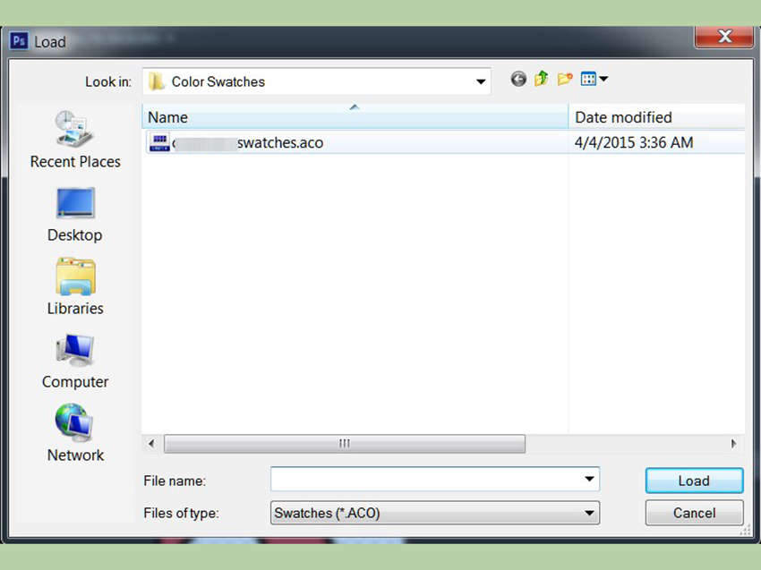
Step-by-Step: Import an ASE or ACO File
- Open Photoshop.
- Go to Window > Swatches.
- Click the panel menu in the upper-right corner of the Swatches panel.
- Choose Import Swatches or Load Swatches, depending on your Photoshop version.
- Select the ASE or ACO file.
- Click Open or Load.
The imported colors should appear in the Swatches panel. If they do not, check whether the file type filter is set correctly. It is surprisingly easy to stare at a folder and think your file vanished when Photoshop is simply filtering for the wrong format.
How to Load Colors from HTML, CSS, or SVG Files
Photoshop can also read colors from certain web files, which is excellent for designers who work with websites, landing pages, and brand systems. When you load an HTML, CSS, or SVG file, Photoshop can detect recognized color values and add them to the Swatches panel. Repeated colors are typically added only once, so your palette does not become a confetti cannon of duplicates.
Supported Color Examples
#112233#123rgb(30, 144, 255)rgba(30, 144, 255, 0.8)hsb(210, 80, 100)hsba(210, 80, 100, 0.8)
Step-by-Step: Load Web Colors
- Open the Swatches panel.
- Open the panel menu.
- Choose Load Swatches or Replace Swatches.
- Select your HTML, CSS, or SVG file.
- Confirm the action.
Use Load when you want to add colors to your current swatches. Use Replace when you want Photoshop to swap the current swatch set for the new one. If your current palette matters, save it before replacing anything. Photoshop may ask whether you want to save the current set, but do not rely on panic-clicking as a file management strategy.
How to Use Adobe Color with Photoshop Swatches
Adobe Color is useful for building color themes from rules such as analogous, monochromatic, triadic, complementary, and compound palettes. You can also extract color themes from images. This is helpful when you want a polished palette but do not want to manually debate whether teal and burnt orange are friends today.
A common workflow looks like this:
- Create or explore a palette in Adobe Color.
- Save the palette to a Creative Cloud Library.
- Open Photoshop.
- Go to Window > Libraries.
- Select the library that contains your color theme.
- Apply colors from the library or sample them into your Photoshop swatches when you need local Swatches panel access.
Creative Cloud Libraries are excellent for shared assets across projects and apps. The Swatches panel is better for fast local color picking inside Photoshop. Many designers use both: Libraries for team-approved brand systems, and Swatches for hands-on production work.
How to Save and Export Swatches
Once you build a useful palette, save it. A palette that exists only inside one Photoshop installation is not a system; it is a fragile little houseplant.
Save Swatches for Photoshop
- Open the Swatches panel.
- Use the panel menu.
- Choose Save Swatches.
- Name the file and choose a safe location.
This is useful for backing up Photoshop-specific palettes.
Save Swatches for Exchange
- Open the Swatches panel.
- Choose Save Swatches for Exchange if available.
- Save the palette as an ASE file.
Use ASE when you want to share colors with Illustrator, InDesign, or another designer using Adobe software. It is one of the cleanest ways to keep color consistent across a full creative workflow.
Best Practices for Photoshop Swatches
Keep Palettes Focused
A good palette does not need 90 colors. Most brand and design palettes work better with a small group of core colors, neutrals, and a few accents. Too many swatches can make decisions slower instead of faster.
Separate Print and Digital Colors
RGB and hex colors are common for screens. CMYK and spot color workflows matter more for print. If you design for both, create separate swatch groups so nobody accidentally uses a web-only neon in a brochure and then blames the printer, the moon, or the office Wi-Fi.
Use Accessibility Checks
If your swatches are used for websites, apps, social graphics, or text overlays, check contrast. A beautiful pale gray on white may look elegant until nobody can read it. Save accessible text/background combinations as paired notes in your design documentation.
Clean Up Old Swatches
Delete unused experiments, duplicate colors, and outdated campaign palettes. Your Swatches panel should feel like a tool chest, not a junk drawer with pixels.
Back Up Important Libraries
Before upgrading Photoshop, moving computers, or resetting preferences, export important swatches. Creative software updates are usually smooth, but “usually” is not a backup plan.
Common Problems When Adding Swatches in Photoshop
The Imported Swatches Do Not Appear
Check whether you imported the correct file type. If you are looking for an ASE file but Photoshop is filtering for ACO files, the file may not display. Also confirm that the colors were added to the active swatch group or lower in the panel.
The Colors Look Different in Another App
Color appearance can change because of color profiles, document color mode, monitor calibration, and app settings. For professional work, synchronize color settings across Adobe apps and confirm print-critical colors with your vendor.
The Swatches Panel Is Too Crowded
Create groups, remove duplicates, and export old palettes before deleting them. A tidy swatch panel is faster to use and less likely to cause accidental color choices.
Creative Cloud Library Colors Are Not Automatically in Swatches
Libraries and Swatches are related but not identical. If a color is in a Creative Cloud Library, you can use it in Photoshop, but you may still need to sample or save it as a local swatch if you want it inside the Swatches panel for quick access.
Example: Build a Simple Brand Palette in Photoshop
Imagine you are creating a brand palette for a small skincare company. The brand wants to feel clean, calm, modern, and natural. You might create this structure:
- Primary Green: Used for logo accents and buttons.
- Soft Cream: Used for backgrounds.
- Clay Pink: Used for highlights and packaging details.
- Deep Charcoal: Used for text.
- Warm Gray: Used for borders and secondary elements.
In Photoshop, you would enter each color value, save it as a named swatch, place the colors into a group called “Skincare Brand,” and export the palette as an ASE file for the rest of the creative team. Now the website designer, packaging designer, and social media designer can all use the same colors. Everyone wins, including the poor intern who no longer has to ask, “Which green?” in Slack twelve times.
Experience Notes: What Actually Helps When Working with Photoshop Swatches
After working with Photoshop palettes on real design tasks, one lesson becomes obvious: the best swatch system is the one you can understand when you are tired, busy, and surrounded by fifteen open tabs. A palette can be technically perfect, but if the naming is vague or the groups are messy, you will eventually ignore it and start choosing colors manually again. That is how chaos sneaks in wearing a very convincing designer scarf.
For brand projects, I like to create three layers of organization. First, I save the official brand colors exactly as provided, including hex or RGB values. These are the sacred colors. Nobody touches them. Second, I create practical usage colors, such as “Button Hover,” “Card Background,” “Text on Dark,” or “Sale Badge.” These are the colors used most often in production. Third, I create temporary campaign colors for seasonal work. When the campaign ends, those swatches can be archived or exported instead of cluttering the main palette forever.
Another useful habit is to test swatches in context before approving them. A color that looks gorgeous as a tiny square may behave very differently on a full hero banner, a product photo overlay, or a mobile screen. I usually create a small test document with sample headings, buttons, backgrounds, and image overlays. Then I click through the swatches and check whether the palette still feels balanced. This catches problems early, especially with colors that are too saturated, too muddy, or too similar to each other.
When sampling colors from images, I avoid grabbing only the prettiest colors. A strong palette needs workers, not just celebrities. The dramatic sunset orange may be the star, but you still need neutrals, shadows, soft backgrounds, and readable text colors. A good image-based palette usually includes one or two attention-grabbing colors, two or three supporting tones, and at least one reliable neutral. Without neutrals, every design starts yelling. Sometimes yelling is useful; usually it is just a poster asking for a nap.
For teams, exporting ASE files is a small action that prevents large headaches. Before sending a palette, I remove duplicates, confirm names, and include a simple note explaining intended use. For example: “Use Primary Navy for headers, Coral for calls to action, Cream for backgrounds, and Charcoal for body text.” This makes the swatch file more than a box of colors; it becomes a practical mini design system.
Finally, I recommend reviewing your Photoshop swatches every few months. Delete abandoned experiments, archive old campaigns, and update brand colors if guidelines change. Swatches are supposed to speed you up. If your panel looks like a spilled bag of candy, it is time for a cleanup. Your future designs will look cleaner, your workflow will feel calmer, and your Color Picker will finally get a little vacation.
Conclusion
Learning how to add swatches in Photoshop is one of those small skills that quietly improves everything. It makes your colors consistent, your workflow faster, your files cleaner, and your design decisions easier to repeat. You can add a swatch from the foreground color, sample colors from images, import ASE or ACO files, load colors from HTML/CSS/SVG documents, organize groups, use Adobe Color, sync Creative Cloud Libraries, and export palettes for future projects.
The real magic is not simply saving colors. It is building a color system that supports the way you work. Name your swatches clearly, group them logically, separate print and digital palettes, check accessibility, and back up important libraries. Do that, and Photoshop becomes less of a color jungle and more of a well-labeled creative kitchen. Still messy sometimes, yesbut at least you know where the good blue is.
Note: This article was written from current, real Photoshop workflow knowledge and synthesized from reputable design and software documentation sources, including official Adobe Photoshop guidance, Adobe Color resources, Creative Cloud Libraries documentation, file-format references, and established color accessibility/design-system practices. Source links are intentionally omitted for clean web publishing.