

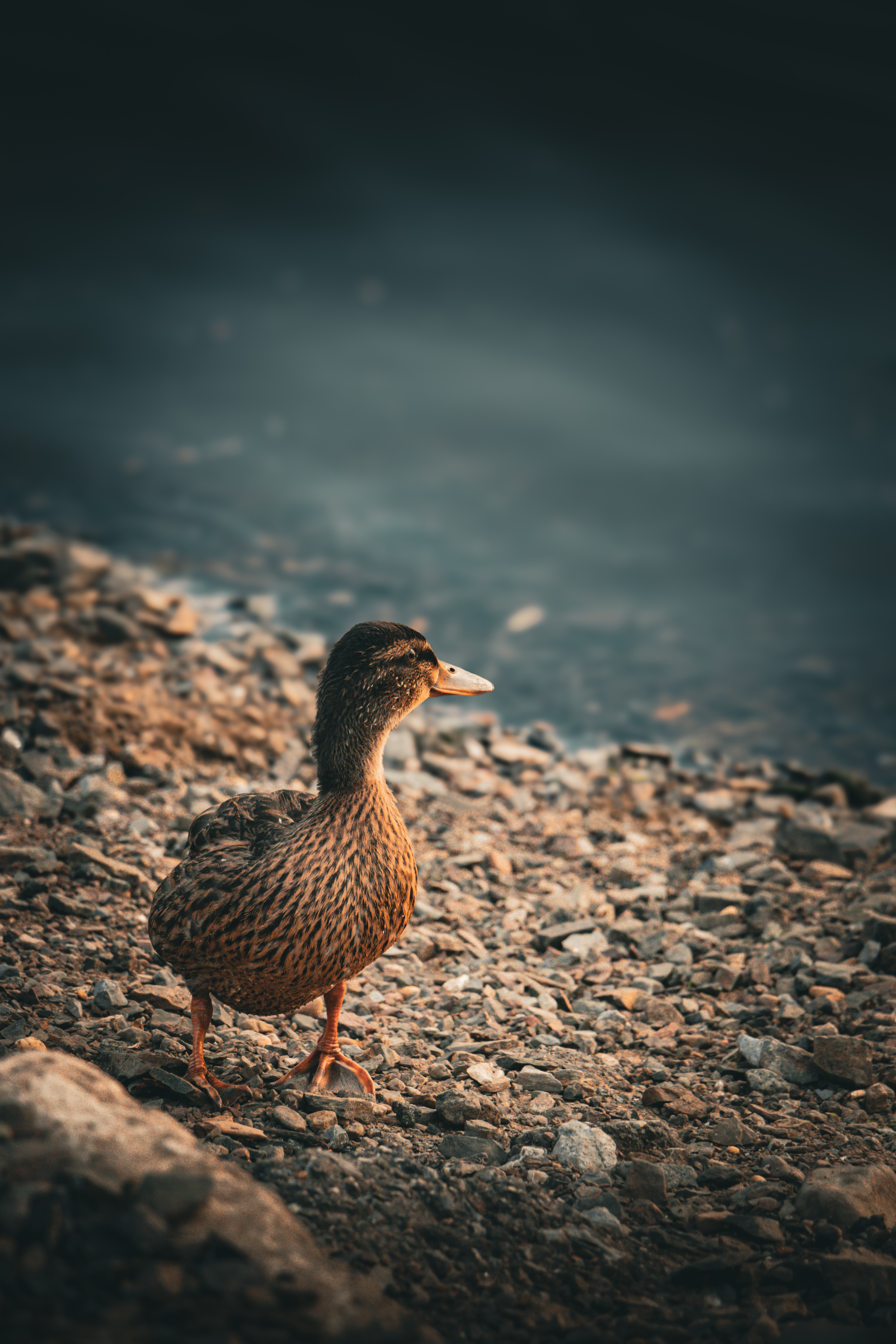
Every photographer eventually reaches the same mysterious milestone: staring at a perfectly decent photo and whispering, “What if the shadows were a little more teal and the highlights had the emotional warmth of a tiny sunset?” That, more or less, is how this teal and orange filmic Lightroom preset started. It was not born from a grand lightning strike of genius. It was born from too many late-night edits, a few questionable coffee decisions, and the belief that digital photos can feel cinematic without looking like they were dipped in radioactive tropical punch.
A teal and orange Lightroom preset is one of those editing styles that refuses to leave the creative conversation. Filmmakers use it. Travel photographers use it. Street shooters use it. Wedding editors use it carefully, because nobody wants a bride who looks like she was lightly roasted. The appeal is obvious: teal cools the shadows, orange warms the skin and highlights, and the whole image gains contrast, mood, and a little bit of “movie trailer energy.” When done well, it feels polished and timeless. When done badly, it looks like a beach vacation argued with a sci-fi poster and nobody won.
The preset I’ve been working on aims for the first result: cinematic, soft, controlled, and believable. It leans into the famous teal and orange color contrast, but with a filmic Lightroom preset approach that respects skin tones, protects highlight detail, softens digital sharpness, and adds just enough texture to make the image feel intentional. This is not a one-click magic wand, because magic wands are for wizards and suspiciously efficient marketing pages. It is more like a carefully tuned starting point: fast enough for workflow, flexible enough for real photos, and tasteful enough that your viewers notice the image before they notice the edit.
Why Teal And Orange Still Works
The teal and orange look became popular because it solves a visual problem elegantly. Human skin naturally lives in the orange, peach, red, and yellow family. Many backgrounds, skies, shadows, city scenes, and reflective surfaces can be shifted toward blue, cyan, or teal without immediately damaging the subject. That gives the image color separation: warm subject, cool environment. The eye knows where to go. The photo suddenly has depth. The viewer thinks, “Wow, cinematic,” even if the actual scene was just your friend standing near a parking garage pretending not to be cold.
In color theory, teal and orange sit close to opposite sides of the color wheel, which makes them a complementary pair. Complementary color contrast is powerful because it creates tension without chaos. Orange brings warmth, life, skin, sunlight, and nostalgia. Teal brings atmosphere, shadow, modernity, and a slightly mysterious “something important might happen after this frame” feeling. Put them together and you get a palette that feels energetic but balanced.
The trick is restraint. A strong teal and orange preset can be exciting for five seconds and exhausting by the sixth. If every shadow becomes electric cyan and every face becomes pumpkin spice, the edit stops feeling cinematic and starts feeling like a theme park map. My goal with this filmic Lightroom preset is to make the effect visible but not loud. Think quiet confidence, not a color grade wearing tap shoes.
The Filmic Part Matters More Than The Trend
A teal and orange grade is only one ingredient. The word “filmic” is doing a lot of work here. A filmic Lightroom preset should not simply push colors around; it should also shape contrast, highlight roll-off, grain, saturation, and tonal softness. Film-inspired editing often feels pleasing because it avoids the overly crisp, overly perfect look that digital cameras can produce straight out of the sensor. Modern files are clean, flexible, and detailed, which is wonderfuluntil they start looking so clinically sharp that every pore files a complaint.
For this preset, I wanted a softer highlight curve, muted but rich color, gentle blacks, and a subtle grain structure. The goal is not to fake a specific film stock exactly. Instead, the preset borrows the feeling people often associate with film photography: smoother transitions, organic texture, less aggressive saturation, and contrast that has shape rather than brute force. A good film look preset should feel like it belongs to the photo, not like it was taped on afterward.
Building The Preset: The Core Lightroom Adjustments
Creating a cinematic Lightroom preset usually starts with the Basic panel, but the real personality develops across the Tone Curve, Color Mixer, Color Grading, Calibration, Effects, and Detail panels. A preset becomes useful only when those pieces work together. One slider can make a photo prettier; a full preset has to survive portraits, landscapes, indoor light, golden hour, neon signs, cloudy afternoons, and that one image where the white balance looks like it has unresolved childhood issues.
Exposure And Contrast: Leaving Room To Breathe
I kept the exposure shift minimal because exposure is highly image-dependent. A preset that automatically brightens everything by a full stop might look dreamy on one underexposed portrait and absolutely unhinged on a sunny beach scene. Instead, the preset focuses on contrast structure. Highlights are gently controlled, shadows are opened slightly, whites stay clean, and blacks are softened with a mild matte effect.
The contrast is cinematic but not crunchy. That matters because heavy contrast can make teal shadows look dramatic, but it can also crush detail in hair, clothing, trees, and low-light backgrounds. A filmic look should invite the viewer into the shadows, not lock the door and turn off the porch light.
Tone Curve: The Secret Sauce With A Tiny Mustache
The Tone Curve is where the preset starts to feel less digital. I used a soft S-curve to add shape, then lifted the black point slightly. This gives the shadows a gentle fade without making the whole image look washed out. The midtones stay alive, the highlights roll off more gracefully, and the photo gets that “printed memory” feeling that many film-inspired presets chase.
A lifted black point can be dangerous if overdone. Too much fade and your image looks like it was found in a shoebox under a humid staircase. Too little and the preset loses its filmic charm. The sweet spot is subtle: blacks remain believable, but they are not brutally clipped.
Color Mixer: Protecting Skin Tones Like A Responsible Adult
The Color Mixer is critical in a teal and orange Lightroom preset. This is where you decide whether skin looks natural or like it has entered a legally complicated relationship with a carrot. I kept oranges warm but controlled, slightly adjusted yellows to avoid greenish skin, and reduced some saturation in greens so backgrounds do not fight the subject.
For blues and aquas, the preset nudges tones toward teal while keeping luminance balanced. Many teal and orange presets make skies too dark or water too neon. This version aims for a cooler cinematic palette without turning every ocean, window reflection, and denim jacket into glowing toothpaste. The adjustment is strong enough to create style but soft enough to leave room for the original scene.
Color Grading: Teal Shadows, Warm Highlights, Calm Midtones
The Color Grading panel is the heart of the preset. The shadows receive a teal-blue tint, the highlights receive a warm amber-orange tint, and the midtones are kept restrained. Midtones are where skin often lives, so pushing them too hard can create strange results. A gentle hand keeps portraits flattering and gives landscapes a warmer emotional center.
The Blending and Balance controls matter as much as the hue choices. Blending controls how smoothly the shadow, midtone, and highlight colors transition into each other. Balance determines whether the grade favors the cooler shadows or the warmer highlights. In this preset, the balance leans slightly warm so the image does not become gloomy, while still allowing the teal shadows to give depth.
Calibration: Small Moves, Big Consequences
Lightroom’s Calibration panel can change the entire personality of an image. It is powerful, which means it should be treated like hot sauce: exciting, useful, and not something to pour blindly over everything you love. I used subtle calibration adjustments to guide blues toward teal and make warm tones feel richer. The goal was not to create a dramatic color mutation, but to build a foundation that supports the filmic grade.
Calibration is especially useful because it affects the color response at a deeper level than simple HSL adjustments. Used lightly, it gives the preset cohesion. Used aggressively, it can make every photo look like it came from the same alternate dimension where grass is allergic to being green.
Where This Preset Works Best
This teal and orange filmic Lightroom preset works best on images that already have some warm and cool separation. Golden hour portraits, street photography, travel images, moody interiors, coastal scenes, city lights, lifestyle shoots, and cinematic couple sessions are all strong candidates. It especially likes photos with warm skin or sunlight against cooler shadows, blue skies, gray buildings, dark clothing, or shaded backgrounds.
For portraits, the preset adds atmosphere without making the subject disappear into the grade. For landscapes, it can turn ordinary daylight into a more dramatic scene, especially when there is sky, water, rock, sand, or warm light. For street photography, it gives night scenes, neon reflections, and urban shadows a polished cinematic mood. Basically, if your photo already feels like a still from a small indie film where someone is about to make a meaningful decision near a vending machine, this preset will probably get along with it.
Where It Needs A Lighter Touch
No preset works perfectly on every photo. This one may need adjustment on images with heavy green foliage, mixed indoor lighting, very red skin tones, or extreme high-ISO noise. Green forests can become too muted if the HSL settings are left untouched. Indoor tungsten lighting can become too orange unless white balance is corrected first. Very cool blue-hour photos may need less teal in the shadows so the grade does not become overly cold.
The best workflow is simple: apply the preset, adjust exposure and white balance first, then fine-tune orange saturation, blue hue, and shadow color grading if needed. A preset should speed up your editing, not replace your eyes. Your eyes are still invited to the party. They may even bring snacks.
Practical Editing Workflow
Step 1: Start With A Proper White Balance
Before applying any cinematic Lightroom preset, correct the white balance enough that skin, whites, and neutral surfaces feel believable. The preset can add mood, but it should not be forced to rescue a file that is already too yellow, too green, or too blue. If the white balance is off, the teal and orange effect may exaggerate the problem.
Step 2: Apply The Preset As A Starting Point
Once the image is balanced, apply the teal and orange filmic preset. Look at the overall mood first, not the tiny details. Ask whether the image feels stronger. Does the subject stand out? Does the color separation help the story? Does the photo look cinematic or merely “edited with enthusiasm”? This first impression matters.
Step 3: Adjust Exposure, Highlights, And Shadows
Exposure should always be customized. Lift exposure if the face is too dark. Pull down highlights if skies or skin are too bright. Open shadows if important detail disappears. The preset is designed to preserve dynamic range, but every photo brings its own tiny drama.
Step 4: Fine-Tune The Color Mixer
If skin becomes too orange, reduce orange saturation slightly or shift orange hue back toward red. If skies become too teal, adjust blue hue or blue saturation. If greens look lifeless, restore a little green saturation or luminance. The Color Mixer is where you personalize the preset to the image instead of letting the preset boss everyone around.
Step 5: Use Masks For Professional Polish
Masks are the difference between a good preset edit and a polished final image. A subject mask can brighten a face, add warmth to skin, or restore natural color. A background mask can deepen shadows or cool the environment. A sky mask can control brightness without affecting the subject. Global presets are fast, but local adjustments make them feel custom.
Specific Examples Of How I Use It
On a golden-hour portrait, I apply the preset, reduce highlight intensity, and keep skin warm but not saturated. The teal shadows create contrast in the background, while the orange highlights make the face feel alive. The final image looks cinematic but still natural enough for a client gallery.
On a city street photo, I let the teal shadows become more visible. Asphalt, glass, metal, and evening shade all respond well to cooler tones. Then I use a radial mask to bring warmth back to the subject or the brightest practical light in the frame. The result feels like a frame from a film noir scene, except with better sneakers.
On a beach or travel image, I reduce aqua saturation slightly so water does not become cartoonish. Warm sand and skin tones already support the orange side of the palette, so the trick is keeping the blues elegant. The best teal and orange travel edits feel expensive, not inflatable.
Why This Preset Is Not Just Another One-Click Filter
There are thousands of orange teal presets online. Some are excellent. Some are aggressive enough to qualify as a weather event. The difference is usually in the details: how skin tones are protected, how greens are handled, how highlights roll off, how much grain is added, and whether the preset works across multiple lighting conditions.
This preset was built around flexibility. It is not meant to flatten every image into the same trendy look. It is meant to create a filmic direction while leaving enough room for individual photo correction. The colors are styled, the contrast is shaped, and the grain is present but not distracting. It gives you a cinematic base, then politely steps aside so you can finish the image like a grown-up with taste and possibly a calibrated monitor.
Common Mistakes With Teal And Orange Editing
Over-Saturating Everything
The fastest way to ruin a teal and orange edit is to push saturation too far. Vibrance can help bring color to muted areas, but too much saturation makes skin, skies, and shadows compete for attention. Cinematic color grading often works because it is selective, not because every color is shouting from a balcony.
Ignoring Skin Tone
Skin tone is the emotional anchor in most portrait edits. If skin looks strange, the viewer notices immediately. Keep orange and red tones believable. Use masks when necessary. A cinematic preset should flatter people, not turn them into limited-edition snack foods.
Making Shadows Too Blue
Teal shadows are beautiful, but they still need detail and variation. If every dark area becomes the same blue-green color, the image loses depth. Use shadow luminance and saturation carefully. Let some neutral tones remain neutral.
Forgetting The Original Light
The best edits respect the lighting that was actually present. A rainy street, sunny beach, candlelit dinner, and studio portrait should not all receive the exact same treatment. The preset can guide the style, but the original light should guide the final decision.
Extra Experience: What Working On This Preset Taught Me
Working on this teal and orange filmic Lightroom preset reminded me that presets are not really about sliders. They are about decisions. Every adjustment says something about what the image should feel like. More teal in the shadows says “mood.” Warmer highlights say “life.” Lifted blacks say “memory.” Grain says “texture.” Too much of any one thing says “please take the mouse away from me.”
The hardest part was not creating a dramatic look. Dramatic looks are easy. You can drag sliders to the edge of civilization and get drama immediately. The harder part was making the preset usable. A preset that looks amazing on one test photo but collapses on the next ten is not a preset; it is a lucky accident wearing sunglasses. I tested the look on portraits, travel photos, street scenes, indoor shots, landscapes, and low-light images. Every time it failed, the failure taught me something useful.
For example, early versions pushed the shadows too far into cyan. It looked cool on city images, but portraits started to feel cold and slightly alien. Not full alien, thankfullymore like someone who had spent too long under discount LED lighting. I pulled back the shadow saturation, adjusted the balance toward the highlights, and let the teal become a supporting character instead of the lead actor.
Another version had too much orange in the highlights. It made sunsets look incredible, but skin tones became too warm in daylight portraits. That is when I realized the preset needed a more careful relationship between the Color Mixer and Color Grading panels. Warm highlights are beautiful, but orange skin is only charming if you are editing a portrait of a sweet potato, and even then, moderation is wise.
Grain was another learning curve. Film grain can add soul, but it can also make clean digital images look unnecessarily noisy. I wanted the texture to be visible at larger sizes but not distracting on social media or portfolio pages. The final grain setting is subtle, with enough roughness to soften the digital finish. It gives the image a tactile quality without making viewers wonder whether the camera sensor needs emotional support.
The experience also changed how I think about presets in general. A good Lightroom preset is not a finished edit. It is a creative shortcut with manners. It should help photographers move faster, build consistency, and explore a recognizable style. But it should never remove the need to think. Exposure, white balance, subject masking, and local contrast still matter. The preset gets you into the neighborhood; your final adjustments choose the house.
I also learned that teal and orange is popular for a reason, but popularity is not the same as laziness. A familiar color palette can still feel personal when it is tuned with intention. The magic is in the restraint, the softness, the way shadows hold color without swallowing detail, and the way warm tones feel inviting rather than artificial. That is the version I have been chasing: cinematic without being cliché, filmic without being fake, stylish without yelling “I downloaded a preset pack at 2 a.m.”
Most of all, this project reminded me that editing should be enjoyable. Yes, color science matters. Yes, Lightroom tools are powerful. Yes, a calibrated workflow is helpful. But there is also something wonderfully human about making an image feel the way you remember the moment, not just the way the camera recorded it. That is what this teal and orange filmic Lightroom preset is trying to do: turn clean digital files into images with atmosphere, warmth, contrast, and a little cinematic mischief.
Conclusion
A teal and orange filmic Lightroom preset can be much more than a trendy color grade. When built carefully, it becomes a practical editing tool for creating cinematic photos with warm highlights, cool shadows, soft contrast, natural skin tones, and a subtle film-inspired finish. The key is balance. Teal should add atmosphere, orange should add life, and the filmic elements should soften the digital edge without burying the image under fake nostalgia.
The preset I’ve been working on is designed for photographers who want mood without mess, style without skin-tone chaos, and a reliable starting point for portraits, travel photography, street scenes, lifestyle work, and cinematic everyday images. It is not a replacement for thoughtful editing, but it can make the process faster, more consistent, and a lot more fun. After all, a good preset should feel like a helpful assistant, not a tiny color-grading goblin living inside your laptop.
Whether you are building your own orange teal preset or refining one you already use, remember the golden rule: make the photo better, not just bluer and oranger. Protect the subject, respect the light, adjust with intention, and let the final image breathe. That is where the real filmic look lives.
Note: This article is original editorial content based on current Lightroom editing practices, cinematic color grading principles, film-inspired photo workflows, and practical preset-building experience.