

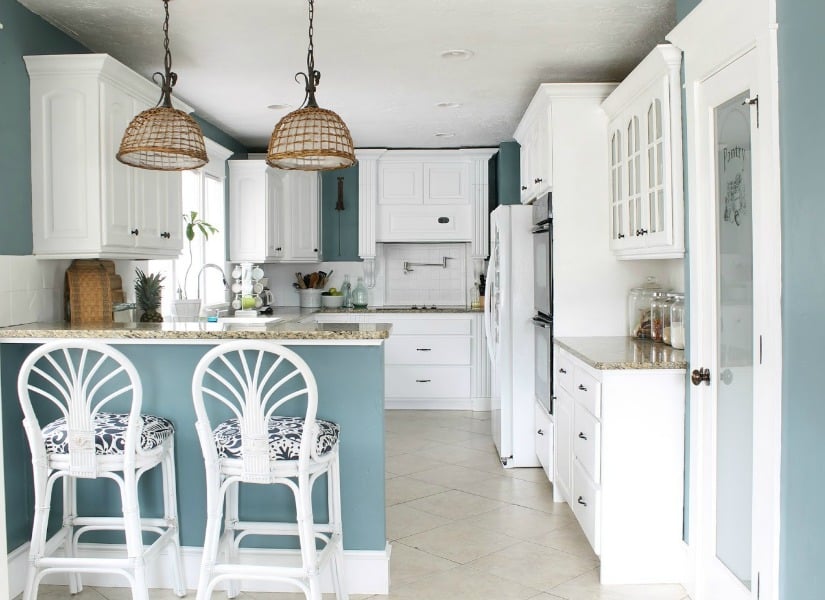
Paint trends move quickly, but the best ones leave fingerprints all over the years that follow. In 2016, interior color took a noticeable breath. After seasons of energetic accent walls and industrial gray, major paint brands introduced soft whites, soothing pastels, warmer neutrals, and carefully chosen bursts of saturated color.
The result was a surprisingly balanced year. Homeowners could embrace polished minimalism with creamy white walls, create peaceful rooms with blush pink and powder blue, or wake up a sleepy space with a confident splash of electric blue. More importantly, the best paint colors from 2016 taught practical lessons about undertones, lighting, contrast, and restraint that still help people avoid expensive decorating mistakes today.
Why 2016 Was an Important Year for Interior Paint
The defining mood of 2016 was calm without boredom. Paint companies responded to visual overload, constant connectivity, and increasingly busy lifestyles by promoting colors associated with simplicity, mindfulness, and comfort. That explains why several leading brands independently selected shades of white as their signature colors.
Benjamin Moore named Simply White OC-117 its 2016 Color of the Year. The company described it as a warm, clean, highly versatile white that could work with both warm and cool palettes. Sherwin-Williams selected Alabaster SW 7008, an understated white intended to provide a sense of calm and visual relief. Glidden followed the same restorative theme with Cappuccino White, a creamy neutral inspired by seashells and smooth stones.
White was not the entire story, however. Pantone chose two Colors of the Year for the first time: Rose Quartz, a gentle blush pink, and Serenity, an airy pale blue. Olympic Paints went in a much louder direction with Blue Cloud, a celebratory, high-energy blue. Together, these selections made 2016 a year of peaceful foundations with occasional flashes of personality.
The Best Paint Colors from 2016
Simply White: Clean, Warm, and Adaptable
Simply White became one of the most recognizable interior paint colors of 2016 because it avoided the cold, clinical appearance associated with some brilliant whites. Its subtle warmth helped rooms feel fresh rather than sterile.
This type of white works especially well in open living areas, kitchens, hallways, and rooms containing a mixture of traditional and contemporary furniture. It also gives artwork, dark wood, colorful upholstery, and architectural details enough breathing room to stand out.
The lesson is that white should never be treated as a default setting. A white with yellow, pink, gray, blue, or green undertones can change dramatically when placed beside flooring, cabinets, countertops, and fabrics. In 2016, designers increasingly emphasized white as a deliberate design choice rather than the color people used when they had run out of ideas.
Alabaster: A Soft White for Comfortable Rooms
Sherwin-Williams Alabaster SW 7008 offered another route to a light interior. It was neither extremely crisp nor heavily creamy, making it useful in bedrooms, living rooms, nurseries, and quiet reading areas.
Alabaster pairs naturally with linen, jute, unfinished wood, stone, leather, and woven baskets. In a modern farmhouse interior, it can soften black metal fixtures and rustic beams. In a more contemporary home, it provides warmth behind streamlined furniture without turning the room beige.
It is particularly effective when repeated across walls, trim, and ceilings in different finishes. Flat or matte walls, satin millwork, and a flat ceiling can create subtle depth even when every surface technically belongs to the same color family. Sherwin-Williams presented Alabaster as a neutral associated with new beginnings, mindfulness, and a less-is-more atmosphere.
Cappuccino White: A Creamier Alternative
Glidden’s Cappuccino White leaned further into warmth. It was an excellent example of the creamy neutrals gaining attention as homeowners slowly moved away from icy gray-beige interiors.
This shade works best in rooms that need softness, including dining rooms, guest bedrooms, and living spaces with warm wood floors. It can also help balance north-facing rooms, where natural light may make cool colors appear flatter or grayer.
Cappuccino White looks attractive beside faded blue, dusty rose, pale green, taupe, and light natural wood. Pairing it with another yellow-heavy cream, however, can make the scheme look unintentionally aged. A cleaner white on the trim usually creates enough definition to keep the room fresh. PPG’s historical announcement described the color as a creamy neutral that coordinated with delicate pastels and light neutrals.
Rose Quartz: Blush Without the Sugar Rush
Rose Quartz demonstrated that pink paint did not have to make a room resemble a box of candy. The 2016 approach was muted, dusty, and grown-up. Instead of bright bubblegum pink, designers used blush as a warm neutral.
Rose Quartz can be beautiful in a bedroom, powder room, dressing area, or small dining room. It becomes more sophisticated when paired with charcoal, walnut, aged brass, cream, navy, or deep green. Gray and black accents keep it tailored, while natural fibers make it relaxed.
For homeowners hesitant to paint an entire room pink, the color works on a ceiling, built-in cabinet, interior door, or painted piece of furniture. A little blush can warm a cold room without announcing itself from the driveway.
Serenity: A Quiet, Airy Blue
Serenity was Pantone’s pale blue companion to Rose Quartz. It reflected the 2016 interest in colors that could make interiors feel peaceful, open, and emotionally lighter. Pantone presented the two colors as subdued alternatives to the more saturated selections of earlier years.
This gentle blue works well in bedrooms, bathrooms, nurseries, and sunrooms. It can be paired with white for a crisp coastal look, with cream for softness, or with camel and medium-toned wood for a more grounded result.
The danger with pale blue is that poor lighting may make it appear chilly. Warm lamps, woven materials, brass hardware, and natural wood prevent the room from feeling like a very attractive refrigerator.
Blue Cloud: The Bold Counterpoint
Olympic Paints’ Blue Cloud D48-5 was louder, deeper, and far more energetic than the other headline colors of 2016. It showed that a calm decorating year still had room for drama.
Blue Cloud is best used intentionally. It can transform a front door, kitchen island, bookcase, powder room, or fireplace wall. In a larger room, it benefits from plenty of white, pale gray, or natural wood to prevent the color from overwhelming the architecture.
PPG’s color experts recommended pairing the bright blue with softer neutrals. That remains the safest approach: let the blue perform the solo while the rest of the palette politely accompanies it.
Other Color Trends That Defined 2016
Beyond the official Colors of the Year, 2016 forecasts included warmer grays, softened greens, muted citrus shades, earthy yellows, deep plums, and complex transitional colors that sat between warm and cool.
Industry observers noticed a gradual movement toward yellow and green undertones after several years dominated by cooler gray. Balanced shades remained especially useful because they could coordinate with both existing cool finishes and newer warm materials. Sherwin-Williams’ forecast collections also explored natural simplicity, global influences, romantic color, and historically inspired combinations rather than relying on one uniform decorating style.
This transitional character is one reason many 2016 paint colors have aged well. They were not all aggressively trendy. A soft green-gray, chalky white, muted blue, or warm greige can be refreshed simply by changing textiles, lighting, and hardware.
How to Choose the Right 2016-Inspired Paint Color
Study the Room’s Natural Light
Natural light can make the same paint color look warm, cool, bright, dull, clean, or muddy. North-facing rooms often receive cooler, more muted light, while west-facing rooms can become noticeably warmer in the afternoon. East-facing rooms tend to be brighter in the morning and cooler later in the day.
A warm white such as Alabaster may balance a dim north-facing room, but it could look noticeably creamier in strong western sunlight. A pale blue may appear gentle in a sunny room and gray in a darker one. Benjamin Moore advises considering both natural and artificial lighting because each can alter visible undertones.
Test Large Samples
A two-inch paint chip is not a reliable preview of an entire room. Color becomes more intense when it covers a large surface, and surrounding furnishings can change how it is perceived.
Bring home several swatches, narrow them to two or three options, and apply generous samples to different walls. Observe them in morning light, afternoon light, cloudy conditions, and evening lamplight. Better Homes & Gardens recommends testing larger sections and watching them over several days before making a commitment.
For an even cleaner test, paint removable sample boards and move them around the room. This prevents existing wall color from influencing the comparison and saves the wall from becoming a patchwork quilt of indecision.
Respect Existing Undertones
Before choosing a wall color, examine the elements that are expensive or inconvenient to replace: flooring, tile, stone, cabinets, countertops, and major furniture. A pink-beige floor may clash with a green-gray wall even when both colors appear neutral in isolation.
Place paint samples beside each fixed element. If a white suddenly looks yellow next to the countertop, believe your eyes. The countertop will not become more cooperative after you buy five gallons.
Coordinate the Trim
Trim does not always need to be brilliant white. Warm wall colors generally look more harmonious beside whites with related warm undertones. Cooler blue, green, and violet walls can support cleaner, crisper whites.
Benjamin Moore recommends using the wall color’s undertone to guide the trim selection. Matching undertone families creates a smoother relationship, while intentional contrast can sharpen architectural details.
Select the Right Paint Finish
Color and sheen work together. Flat and matte finishes absorb more light and help disguise minor surface imperfections. Eggshell and satin are easier to clean and are practical for living rooms, hallways, family rooms, and children’s spaces. Semi-gloss is commonly used on doors, trim, cabinets, and other surfaces that require durability.
Higher sheen can make a color appear slightly brighter while also revealing dents, roller marks, and uneven drywall. Historical color accuracy means very little when the wall looks like it lost an argument with a garden rake.
Room-by-Room Ideas Using a 2016 Palette
Living Room
Use Simply White or Alabaster on the walls, then introduce Serenity blue through pillows, artwork, or a painted cabinet. Add walnut furniture, black accents, and a textured rug to prevent the light palette from appearing empty.
Kitchen
Warm white walls can soften a kitchen with stainless steel appliances. For a stronger focal point, paint the island in a saturated blue inspired by Blue Cloud. Brass or matte-black hardware adds definition without competing with the color.
Bedroom
Combine a soft blue wall with warm white trim, natural linen, and medium-toned wood. Rose Quartz can be introduced through an upholstered headboard or a painted ceiling. The result feels restful rather than themed.
Bathroom
Pale blush, powder blue, and creamy white all work well in bathrooms, but the undertones should coordinate with the tile. A satin or moisture-resistant finish is generally more practical than a dead-flat wall paint in humid areas.
Home Office
A muted green-gray or warm off-white creates a flexible background for work. Blue Cloud can energize built-in shelves or the wall behind a desk, especially when the surrounding furnishings are simple.
Common Mistakes to Avoid
- Choosing a white from memory: White paint has visible undertones that may clash with flooring and furniture.
- Testing only one wall: Each wall receives different light and may display the color differently.
- Following the trend too literally: Rose Quartz and Serenity do not have to appear together in equal amounts.
- Ignoring surface preparation: Even the perfect color cannot hide dust, peeling paint, or poorly patched holes.
- Using too many headline colors: One dominant neutral and one or two supporting accents usually create a more polished result.
- Forgetting artificial light: Warm and cool bulbs can significantly alter whites, grays, blues, and pinks after sunset.
Conclusion
The best paint colors from 2016 succeeded because they addressed two seemingly opposite needs. People wanted calm, but they also wanted personality. Warm whites such as Simply White, Alabaster, and Cappuccino White created quiet foundations. Rose Quartz and Serenity introduced gentle color, while Blue Cloud supplied a confident burst of energy.
The most valuable takeaway is not that every house should be painted like it is permanently attending a 2016 design conference. It is that color works best when it responds to the room. Study the light, identify undertones, coordinate with permanent materials, test large samples, and choose an appropriate finish. A thoughtful color from ten years ago will usually look better than a fashionable color selected in ten seconds.
Practical Experiences and Lessons from Revisiting 2016 Paint Colors
Looking back at rooms decorated with 2016-inspired palettes reveals how differently colors age. The most successful spaces rarely copied every trend at once. Instead, they used one fashionable idea while allowing the room’s architecture and permanent materials to control the rest of the design.
Consider a typical living-room update involving dark wood floors, a tan sofa, and limited northern light. A brilliant gallery white might appear blue and severe in that setting. Switching to a softer white similar to Alabaster creates a noticeably more comfortable relationship with the floor and upholstery. The room still looks fresh, but the warmer undertone prevents the surfaces from feeling disconnected. This is where the 2016 white-paint trend remains especially useful: it proves that “light and neutral” does not have to mean “cold and empty.”
A different lesson emerges from blush pink. In small swatches, Rose Quartz can look extremely sweet. Across four walls, however, the shade becomes much stronger. Successful applications usually balance it with mature materials such as walnut, charcoal linen, dark green velvet, antique brass, or black-framed artwork. Without those grounding elements, a sophisticated blush may wander dangerously close to birthday-cake territory.
Powder blue creates a similar surprise. Under cool LED bulbs, a soothing blue can suddenly appear gray and lifeless. Changing the bulbs to a warmer color temperature, adding natural wood, or incorporating cream textiles often restores the intended softness. The experience reinforces a rule that paint samples should be evaluated under the lighting that will actually be used. A color chosen at noon may have an entirely different personality during a winter evening.
Bold blue offers another practical lesson. A color inspired by Blue Cloud can look thrilling on a kitchen island or bookcase but exhausting across a large, dim room. In successful projects, saturated blue usually occupies a clearly defined architectural element. White walls, pale counters, and restrained accessories allow the feature to feel intentional. When the same blue appears on walls, trim, cabinets, furniture, and curtains, the room may begin to resemble the inside of a very enthusiastic blueberry.
Warm whites also demonstrate why preparation matters. Soft neutral paint reflects shadows, drywall repairs, and uneven roller texture more clearly than many homeowners expect. Cleaning the walls, filling holes, sanding patches, and priming repaired areas often has more influence on the finished result than changing from one premium white to another. The glamorous part of a paint project may be selecting colors, but the unglamorous preparation determines whether those colors look expensive.
Another common experience involves open floor plans. Using five unrelated 2016 colors in connected rooms can make the home feel fragmented. A more effective approach is to repeat one warm white through the main areas, introduce a pale blue or muted green in a quieter room, and reserve the boldest shade for a door, cabinet, or powder room. Repetition creates continuity, while controlled variation keeps the house interesting.
The lasting value of the 2016 palette is therefore not nostalgia alone. It offers a practical model for decorating: begin with a livable foundation, add emotional color carefully, and let lighting determine the final decision. When those principles are followed, the room feels current even if the inspiration came from a paint forecast published years ago.