Move over, dramatic jewel tones. Take a polite step back, moody greens. Sherwin-Williams has named its 2026 Color of the Year, and the winner is not a neon, a plum, a cyber-lavender, or anything that sounds like it belongs in a futuristic smoothie. It is Universal Khaki SW 6150, a warm, earthy, midtone neutral that proves quiet colors can still walk into a room and own the conversation.
At first glance, a khaki paint color may sound about as thrilling as alphabetizing the linen closet. But that is exactly why this pick is interesting. After years of bold color moments, maximalist pattern mixing, and enough “statement walls” to make drywall nervous, Sherwin-Williams is pointing toward a softer design future: calm, durable, flexible, and intentionally livable.
Universal Khaki is not trying to be the loudest person at the party. It is the person who brings good snacks, remembers everyone’s name, and somehow makes the whole room feel more comfortable. As a Sherwin-Williams 2026 Color of the Year, it speaks to a bigger design shift toward simplicity, grounded elegance, and homes that feel like places to exhale.
What Is Sherwin-Williams’ 2026 Color of the Year?
Sherwin-Williams’ 2026 Color of the Year is Universal Khaki SW 6150, described by the brand as an essential neutral with a balance of livability and longevity. It is a midtone tan with warm, earthy character and a slightly grounded feel that makes it more sophisticated than basic beige.
The color was selected by Sherwin-Williams’ color experts and Trendsight Team as part of the broader Colormix Forecast 2026: Anthology Volume Two. It belongs to a design story centered on timeless functionality, nature-inspired warmth, and layered elegance. In plain English: it is a paint color built for real homes, not just perfectly styled rooms where nobody has ever dropped a cracker between the sofa cushions.
Why Universal Khaki Feels Unexpected
Color of the Year announcements often lean theatrical. Paint brands have introduced deep reds, smoky greens, buttery yellows, rich browns, misty blues, and other shades that practically demand a dramatic reveal. Universal Khaki, on the other hand, is refreshingly practical. That is the twist.
Neutral colors are sometimes treated like background actors, but Universal Khaki makes the case that the background can be the whole point. It is warm enough to feel inviting, structured enough to look polished, and flexible enough to work with many decorating styles. It also reflects a cultural appetite for interiors that feel stable and useful rather than trendy for three minutes and exhausting by spring.
After the cool gray era, the all-white era, and the “please add one more arch mirror” era, homeowners are ready for neutrals with more personality. Universal Khaki offers that middle ground. It is not sterile. It is not sugary. It is not the beige of forgotten office cubicles. It is more like sun-warmed linen, natural clay, sandy stone, and a well-loved canvas jacket.
The Design Meaning Behind Universal Khaki
Sherwin-Williams positioned Universal Khaki as a color rooted in simplicity and essentials. That matters because home design is not just about what looks good in a photo. It is also about how a space supports daily life. A good neutral can make a room feel calmer, cleaner, and more pulled together without requiring you to replace every lamp, rug, and throw pillow you own.
Universal Khaki fits the growing interest in warm neutral paint colors, natural textures, and timeless interiors. It supports wood, stone, linen, leather, woven materials, aged metals, and handmade ceramics. It also works well with both minimalist and traditional spaces because it does not lock a room into one narrow mood.
Think of it as a design diplomat. It can sit beside creamy whites, deep browns, soft greens, muted blues, burgundy, terracotta, or buttery yellow without starting an argument.
What Does Universal Khaki Look Like?
Universal Khaki is an earthy midtone tan with a warm undertone. It has enough depth to avoid looking washed out, but it is still neutral enough to cover large surfaces without overwhelming the room. Depending on the lighting, it may appear more beige, more sandy, more golden, or slightly olive-gray.
In bright natural light, Universal Khaki can feel softer and lighter. In dim rooms, it becomes moodier and more cocooning. Under warm bulbs, it may lean cozy and golden. Under cooler lighting, its grounded undertones may become more noticeable. This is why testing a sample is essential. Paint has a secret hobby: changing personalities after you commit.
Why Neutral Paint Colors Are Making a Comeback
Neutral paint never truly disappears, but the kind of neutral people want keeps evolving. For years, cooler grays dominated interiors. Then warmer whites and creamy off-whites took over. Now, the trend is moving toward earthy neutrals with more depth: khaki, clay, mushroom, taupe, sand, flax, camel, and warm greige.
The appeal is easy to understand. These shades feel grounded and human. They pair naturally with organic materials and do not fight with personal decor. They also photograph beautifully without turning a home into a showroom that whispers, “Please do not sit anywhere.”
Universal Khaki joins that movement by offering warmth without heaviness. It can make a room feel finished even before the art goes up. And for homeowners who want a color that will not look dated immediately, this kind of neutral has staying power.
Best Rooms for Universal Khaki SW 6150
Living Rooms
Universal Khaki is especially strong in living rooms because it creates an inviting foundation. It works with cream sofas, leather chairs, wood coffee tables, jute rugs, brass lamps, black accents, and collected artwork. If your living room currently feels like separate furniture pieces are attending an awkward networking event, this color can help introduce everyone.
Bedrooms
In a bedroom, Universal Khaki can feel calm, tailored, and restful. Pair it with white bedding, oatmeal linen, walnut nightstands, warm lighting, and a textured rug. For a more romantic look, add dusty rose, oxblood, or soft terracotta. For a cleaner look, combine it with ivory, charcoal, and natural oak.
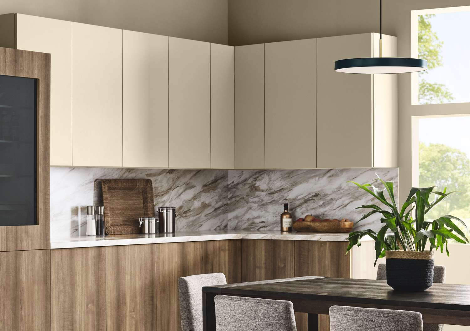
Kitchens
Universal Khaki can work beautifully on kitchen walls, cabinetry, or a pantry area. It pairs well with white stone countertops, cream tile, unlacquered brass, bronze hardware, and wood floors. For contrast, try it with deep green, navy, black, or burgundy accents.
Dining Rooms
Dining rooms benefit from colors that feel warm under evening light. Universal Khaki gives the space a cozy glow without going too dark. Add candlelight, linen curtains, wood furniture, and a sculptural pendant for a room that says, “Yes, we made dinner,” even if dinner is takeout in a ceramic bowl.
Entryways and Hallways
Because Universal Khaki is adaptable, it can connect different rooms without making the home feel choppy. In hallways, it adds warmth and depth. In entryways, it creates an immediate sense of calm, especially with black hooks, woven baskets, a vintage runner, and a mirror.
How to Pair Universal Khaki with Other Colors
The beauty of Universal Khaki is its ability to support both quiet and bold palettes. For a classic look, pair it with warm white trim and wood furniture. For a modern organic look, add moss green, clay, ivory, and matte black. For a more dramatic interior, layer it with burgundy, dark auburn, deep blue, or charcoal brown.
Several colors in Sherwin-Williams’ 2026 forecast and related palettes complement Universal Khaki beautifully. Soft whites and creams keep it fresh. Terracotta and burgundy bring warmth. Blue-greens and earthy greens add balance. Buttery yellow offers a cheerful accent without pulling the room into cartoon territory.
Easy Color Combinations
Warm and classic: Universal Khaki walls, creamy white trim, walnut furniture, and brass accents.
Organic modern: Universal Khaki with olive green, black metal, natural oak, linen, and stone.
Soft traditional: Universal Khaki with ivory, muted blue, antique wood, floral art, and aged bronze.
Bold but balanced: Universal Khaki with burgundy, dark brown, terracotta, and warm white.
Universal Khaki vs. Beige: What Makes It Different?
Universal Khaki may live in the neutral family, but it is not the flat beige many people remember from old rental apartments, waiting rooms, or that one guest room nobody wanted to claim. It has more earthiness and structure. Beige can sometimes feel passive; khaki feels more intentional.
The difference comes from undertone and depth. Universal Khaki has a grounded warmth that lets it behave like a neutral while still adding visual interest. It is not trying to disappear. It is trying to create a more thoughtful foundation.
This is especially useful in open-concept homes, where one wall color may need to coordinate with a kitchen, living area, hallway, and dining space. A balanced neutral like Universal Khaki can hold those areas together without making everything feel identical.
Is Universal Khaki Good for Small Spaces?
Yes, but with a little strategy. Universal Khaki is a midtone color, so it will not brighten a small room the way a crisp white might. However, it can make a small space feel cozy, finished, and intentional. The trick is to balance it with lighter elements.
Use creamy trim, pale upholstery, reflective surfaces, mirrors, and layered lighting. In a tiny powder room, Universal Khaki can look elegant with a stone vanity, antique brass, and a patterned floor. In a small bedroom, it can feel restful when paired with white bedding and simple natural textures.
If the room has very little natural light, test the color carefully. It may become deeper and moodier, which can be wonderful if you want coziness but less ideal if your goal is airy brightness.
Where Universal Khaki Works Best in Real Homes
Universal Khaki is not just for design-magazine spaces. It can work in real homes with pets, kids, coffee mugs, laundry piles, and the occasional mystery sock. It hides everyday visual noise better than stark white and feels warmer than many grays.
For busy households, that matters. A color like Universal Khaki can make a room look composed even when life is not. It gives walls a finished quality and provides a forgiving backdrop for mixed furniture styles. If your home includes inherited pieces, new purchases, thrifted treasures, and one chair everyone pretends is “temporary,” this shade can help make the mix feel intentional.
Decorating Ideas Inspired by the 2026 Color of the Year
1. Paint the Trim, Too
For a modern tone-on-tone effect, use Universal Khaki on walls and trim in different sheens. This creates a seamless, designer look that feels calm and architectural. It is especially effective in bedrooms, offices, and small dining rooms.
2. Use It as a Cabinet Color
Universal Khaki can make cabinets feel warm and custom. In a kitchen, pair it with cream tile, stone counters, and aged brass pulls. In a laundry room, it can make the space feel more polished than a room dedicated to sock negotiations has any right to be.
3. Pair It with Natural Materials
This color shines beside natural textures. Try linen curtains, jute rugs, cane chairs, woven baskets, rattan lighting, oak floors, walnut frames, and handmade ceramics. The result feels layered, not flat.
4. Add One Strong Accent
Because Universal Khaki is neutral, it can handle a bold accent. Consider a deep red door, a dark green velvet chair, a navy sideboard, or black-framed art. The neutral background keeps the accent from looking random.
5. Make It Exterior-Friendly
Universal Khaki can also suit exterior applications, especially on homes with stone, brick, wood, or black trim. It offers a natural look that feels more distinctive than plain beige but less risky than a very dark color.
What This Color Says About 2026 Home Trends
Sherwin-Williams’ choice reflects several major home design trends: essentialism, longevity, comfort, and a renewed respect for neutrals. Instead of chasing spectacle, 2026 interiors appear to be moving toward colors that support daily life. People want homes that feel personal, restful, and durable.
That does not mean design is becoming boring. It means the drama is getting smarter. Rather than painting every wall emerald green, homeowners may choose a warm neutral foundation and then bring in richness through art, upholstery, tile, rugs, and wood tones. Universal Khaki makes that approach easier.
The color also fits the larger movement toward “quiet luxury” and “warm minimalism,” but with a more approachable personality. It does not require marble everything or a sofa that costs more than a used car. It simply asks for balance, texture, and intention.
Should You Use Universal Khaki in Your Home?
Use Universal Khaki if you want a neutral that feels warmer and more current than gray, more grounded than white, and more polished than builder beige. It is a strong choice for homeowners who like calm interiors but do not want their rooms to feel empty or bland.
Skip it if you prefer crisp, cool, high-contrast spaces or if your room already has strong yellow undertones you do not want to emphasize. As with any paint color, the final result depends on light, flooring, furniture, and nearby finishes.
The best move is simple: sample before painting. Put a large swatch on multiple walls. Check it in morning light, afternoon light, evening light, and artificial light. Look at it next to your floors, counters, sofa, and trim. Paint is cheaper than regret, but samples are cheaper than repainting an entire living room while questioning your life choices.
Experience Notes: Living With a Neutral Like Universal Khaki
There is something surprisingly practical about living with a warm neutral like Universal Khaki. In real homes, color has to do more than look nice for five minutes on a mood board. It has to survive shifting daylight, mismatched furniture, seasonal decor, and everyday mess. A neutral with depth can be one of the easiest ways to make a home feel collected instead of chaotic.
One of the best experiences with khaki-like colors is how forgiving they are. White walls can be beautiful, but they also tend to announce every scuff, shadow, and awkward empty corner. Dark colors can be stunning, but they may demand stronger lighting and more confident styling. Universal Khaki lands in a comfortable middle zone. It adds color without shouting and hides imperfections better than paler shades.
In a living room, this kind of color can instantly make older furniture feel more intentional. A brown leather chair, a cream sofa, a wood cabinet, and a black floor lamp may seem unrelated against a stark wall. Against Universal Khaki, they begin to speak the same language. The wall color becomes the bridge. It says, “Relax, everyone belongs here.”
Another practical advantage is seasonal flexibility. In spring, Universal Khaki can look fresh with pale blue, white flowers, and light linen. In summer, it pairs beautifully with woven shades, sandy textures, and greenery. In fall, it welcomes rust, olive, amber, and burgundy. In winter, it feels cozy with wool throws, candlelight, dark wood, and warm metallics. A color that works across seasons saves money because you do not have to reinvent the room every time the weather changes.
It is also a helpful color for people who are nervous about decorating. Some paint colors demand a full design plan. Universal Khaki is more forgiving. You can start with the walls, then gradually layer in art, pillows, rugs, and lighting. It does not force every decision at once. That makes it ideal for new homeowners, renters with paint permission, or anyone slowly upgrading a space on a real-world budget.
In bedrooms, a warm khaki wall can make the room feel settled. It is less stark than white and less heavy than chocolate brown. Add white sheets, a beige quilt, wood nightstands, and a soft lamp, and the room immediately feels calmer. If the space needs personality, bring in a patterned pillow, framed landscape print, or vintage rug. Universal Khaki gives those details room to shine.
For home offices, the color can be surprisingly effective. It is neutral enough for video calls but warmer than gray. It creates a professional background without feeling corporate. Pair it with black shelves, oak furniture, and a simple desk lamp for a workspace that feels focused but not cold.
The main lesson from using colors like Universal Khaki is that “neutral” does not have to mean “nothing is happening.” A good neutral creates atmosphere. It improves the way furniture relates to the room. It can make inexpensive decor look more elevated and make a busy space feel calmer. That is why Sherwin-Williams’ 2026 Color of the Year feels smarter than it first sounds. It is not a flashy trend color. It is a useful oneand useful is underrated.
Conclusion
Sherwin-Williams named Universal Khaki SW 6150 its 2026 Color of the Year, and the choice signals a meaningful shift toward warm, grounded, long-lasting interiors. While it may seem unexpectedly neutral, that restraint is exactly what makes it powerful. Universal Khaki is practical, elegant, flexible, and easy to imagine in real homes.
Instead of chasing shock value, Sherwin-Williams chose a color that supports comfort, longevity, and everyday beauty. It works with natural materials, layered palettes, traditional spaces, modern rooms, and bold accents. It is proof that a neutral can be memorable when it has warmth, depth, and purpose.
Universal Khaki may not scream for attention, but it does something better: it makes a home feel more settled. And in 2026, that might be the most stylish move of all.