

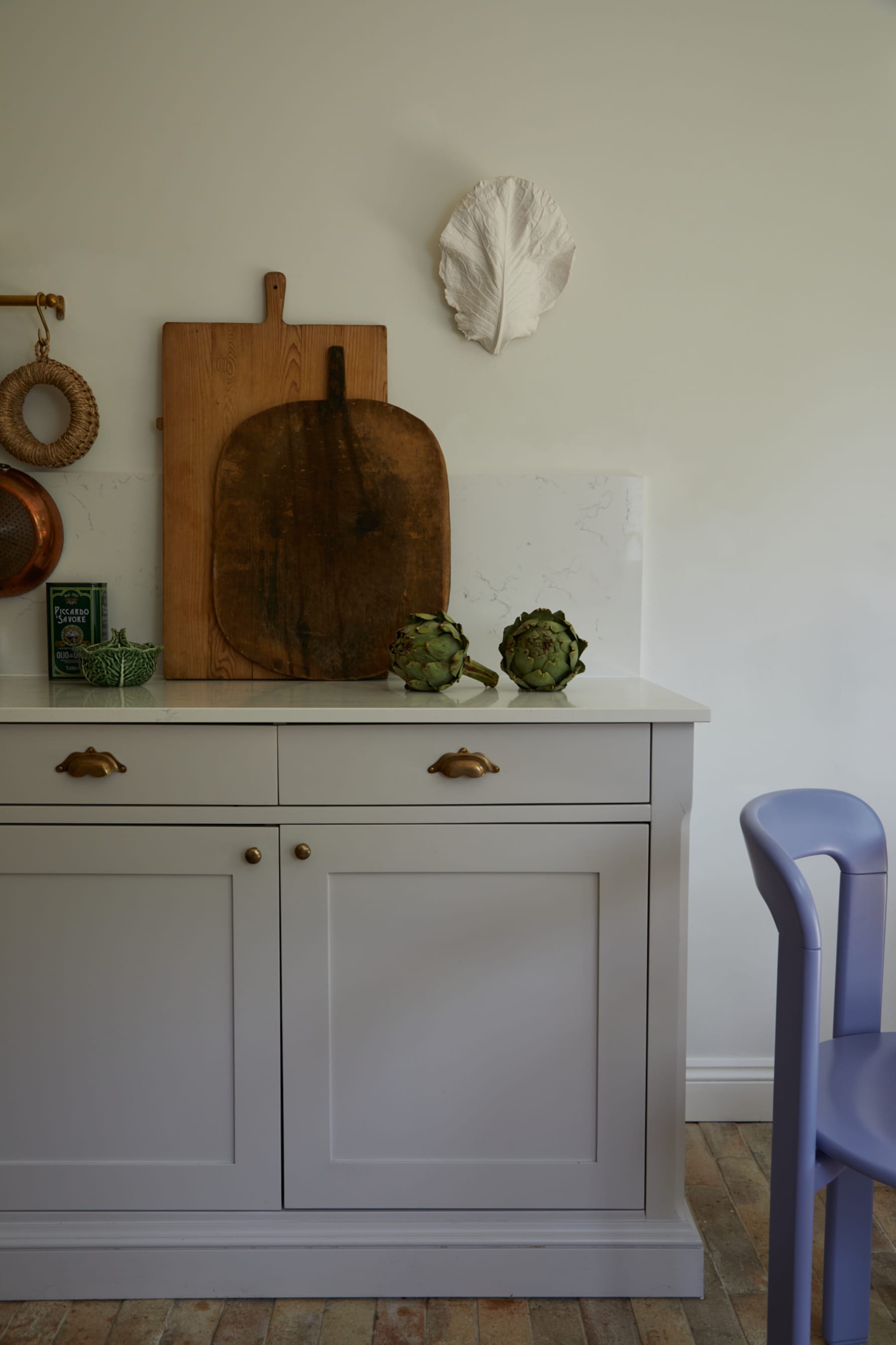
There was a time when home color advice came in two exhausting flavors: play it safe or paint the ceiling oxblood and live a little. But lately, the most interesting spaces seem to be choosing a third option: subtle color. Not boring color. Not timid color. Not “I got lost in a rental-beige fog and never came back” color. Subtle color is the sweet spot between personality and peace. It has enough pigment to wake up a room, but not so much that your coffee table starts acting like it owns the place.
That is exactly why subtle color feels so current. It works with the way people actually want to live now: calmer, warmer, layered, and a little more human. Instead of sterile white boxes or loud rainbow statements, today’s most compelling interiors lean into muted sages, dusty blues, creamy whites, clay pinks, gentle browns, smoky greens, and soft mineral shades. These colors do not scream for attention. They charm their way into the room, then stay long enough to make everything look better.
In other words, subtle color is not playing defense. It is quietly running the whole game.
Why Subtle Color Is Having a Moment
The obsession with subtle color is partly a reaction. After years of sharp white interiors, cool grays, and minimal spaces that looked amazing online but felt emotionally unavailable in real life, homeowners and designers started craving softness. Not blandness. Softness. Rooms that feel settled, flattering, and collected. Colors that behave like neutrals but still bring mood.
That shift matters because color is no longer just about making a room look stylish. It is about making a room feel livable. Subtle color helps bridge that gap. It gives a home warmth without visual chaos, and character without turning every corner into a dramatic monologue.
It also plays beautifully with today’s most popular materials. Think white oak, walnut, linen, plaster, travertine, unlacquered brass, brushed nickel, handmade tile, natural stone, boucle, jute, and nubby upholstery. A muted palette lets texture do some of the talking, which is very convenient for anyone who wants a sophisticated room without needing seventeen “statement” objects fighting for screen time.
What Counts as Subtle Color?
Subtle color is usually desaturated, toned down, or softened by gray, brown, cream, or earthy undertones. It might be a green with a smoky cast, a blue that feels weathered rather than nautical, or a pink that reads more like sun-warmed plaster than bubble gum. These shades often live in a beautiful in-between space: they are not quite neutral, but they are easy to use like one.
Common examples of subtle color include:
- Sage green
- Eucalyptus and olive
- Dusty blue and blue-gray
- Mushroom, taupe, and greige
- Clay, terracotta blush, and muted peach
- Soft ochre and buttery cream
- Warm mocha and cocoa browns
- Lavender-gray and frosted pastel tones
The beauty of these shades is that they do not demand a total room makeover. A subtle color can slide into an existing palette and instantly make it feel richer. That is a big reason designers love it and homeowners trust it.
The Psychology of Softly Saturated Spaces
Subtle color works because it supports mood rather than hijacking it. A room wrapped in muted greens or warm stone shades often feels grounded. A barely-there blue can cool a bright space without making it feel icy. Dusty pinks and peachy neutrals bring warmth to rooms that might otherwise read flat. Deep-but-soft browns add comfort and elegance without the heaviness of stark black.
There is also a flattering quality to subtle color that people do not talk about enough. These shades are kinder to natural light. They shift gently throughout the day, which makes a home feel alive. Morning light might pull out the silvery notes in a blue-gray wall, while evening light warms up a mushroom or soft khaki. It is design with range. Like a good actor, but in paint form.
The Palette Everyone Seems to Love Right Now
If you look across current interiors, a few subtle-color families keep showing up again and again.
Muted greens
Sage, eucalyptus, moss, and smoky jade feel restorative and timeless. These shades connect interiors to nature without becoming theme-y. They work especially well in kitchens, bedrooms, mudrooms, and anywhere wood tones are part of the mix.
Soft blues
Not beach-house blue. Not baby blue. Think stormy blue, mineral blue, washed denim, and blue-grays with a weathered finish. These hues can make a room feel calm, tailored, and slightly historic in the best way.
Warm neutrals
Cream, parchment, mushroom, oat, sand, and greige are replacing stark whites and flat grays. They are subtle, yes, but they are not sleepy. Their power lies in making a room feel warm and expensive without trying too hard.
Earthy pinks and quiet corals
Blush has grown up. The newest pinks are muddier, dustier, and more architectural. They pair beautifully with browns, oxblood, olive, and brass, which makes them far more versatile than many people expect.
Brown as a soft statement
Mocha, cocoa, espresso, chestnut, and other nuanced browns are back in a big way. Used well, brown is not heavy. It is enveloping. It can function like a neutral while still giving a room gravitas and depth.
How to Use Subtle Color Without Making a Room Feel Flat
The biggest myth about soft palettes is that they are automatically boring. They are only boring when everything sits at the same visual volume. The trick is contrast, but not the harsh, black-and-white kind. You want contrast in texture, finish, undertone, and depth.
1. Layer tones, not exact matches
If your walls are a muted sage, do not force every textile into the exact same shade. Pair that sage with olive, flax, parchment, weathered wood, and a darker green accent. Rooms feel more sophisticated when color relationships are loose, not literal.
2. Let one element go deeper
A subtle room still needs an anchor. That might be a walnut dining table, a dark bronze light fixture, a charcoal linen headboard, or a deep olive rug. Without one deeper note, the room can drift into visual mush, and nobody wants to live inside visual oatmeal.
3. Use natural materials generously
Muted palettes look best when they are surrounded by texture. Stone, linen, wool, oak, cane, leather, ceramic, plaster, and antique metals give quiet colors something to bounce off of. Texture is what turns subtle color from safe to stunning.
4. Think about finish
A matte wall in a soft color feels different from satin cabinetry in the same hue. Finish changes the mood. Chalky, limewashed, brushed, and hand-finished surfaces tend to make subtle colors feel even more nuanced and dimensional.
5. Edit your accents
If you want subtle color to shine, do not bury it under a pile of random bright accessories. Choose a few pieces that support the palette and let the room breathe. This is one of those rare moments where restraint really does look glamorous.
Room-by-Room Ideas for Bringing in Subtle Color
Living room
Try warm off-white walls with a dusty olive sofa, a camel leather chair, and faded blue textiles. Or go with mushroom walls, a cream sectional, walnut tables, and muted rust pillows. The goal is a room that feels layered, not loud.
Kitchen
Subtle color is especially effective on cabinetry. Soft green, smoky blue, clay beige, and cocoa-stained wood all feel fresh without becoming trendy overnight. Pair them with creamy counters, handmade tile, and mixed metals for a kitchen that ages gracefully.
Bedroom
Bedrooms are where subtle color really earns its paycheck. A misty blue-gray, pale olive, or warm putty can turn a basic room into a retreat. Add linen bedding, dimmable lighting, and a rug with tonal variation, and suddenly your bedroom feels like it has boundaries and emotional intelligence.
Bathroom
Muted greens, warm whites, and dusty stone shades work beautifully in bathrooms. They make tile, marble, and brass look richer, and they tend to flatter both daylight and lamplight. That is helpful in a room where people regularly evaluate their faces before coffee.
Entryway
If you are color-shy, this is a smart place to experiment. An entry painted in a subtle earth tone or smoky blue can create a strong first impression without overwhelming the rest of the house.
Subtle Color vs. Trend Fatigue
One reason this obsession has legs is that subtle color does not behave like a gimmick. These hues can feel current, but they also connect to classic interiors. Historic houses have long used softened pigments. European-inspired spaces rely on patina, undertone, and mood. Even minimalist homes now look better with a little warmth and tonal complexity.
That gives subtle color unusual staying power. It is trend-aware without being trend-trapped. You can update it with art, textiles, lighting, or hardware, and the room still holds together. That is the difference between decorating for a season and designing for real life.
Specific Examples That Make the Look Work
Picture a dining room painted a dusty olive with antique brass sconces, a dark wood table, and oatmeal linen drapes. Or a kitchen with smoky blue cabinetry, creamy walls, zellige tile, and a runner in faded brick and sand tones. Or a bedroom in warm putty with a rust velvet pillow, blackened metal lamps, and a quilt that mixes ivory, sage, and muted brown.
Notice what all of these examples have in common: no color is trying to be the funniest person at the party. Everything is participating. That is the secret. Subtle color works best when it feels woven through the room rather than dropped into it like a surprise guest.
How to Start If You Are Nervous About Color
Start with one of three gateways: paint, textiles, or upholstery. Paint is the most transformative, but textiles are the least risky. A soft green curtain, a dusty blue throw, or a clay-toned rug can show you how subtle color behaves in your light before you commit to walls or cabinetry.
It also helps to test color next to the materials you already own. That “perfect” muted green can turn minty next to cool marble or go muddy beside orange-toned wood. Undertones matter. In subtle palettes, they matter a lot. The quietest colors are often the trickiest because their shifts are gentler but more noticeable over time.
And remember: subtle color does not have to mean pale color. Deep colors can still be subtle if they are nuanced. A smoky aubergine, a softened espresso, or a blue-black with gray undertones can all create a restrained, elegant mood.
Why This Obsession Feels So Personal
Maybe that is the real reason subtle color resonates right now. It lets homes feel expressive without feeling performative. It gives people permission to move beyond blank-box minimalism while avoiding the pressure to create a hyper-styled, social-media-ready set piece. Subtle color is stylish, yes, but it is also forgiving. It leaves room for books, dogs, hand-me-down furniture, odd ceramics, favorite quilts, and the ordinary clutter of actual living.
And that may be its biggest strength. Subtle color does not just decorate a room. It softens the edges of daily life.
Personal Experiences With “Current Obsessions: Subtle Color”
The funny thing about subtle color is that I did not notice I was falling for it at first. It started the way many design obsessions do: innocently, almost academically. I would save a photo of a living room because I liked the sofa, then realize two days later that the room’s magic had less to do with the furniture and more to do with the wall color behind it. Not white. Not beige. Something whispery. Something between stone and mushroom. The kind of shade that sounds boring until it is next to oak, linen, and late-afternoon sunlight, and then suddenly it feels like poetry with baseboards.
I remember seeing a muted green kitchen that changed the way I thought about color completely. It was not a dramatic emerald, not a farmhouse mint, not one of those “look at me, I’m a trend” greens. It was quieter than that, with a gray cast that made the cabinets feel collected rather than newly painted. The room looked grounded. Calm. As if it had always known exactly who it was. That was the moment I realized subtle color does not ask for applause. It just makes everything around it look smarter.
Since then, I have noticed how subtle color changes the way a space behaves. In bright rooms, soft hues can filter the light so it feels gentler and more flattering. In smaller rooms, they create intimacy without making the walls close in. In busy homes, they seem to lower the visual volume. That is not a technical design term, but it should be. Some colors make a room buzz; subtle colors make it hum.
What I love most is how forgiving they are. A loud statement color can be thrilling, but it can also turn one bad styling decision into a full-blown identity crisis. Subtle color is more gracious. It lets vintage pieces, family furniture, imperfect textures, and everyday objects coexist. A dusty blue wall does not mind if your lamp is a little quirky. A warm putty bedroom does not panic when the bedding is wrinkled. These colors seem to understand that homes are meant to be lived in, not just photographed between the hours of 10 a.m. and noon.
There is also something deeply emotional about the right soft shade. A muted clay can feel warm and social, perfect for a dining room where conversations drag pleasantly into dessert. A smoky green can make a bedroom feel protected. A cream with just enough depth can take a once-sterile room and make it exhale. Even subtle browns, which I once unfairly filed under “serious” and “possibly upholstered by a law firm,” now feel rich, comforting, and surprisingly chic.
If this obsession has taught me anything, it is that color does not need to be loud to be memorable. Sometimes the most effective palette is the one that reveals itself slowly. The one that looks different at breakfast than it does at dusk. The one that makes wood glow, brass mellow, fabric soften, and people linger. Subtle color is not the absence of personality. It is personality with impeccable manners. And honestly, that may be my favorite kind.
Conclusion
Subtle color is more than a passing design crush. It reflects a broader move toward homes that feel warm, layered, restful, and deeply personal. Whether you lean toward sage, mushroom, dusty blue, clay, or cocoa, the appeal is the same: these shades add mood without chaos and style without strain. They prove that color does not have to be loud to be transformative. Sometimes the most powerful design decision is the one that speaks softly and stays with you.