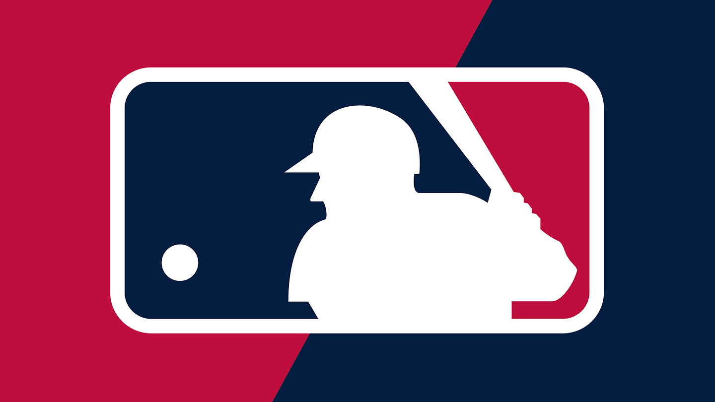
At first glance, the Major League Baseball logo seems almost too simple to hide a secret. A white batter. A ball. A red-and-blue background. That is it, right? Case closed, peanuts purchased, seventh-inning stretch complete.
Not quite. Look a little longer and the famous MLB logo starts playing a quiet little trick on your eyes. The batter can appear to be facing one direction or the other. Depending on how your brain reads the silhouette, he may be batting right-handed or left-handed. The same clean white figure can flip perspective without moving a single pixel. It is not the loud kind of optical illusion that makes you question whether your kitchen floor is melting. It is subtler, smarter, and much more useful.
This hidden ambiguity is one reason the MLB logo has lasted for decades. It does not show a specific player, a specific race, a specific team, or even a specific handedness. It represents baseball itself. And somehow, in a tiny rectangular mark, it captures the game’s tension: the pitch is coming, the batter is waiting, and the viewer’s brain is doing a little extra batting practice.
The MLB Logo Looks Simple, But That Is the Trick
The MLB logo is a master class in visual economy. It uses negative space, strong color blocks, and a minimal silhouette to create an image that is instantly recognizable even from a distance. There are no facial details, no uniform numbers, no team colors, and no decorative fireworks. It is baseball reduced to its purest visual ingredients: batter, bat, ball, and anticipation.
That simplicity is not accidental. A great sports logo needs to survive everywhere: on caps, jerseys, helmets, bases, broadcast graphics, merchandise, websites, mobile screens, and tiny social media icons. If a logo falls apart when it is stitched onto fabric or shrunk to the size of a sunflower seed, it is not going to last long in professional sports.
The MLB logo passes that test beautifully. The white batter is formed by the empty space between red and blue shapes. In design terms, this is negative space. In everyday terms, it is the art of making nothing do something. The “empty” white area becomes the most important part of the image.
What Is the Optical Illusion in the MLB Logo?
The hidden optical illusion is based on perspective. When you look at the batter, your brain has to decide which way the figure is facing. If you see the player from behind, as though you are standing behind the batter near the catcher’s view, the figure can read as a right-handed hitter. If you see the player from the front, with home plate between you and the batter, the figure can read as a left-handed hitter.
That means the logo works like an ambiguous image. It is not as dramatic as the classic duck-rabbit illusion, where one drawing can be seen as either a duck or a rabbit. But the basic idea is similar: the brain receives limited visual information and completes the image based on interpretation.
The MLB logo does not include eyes, a mouth, jersey folds, shoulder detail, or a clear body angle. Without those clues, your mind fills in the blanks. One viewer may see a righty. Another may see a lefty. Some fans can switch between the two views once they notice the trick. Congratulations, your brain just stole second base.
Why the Ambiguity Matters
The illusion is not just a fun trivia fact. It supports the entire purpose of the logo. Major League Baseball needed a symbol that could stand for the whole league, not one club or one player. A highly detailed batter would have raised questions. Which team is he on? What era is he from? Is he famous? Why does he look like someone’s uncle who still talks about his high school batting average?
By keeping the player anonymous and visually flexible, the logo becomes universal. The batter can be anyone. He can be right-handed or left-handed. He can be from any background. He can belong to any team. He can be a superstar, a rookie, a legend, or a kid imagining himself in the box while swinging a plastic bat in the backyard.
This is where the optical illusion becomes a branding advantage. The mark is inclusive because it refuses to over-explain itself. It gives fans enough information to recognize baseball, then steps aside and lets the viewer bring meaning to it.
Who Designed the MLB Logo?
The official Major League Baseball logo was designed by Jerry Dior in 1968. At the time, Dior was working for Sandgren & Murtha, a New York marketing and design firm. MLB commissioned the firm to create a logo connected to the 1969 centennial celebration of professional baseball.
The logo first appeared on MLB uniforms during the 1969 season. It was originally tied to a special anniversary moment, but the design proved too strong to retire. Instead of becoming a one-year commemorative mark, it became one of the most recognizable sports logos in the United States.
Dior’s design was created in a pre-digital era, which makes its lasting power even more impressive. No vector software. No endless online mood boards. No designer whispering, “Can we make it pop?” into a Zoom call. The logo was built with traditional tools, strong instincts, and a clear understanding of what makes a symbol memorable.
Was the MLB Logo Based on Harmon Killebrew?
One of the most persistent myths about the MLB logo is that the batter was modeled after Hall of Famer Harmon Killebrew. The theory has floated around for years, partly because some old photos of Killebrew resemble the pose. Baseball fans love a good mystery almost as much as they love arguing about the designated hitter, so the rumor stuck.
However, Dior said the logo was not based on Killebrew or any single player. Instead, it was a composite inspired by multiple baseball images. That distinction matters. If the logo were one famous player, it would become a portrait. Because it is not, it becomes a symbol.
The Killebrew myth is understandable, though. The MLB silhouette has just enough personality to feel real, but not enough detail to identify anyone. That is part of the magic. It invites speculation without requiring a final answer.
How Negative Space Makes the Logo Work
Negative space is one of the logo’s greatest strengths. The batter is not drawn with black outlines or shaded muscles. He appears because the red and blue shapes around him create the white form. This makes the image feel bold, clean, and almost architectural.
The baseball itself is also brilliantly simple. It is just a white circle in the blue field, but because of its position, your brain instantly reads it as a pitch traveling toward the batter. There are no speed lines, no seams, and no cartoon “whoosh.” The drama comes from placement.
The bat is another important clue. It leans through the upper part of the logo, giving the white silhouette motion and purpose. Without the bat, the figure might be harder to read. With it, the image becomes unmistakably baseball.
Why Red, White, and Blue Feel So Natural
The MLB logo’s red, white, and blue palette gives it a patriotic American feel without turning it into a waving flag. Baseball has long been marketed as America’s pastime, so the colors naturally support the identity of the sport. They also create strong contrast, which helps the logo remain readable in different sizes and formats.
Color also helps divide the composition. The blue side holds the ball and much of the batter’s head and body. The red side creates energy behind the bat and front edge of the figure. The white silhouette sits between them like a moment frozen in time.
Many teams and special events have adapted the logo colors over the years, but the core structure remains recognizable. That is another sign of a great mark: even when the colors change, the design still communicates.
Why the MLB Logo Has Lasted So Long
Sports branding changes constantly. Teams refresh uniforms, adjust colors, modernize mascots, and occasionally unveil logos that make fans ask whether anyone in the room owned eyes. Yet the MLB logo has remained remarkably stable.
Its longevity comes from restraint. The design does not chase a trend. It does not rely on a fashionable typeface, a mascot expression, or a visual effect that would scream “made in 1968.” Instead, it uses shape, contrast, and ambiguity. Those elements age well.
The logo also captures a universal baseball moment. The batter is waiting for the pitch. That moment exists in every game, every season, every generation. It is not tied to one stadium, one uniform style, or one era of baseball. Whether the game is played under old ballpark lights or streamed on a phone, the confrontation between pitcher and hitter still defines the sport.
The Logo’s Influence on Other Sports Branding
The MLB logo helped establish a visual language that many sports organizations later followed: a central athlete silhouette, strong color fields, and a clean league-wide identity. The NBA logo is often discussed in relation to this tradition, and other sports marks have used similar ideas of motion, contrast, and simplified human form.
That influence is not surprising. League logos have a difficult job. They need to represent many teams at once while staying neutral, authoritative, and easy to reproduce. The MLB logo solved that problem so efficiently that it became a template for what a modern sports league logo could be.
Even people who do not watch baseball recognize it. That is the highest level of branding success. When a symbol escapes its original audience and becomes part of general culture, it has done more than decorate merchandise. It has become visual shorthand.
How the Optical Illusion Changes the Way Fans See It
Once you notice the illusion, the MLB logo becomes more interesting. You may find yourself switching between interpretations: front view, back view, left-handed batter, right-handed batter. The image suddenly feels less static. It has a little motion inside it, even though nothing is actually moving.
This is why the hidden illusion keeps resurfacing online. Fans enjoy discovering that a logo they have seen thousands of times still has something new to offer. It is like finding a secret compartment in a desk you have owned for 20 years, except the compartment is full of baseball arguments.
The illusion also gives the logo a conversational quality. It asks viewers to participate. Instead of telling you exactly what to see, it leaves a small question open. That open-endedness keeps the design alive.
What Designers Can Learn From the MLB Logo
1. Simplicity Can Be Powerful
The MLB logo proves that a design does not need many details to carry deep meaning. In fact, fewer details can make a logo stronger because it becomes more flexible and memorable.
2. Ambiguity Is Not Always a Problem
Many brands fear ambiguity, but the MLB logo uses it as a strength. The uncertain perspective allows more people to see themselves in the image.
3. Negative Space Can Do the Heavy Lifting
The logo’s most important figure is created by empty space. That is a reminder that what a designer leaves out can be just as important as what they include.
4. Timeless Design Avoids Trend Traps
Because the MLB logo is built on clear shape and contrast, it does not feel trapped in the design trends of its era. It still works in print, broadcast, embroidery, and digital environments.
Common Misconceptions About the MLB Logo
It Is Not a Detailed Portrait
The batter is not meant to be a specific player. That is why the face, body, and uniform remain intentionally generic.
It Is Not Just a Random Silhouette
The figure may look simple, but its shape, spacing, and direction are carefully balanced. The ambiguity is part of the design’s intelligence.
It Is Not Outdated Just Because It Is Old
A logo can be old and still feel fresh. The MLB logo has survived because its core idea is strong, not because baseball forgot to update the file folder.
Why This Hidden Detail Makes the Logo Better
The optical illusion hidden in the MLB logo is not a gimmick. It is a quiet design feature that supports the brand’s larger message. Baseball is a game of perspectives: pitcher versus hitter, home team versus visitor, tradition versus innovation, statistics versus gut feeling. The logo reflects that duality in a tiny visual way.
Whether you see the batter as a lefty or a righty, the logo still works. That is the point. It does not demand one correct interpretation. It welcomes multiple readings while remaining instantly recognizable.
In a world full of overdesigned logos, that restraint feels almost radical. The MLB logo does not shout. It waits in the batter’s box, calm and balanced, letting the pitch come to it.
Personal Experiences and Everyday Ways to Notice the MLB Logo Illusion
The funny thing about the MLB logo illusion is that many people do not notice it until someone points it out. Then, once they see it, they cannot unsee it. It becomes one of those small visual facts that follows you around like a foul ball you almost caught but still bring up years later.
Imagine watching a game with friends and seeing the logo on a player’s cap. One person says, “The batter is right-handed.” Another says, “No, he is left-handed.” Suddenly, the room turns into a tiny courtroom, except the evidence is a two-inch patch and everyone is eating nachos. That is the charm of the design. It creates debate without needing controversy.
For younger fans, the illusion can be a fun entry point into design thinking. Kids may recognize the batter immediately, but when asked which direction he faces, they often pause. That pause is valuable. It shows how much work the brain does when reading images. Logos are not just decorations; they are little puzzles of shape, memory, and meaning.
For baseball fans, the logo also has emotional weight. It appears during big moments: Opening Day, the All-Star Game, the postseason, the World Series, and quiet summer broadcasts that feel like background music for American life. The optical illusion adds another layer to that familiarity. The symbol you thought you knew turns out to be more flexible than expected.
There is also something poetic about the batter’s uncertainty. Baseball itself is built on uncertainty. A hitter can do everything right and still line out. A pitcher can miss a spot and somehow get a double play. A fan can promise, with great confidence, that this is finally the team’s year, and then spend August researching football schedules. The MLB logo captures that suspense without showing a scoreboard.
Designers often talk about “ownable” marks, meaning logos that a brand can claim as uniquely its own. The MLB logo is ownable because it is so spare and specific. But it is also shareable because it leaves room for interpretation. Fans can project their own memories onto it: a first game with a parent, a Little League season, a favorite player, a heartbreaking loss, a walk-off home run, or the smell of hot dogs that somehow taste better at the ballpark than anywhere else on Earth.
Once you start noticing the logo in daily life, you see how well it adapts. On a navy cap, it feels official. On a jersey sleeve, it feels traditional. On a broadcast graphic, it feels clean and modern. On merchandise, it becomes a stamp of authenticity. The illusion remains tucked inside all those uses, quietly doing its job.
That is the best kind of hidden detail. It does not distract from the main message. It rewards attention. The MLB logo does not need to announce, “Look, I am clever.” It simply lets fans discover the cleverness on their own. And when they do, the design feels new again, even after more than half a century in public view.
So the next time you see the MLB logo, take an extra second. Ask yourself: is the batter facing me or facing away? Is he a lefty or a righty? There may not be one final answer, and that is exactly why the logo works. Baseball has always loved arguments that can last nine innings and beyond. The MLB logo just gives fans one more beautiful little debate to enjoy.
Conclusion
The optical illusion hidden in the MLB logo is more than a clever visual trick. It is a key reason the design has become timeless. By leaving the batter’s direction open to interpretation, Jerry Dior created a symbol that feels inclusive, flexible, and deeply connected to the spirit of baseball. The logo can represent left-handed hitters and right-handed hitters, famous stars and unknown rookies, lifelong fans and casual viewers. It is simple enough to recognize instantly, yet smart enough to keep people looking.
That is rare branding magic. The MLB logo does not need extra detail because its power comes from what it leaves unsaid. Like the best moments in baseball, it holds suspense, balance, and possibility in one clean frame.